Midday design research
This is a measured teardown of the public marketing site at https://midday.ai. It was captured on 2026-11-21 at 1440 × 900. Light mode and 390 px mobile were captured too. It is written so a designer or engineer can understand why the site looks the way it does and rebuild that feel without copying it.
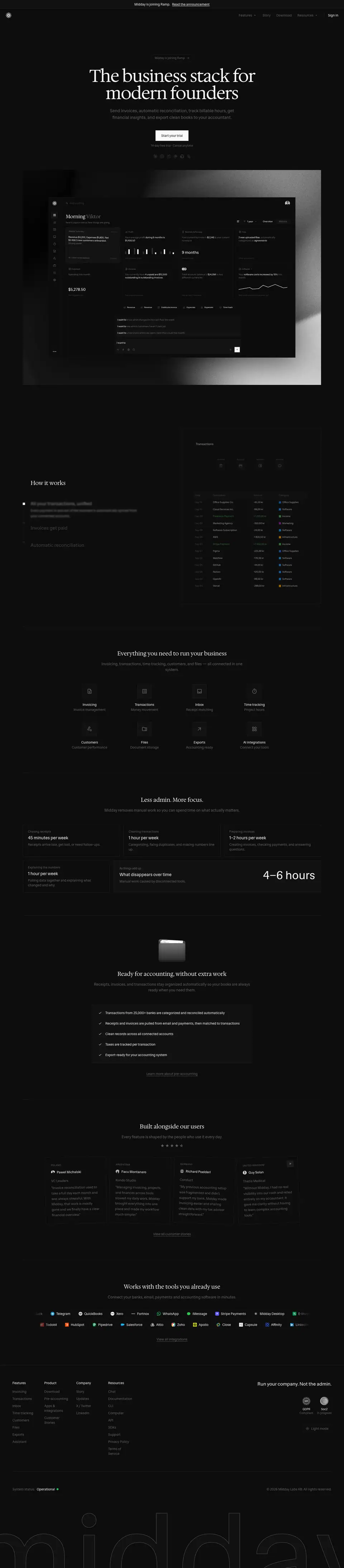
What Midday is, in one paragraph
Midday is a back office for one-person and small companies: invoicing, bank transactions, receipt matching, time tracking, files and exports to an accountant. In 2026 it added an AI assistant, agents, a CLI, MCP servers and "Midday Computer". The site's one-line promise is "The business stack for modern founders". The site is in a late-life state. A banner and a pill say "Midday is joining Ramp". /pricing now redirects to that announcement. Plan cards still appear at the bottom of every feature page.
The design in six measured facts
- Two typefaces from one family. Hedvig Letters Serif is used for every display heading (H1 72 px, H2 24 px). Hedvig Letters Sans is used for everything else. Each family ships one weight, 400. The few 500 and 600 labels on the site, such as buttons and table headers, are faux bold, synthesized by the browser.
- Two grays do all the work. In dark mode, text is
#fafafa and everything secondary is #616161. The same #616161 is used in light mode. → Color
- Square corners. Buttons, cards, tables and pricing cards have
border-radius: 0. The only rounded shapes are pills (9999px): the hero pill and the feature chips. → Components
- Hairlines instead of shadows. 216 elements on the home page carry a
1px solid #1c1c1c border. There are no box shadows except one green "status" glow. → Layout
- The product is the illustration. Every hero is a product screen. It is drawn as a crisp SVG on top of a looping grayscale video, or built live in HTML tables. → Art direction
- One giant outlined wordmark. Every page ends with "midday" set at 508 px. It is filled with the background color and stroked with a 1 px
#616161 line. → Brand assets
How to read this site
| Doc |
What it covers |
| 01 Principles |
The rules behind the choices |
| 02 Color |
Every measured color, both themes, contrast ratios |
| 03 Typography |
Fonts, foundry, licence, scale, free substitutes |
| 04 Layout |
Container, gutters, section rhythm, dividers |
| 05 Heroes |
The six hero patterns |
| 06 Section types |
Every recurring block, including the bento |
| 07 Copywriting |
Voice, headline formulas, microcopy |
| 08 Components |
Nav, buttons, pills, cards, tables, pricing, footer |
| 09 Art direction |
Product-UI illustration, video, photo, 3D, ASCII |
| 10 Brand assets |
Every graphic type, how it is made, how to rebuild it |
| 11 Motion |
Measured transitions, keyframes, hover rules |
| 12 Glossary |
The words you need to brief this style |
| 13 Build recipe |
Tokens and CSS to start a page in this style |
| Public pages |
All 232 public URLs on midday.ai |
Page-by-page teardowns are in pages/. Feature pages share one template, so that template has one doc: Feature page template.
Method
- Every public URL comes from
sitemap.xml plus the navigation links (list).
- 31 pages were captured full-page at 1440 px in dark mode, which is the site default under
prefers-color-scheme: dark. The list covers every top-level product and company page and every index page (updates, docs, compare, integrations, MCP). It also covers two examples of each template: update post, integration detail, compare detail, MCP detail, docs article and legal.
- Light mode was captured at 1440 px for home, invoicing and agents. Mobile was captured at 390 px for home and invoicing, in both themes.
- Values come from
getComputedStyle in the live page. The raw data is in data/*.json: per-page type, color, button and media dumps, *.probe.json (fonts, keyframes, transitions, radii), home.comp.json (components) and theme-tokens.css (both themes' CSS variables, copied verbatim).
- Values marked ≈ are read from pixels, not from CSS.
Known gaps
- Hover states were read from each element's Tailwind classes (
hover:text-foreground, hover:bg-primary/90), not filmed.
/about renders only the footer: the page is 910 px tall and has no content block. It is documented as found./pricing returns 308 to /updates/joining-ramp, so no standalone pricing page exists. Pricing is documented from the plan block that every feature page carries.- The typefaces (Hedvig Letters Sans and Serif) are free (Google Fonts, SIL OFL). Nothing here needs a paid font.
Public pages · every public URL on midday.ai
232 public URLs, read on 2026-11-21 from https://midday.ai/sitemap.xml (229 entries) plus three links that appear only in the site navigation: /pricing, /chat and /mcp/manus. Each title is the page's own <title>, with the "| Midday" suffix removed. Every URL returned HTTP 200, except /pricing.
robots.txt allows every path. It lists one sitemap.- There is no
/blog and no /changelog (both return 404). Both jobs live under /updates: release notes, monthly product updates, engineering posts and company news share one stream.
/pricing redirects (308) to /updates/joining-ramp. Midday is joining Ramp, so the pricing page is no longer public.- The app (
app.midday.ai), API (api.midday.ai) and status page (midday.openstatus.dev) are separate hosts. They are out of scope.
Home and product
12 pages.
Company and legal
9 pages.
Pricing
1 pages.
Updates (blog + changelog)
30 pages.
Compare
17 pages.
MCP
12 pages.
Integrations — index and categories
7 pages.
Integrations — native apps
22 pages.
Integrations — AI connectors
69 pages.
Docs
53 pages.
01 · Design principles
These are the rules the site follows. Each one is inferred from measured values, and the evidence sits next to it. The "why" is our reading of the intent. It is labelled as reasoning, not as a quote from Midday.
1. Look like a ledger, not like a launch
Evidence.
- 0 px radius on buttons, cards, tables and pricing.
- 1 px #1c1c1c hairlines on 216 elements of the home page.
- One weight (400) for every text role except the 500-weight button label.
- No drop shadows except the hero image's drop-shadow(0 30px 60px rgba(0,0,0,.6)) and one status glow.
Why. The product handles money. Square boxes, thin rules and tabular numbers read like an accounting book or a bank statement. That borrows the trust those objects carry. A rounded, glowing SaaS look would signal "app", not "books".
2. A serif for the promise, a sans for the facts
Evidence. Hedvig Letters Serif sets the H1 (72 px) and every section headline (24 px). Hedvig Letters Sans sets every paragraph, label, table and button. → Typography
Why. The serif carries the editorial, human voice ("Get paid faster"). The sans carries the operational detail. Both come from one superfamily, so the switch never looks like two brands.
3. Two grays, no accent
Evidence. Text is #fafafa (dark) or #121212 (light). Secondary text is #616161 in both themes. The only hue on marketing chrome is functional: green #4caf50 marks income amounts and #22c55e the "Operational" status dot. The only filled button is the primary CTA, in the foreground color. → Color
Why. Without a brand accent, the product screenshots become the color. The small category swatches inside the UI (blue, purple, orange, green) are the only saturated pixels. That pulls the eye to the product.
4. The product is the hero
Evidence.
- Every feature-page hero puts a 1152–1248 px product frame directly under the H1. The frame is an SVG, so it stays sharp at any zoom.
- The home hero layers that SVG over a looping grayscale video (login-video.mp4).
- Feature rows rebuild real tables, invoices and charts in HTML.
Why. Founders buy tools by imagining the screen they will live in. Showing the real UI, at real density and with plausible data ("Office Supplies Co. −45,20 kr"), answers "what is it?" faster than any illustration.
5. Repeat the template, change the headline
Evidence.
- Six feature pages share one structure. These are invoicing, transactions, inbox, time tracking, file storage and customers.
- The structure is a 128 px serif H1, a product frame and two alternating feature rows.
- The same seven shared modules follow: the "Everything you need…" grid, the "Less admin" bento, "Ready for accounting", testimonials, the integration marquee, pricing and the footer.
- Page heights cluster at 8263–8391 px. → Feature template
Why. A small team maintains a 232-URL site. One template keeps every page on-brand, and each new feature is one hero plus two rows. Repetition also builds recall: a visitor who lands on any page meets the same proof (testimonials, integrations, price).
6. Quiet motion, measured in 150–200 ms
Evidence.
- 267 elements use transition: color, background-color, border-color 150ms cubic-bezier(.4,0,.2,1). These are Tailwind's defaults.
- Entrances use fadeInBlur for 350 ms and fadeInScale for 400 ms.
- The only continuous motion is the two integration marquees (30 s and 28 s, linear) and a 2 s status pulse. → Motion
Why. Motion is used to confirm a hover or reveal a step, never to decorate. That keeps the "ledger" calm.
7. Each AI surface gets its own mood
Evidence.
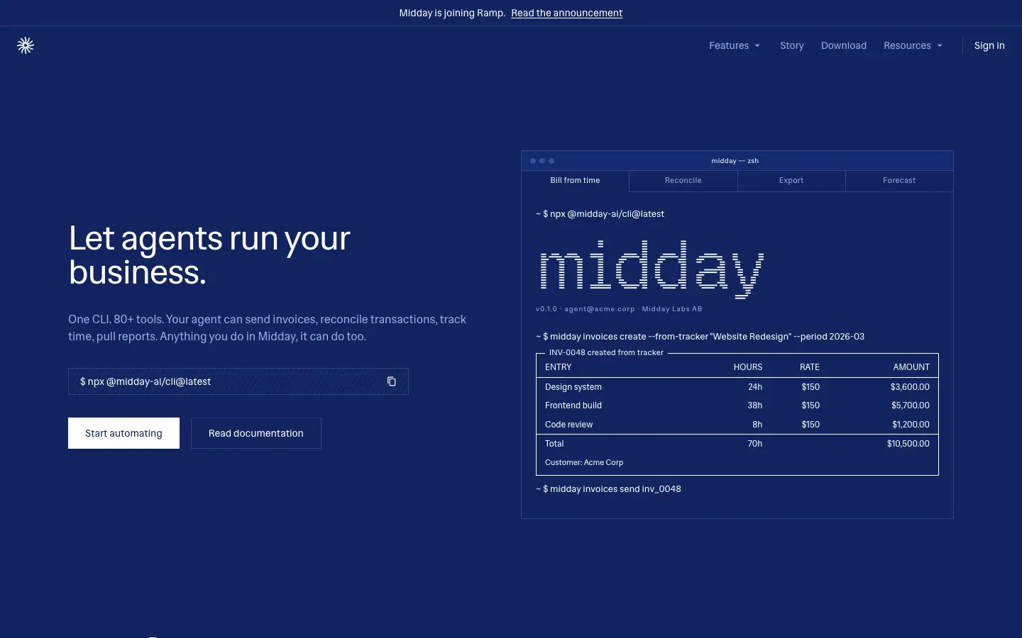
- /agents switches the whole page to navy #11245f with blue hairlines #2d4386.
- It sets the wordmark in Geist Pixel and draws diagrams in monospace box-drawing.
- /computer keeps the dark base but uses the same terminal and diagram language.
Why. The developer and agent audience reads terminals and diagrams faster than marketing prose. A color shift marks "you are in the developer part of the site" without a separate brand.
8. Late-life honesty
Evidence.
- A 36 px announcement bar sits on every page: "Midday is joining Ramp. Read the announcement".
- The H1 is preceded by a pill with the same message.
- /pricing redirects to the announcement.
Why. It tells existing customers the most important fact first, on every page. It also stops new sign-ups from expecting a long future for the plan.
02 · Color system
Midday uses shadcn/ui-style HSL tokens, switched by the .dark class (from the next-themes library). The default theme is system. With no saved choice the site follows prefers-color-scheme, and the footer has a "Light mode / Dark mode" toggle. Both token sets below are copied from the live CSS. The verbatim file is data/theme-tokens.css.
Tokens, both themes
| Token |
Light (:root) |
→ hex |
Dark (.dark) |
→ hex |
Used for |
--background |
0 0% 100% |
#ffffff |
0 0% 5% |
#0d0d0d |
Page, most section fills |
--foreground |
0 0% 7% |
#121212 |
0 0% 98% |
#fafafa |
Headings, active text |
--card / --popover |
45 18% 96% |
#f7f6f3 |
0 0% 7% |
#121212 |
Raised panels |
--primary |
240 5.9% 10% |
#18181b |
0 0% 98% |
#fafafa |
Primary button fill |
--primary-foreground |
0 0% 98% |
#fafafa |
240 5.9% 10% |
#18181b |
Primary button label |
--secondary |
40 11% 89% |
#e6e4e0 |
0 0% 7% |
#121212 |
Announcement bar, footer wordmark fill, highlighted bento |
--muted / --accent |
40 11% 89% / 40 10% 94% |
#e6e4e0 / #f1f0ee |
0 0% 11% |
#1c1c1c |
Icon tiles, hover fills |
--muted-foreground |
0 0% 38% |
#616161 |
0 0% 38% |
#616161 |
All secondary text, both themes |
--border |
45 5% 85% |
#dbdad7 |
0 0% 11% |
#1c1c1c |
Every hairline |
--destructive |
0 84.2% 60.2% |
#ef4444 |
359 100% 61% |
#ff383b |
Errors (not seen on marketing) |
--radius |
.5rem |
|
.5rem |
|
Declared but overridden to 0 on most components |
Light mode is warm. The light grays have a yellow hue (40–45°): #e6e4e0 and #dbdad7. The dark grays are neutral (0°). The light theme therefore feels like paper. The dark theme feels like a screen.
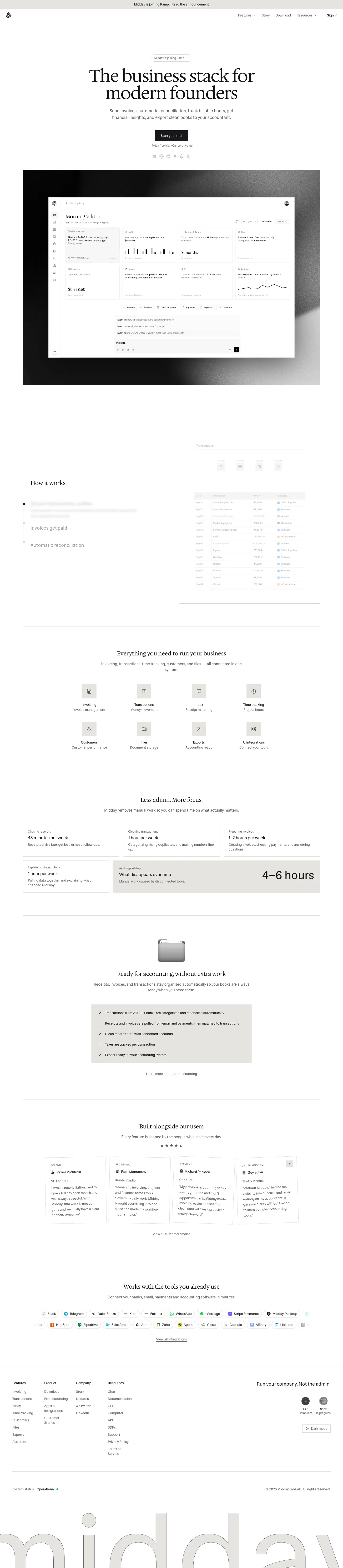
Measured usage counts (home page, dark)
| Color |
Elements |
Role |
#0d0d0d background |
216 |
page and section fills |
#121212 |
17 |
bento highlight cell, footer wordmark fill |
#1c1c1c border |
216 |
every hairline |
#fafafa text |
250+ |
headings, table cells, active step |
#616161 text |
70+ |
leads, labels, inactive steps, footer links |
#4caf50 text |
6 |
positive amounts (income rows) |
#22c55e |
2 |
status dot plus its pulse-glow ring |
#2196f3, #1976d2, #9c27b0, #ff9800 |
12 |
category swatches inside product tables |
Section-specific palettes
| Page |
Background |
Text |
Secondary |
Hairline |
Note |
/agents |
#11245f navy |
#ffffff |
#99ace6 |
#2d4386 |
Same in both themes. Labels are #6680cc at 12 px with +1.2 px tracking. Mono text is #476ad1. |
/computer |
#0d0d0d |
#fafafa |
#616161 |
#1c1c1c |
Big step numbers are #4d4d4d at 30 px |
Code (--sh-*) light |
— |
#171717 |
#4a4a4a strings/keywords |
— |
Grayscale syntax highlighting, no hues |
Code (--sh-*) dark |
— |
#ffffff |
#a7a7a7, comments #878787 |
— |
Grayscale syntax highlighting |
| Charts dark |
#0c0c0c pattern bg |
bars white |
#6666664d secondary |
grid #1d1d1d |
Monochrome charts |
Agents palette:
Contrast (WCAG 2.x)
| Pair |
Ratio |
Passes |
#fafafa on #0d0d0d |
18.62 |
AAA |
#616161 on #0d0d0d (dark secondary text) |
3.14 |
AA large only. Fails AA for 14–16 px body text. |
#616161 on #121212 |
3.02 |
AA large only |
#121212 on #ffffff |
18.73 |
AAA |
#616161 on #ffffff (light secondary text) |
6.19 |
AA |
#616161 on #e6e4e0 |
4.88 |
AA |
#18181b on #fafafa (dark primary button) |
16.97 |
AAA |
#4caf50 on #0d0d0d |
6.99 |
AA |
#ffffff on #11245f |
14.57 |
AAA |
#1c1c1c hairline on #0d0d0d |
1.14 |
Decorative. This low contrast is intended: the line is felt more than seen. |
#dbdad7 hairline on #ffffff |
1.40 |
Decorative |
Finding. One --muted-foreground value (38% lightness) serves both themes. It is comfortable on white (6.2:1). On near-black it is only 3.1:1, and that gray carries every lead paragraph and card description in dark mode. This is the single largest accessibility weakness of the site. If you borrow the palette, raise dark secondary text to about #8a8a8a (5.6:1) or #9a9a9a (6.8:1).
Why this palette works
- Value contrast, not hue contrast. Hierarchy comes from moving between 98% and 38% lightness. The page reads in grayscale, so any colorful product data shows up at once.
- Near-black, not black.
#0d0d0d (5%) avoids the harsh pure-black look on OLED screens. It also lets #121212 (7%) panels read as "raised" with only 2% difference, plus a hairline.
- Warm light theme. The 40–45° hue in the light grays makes printed-paper documents (invoices, receipts) feel physical.
03 · Typography
The families
| Family |
Role |
Weights loaded |
Source |
Licence |
| Hedvig Letters Serif |
H1, section H2, numbers in UI cards, docs headings |
400 only |
Self-hosted woff2 (4 subsets) via next/font. Also on Google Fonts. |
SIL Open Font License 1.1, free |
| Hedvig Letters Sans |
Body, leads, nav, buttons, tables, labels, footer, the 508 px wordmark |
400 only |
Self-hosted woff2 (4 subsets). Also on Google Fonts. |
SIL OFL 1.1, free |
| Geist Pixel (Line, Square, Grid, Circle, Triangle) |
The "midday" pixel wordmark in the /agents terminal |
500 |
Vercel's Geist Pixel family (Google Fonts, added 2026-06-29) |
SIL OFL 1.1, free |
monospace (system) |
CLI lines, box-drawing diagrams on /agents, /computer |
— |
Platform default (SF Mono / Menlo on macOS) |
— |
Designers. Hedvig Letters was drawn by Kanon Foundry: Alexander Örn and Tor Weibull. It was commissioned by the Swedish insurer Hedvig, which released it as open source in 2023. Midday is also a Swedish company ("Midday Labs AB", per the footer). Using a free Stockholm-made typeface with a print-like serif fits a small Nordic team.
Fallback stacks (from CSS):
--font-hedvig-sans:  "Hedvig Letters Sans", system-ui, sans-serif;
--font-hedvig-serif: "Hedvig Letters Serif", Georgia, serif;
Faux bold. Only the 400 file is loaded for each family. Every font-weight: 500/600 seen on the site is a browser-synthesized bold. These are button labels, table headers, testimonial names, update-post H2s and compare column heads. The faux weight is slightly smeared. Midday keeps it rare, so it reads as "slightly firmer", not "bold".
Optical size. The Google Fonts build of Hedvig Letters Serif has an opsz axis (12–24). The self-hosted Midday files are static 400 cuts, so no optical sizing is applied at 72 or 128 px. The H1s use the text cut, which is why they look sturdy rather than high-contrast.
Type scale (measured at 1440 px)
| Role |
Family |
Size / line-height |
Tracking |
Color (dark) |
Example |
| Footer wordmark |
Sans |
508 / 508 (200 on mobile) |
0 |
fill #121212, 1 px stroke #616161 |
"midday" |
| Feature H1 |
Serif |
128 / 128 |
0 |
#fafafa |
"Get paid faster" |
| Home / MCP / SDK / Download H1 |
Serif |
72 / 72 |
−1.8 px (−0.025 em) |
#fafafa |
"The business stack for modern founders" |
| Pixel wordmark |
Geist Pixel Line |
96 / 96 |
0 |
#fff on navy |
"midday" |
| Docs H1 |
Serif |
48 / 48 |
−1.2 px |
#fafafa |
"How can we help?" |
| Agents H1 |
Sans |
48 / 48 |
−1.2 px |
#fff |
"Let agents run your business." |
| Bento stat |
Sans |
48 / 48 |
0 |
#fafafa |
"4–6 hours" |
| Article / docs H1 |
Serif |
36 / 40 |
−0.9 px |
#fafafa |
"Create an Invoice", "Integrations" |
| Section H2 (large) |
Serif or Sans |
30 / 36 |
0 |
#fafafa |
"Secure by design", "Infrastructure" |
| Story H1 |
Serif |
30 / 39 |
0 |
#fafafa |
"Why we started Midday" |
| Section H2 (default) |
Serif |
24 / 32 |
0 |
#fafafa |
"Everything you need to run your business" |
| Feature-row H2 |
Sans |
24 / 32 |
0 |
#fafafa |
"Flexible invoicing setup" |
| Update post H2 |
Sans 500 |
24 / 32 and 26 / 39 |
0 |
#fafafa |
"Midday v2" |
| Step title (active / inactive) |
Sans |
20 / 28 |
0 |
#fafafa / #616161 |
"All your transactions, unified" |
| Docs H2 |
Serif |
20 / 28 |
−0.5 px |
#fafafa |
"# Create a new invoice" |
| Hero lead |
Sans |
18 / 28 |
0 |
#616161 |
"Send invoices, automatic reconciliation…" |
| Bento title |
Sans |
18 / 28 |
0 |
#fafafa |
"45 minutes per week" |
| UI money figures |
Serif |
18 / 28 |
0 |
#fafafa |
"$36,500.75" |
| Section lead |
Sans |
16 / 24 |
0 |
#616161 |
"Midday removes manual work…" |
| Body / nav / buttons / cards |
Sans |
14 / 20 |
0 |
#fafafa or #616161 |
199 of ~350 text nodes on home |
| Testimonial quote |
Sans |
14 / 22.75 (1.625) |
0 |
#616161 |
"Invoice reconciliation used to take…" |
| Eyebrow (feature) |
Sans |
12 / 16, uppercase |
+0.6 px (0.05 em) |
#616161 |
"INVOICING" |
| Eyebrow (bento) |
Sans |
12 / 16 |
+0.3 px |
#616161 |
"Chasing receipts" |
| Eyebrow (agents) |
Sans |
12 / 16, uppercase |
+1.2 px (0.1 em) |
#6680cc |
"CLAUDE" |
| Country label |
Sans |
10 / 15, uppercase |
+0.5 px |
#616161 |
"POLAND" |
| Badge / tag |
Sans |
10 / 15, uppercase |
+1 px |
#616161 |
"PRIVATE BETA" |
| Table text |
Sans |
11 / 16.5 (headers 500) |
0 |
#fafafa / #616161 |
"Office Supplies Co." |
| Micro UI |
Sans |
9 / 13.5 |
0 |
#fafafa |
"Account" (in diagrams) |
The H1 also shows Midday's one typographic flourish. Inside the H1, the word "modern" is wrapped in <em class="not-italic text-muted-foreground/80">. It is not italic. It is the same serif at 80% of the muted gray, so one word steps back in tone.
Mobile (390 px): the home H1 falls to 30 / 33, −0.75 px. The "4–6 hours" stat falls to 36 / 40. The wordmark falls to 200 px. The feature-page H1s follow Tailwind breakpoints (text-3xl … xl:text-7xl 2xl:text-7xl 3xl:text-8xl).
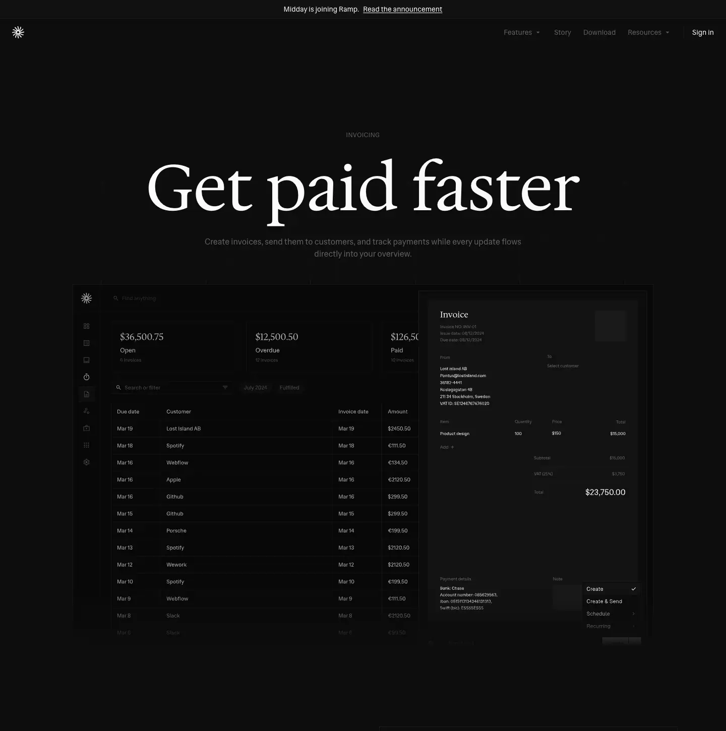
Rules you can copy
- Serif only above 18 px. Every serif use is a headline or a money figure. No paragraph is set in the serif.
- Headlines stay at 400. Size alone gives hierarchy. The 24 px serif H2 is often smaller than the 128 px H1 by 5×, with no weight change.
- Negative tracking only on big serif. −0.025 em at 72 px and above. Normal tracking at 24 px and below. Positive tracking (+0.05 to +0.1 em) only on uppercase labels.
- Line-height 1.0 for display, 1.33–1.55 for text. 72/72, 128/128, then 24/32, 18/28, 14/20.
- Figures are proportional. The CSS declares
--tw-numeric-spacing: tabular-nums, but no element on the home page computes to font-variant-numeric: tabular-nums (0 of all elements). Amounts in the demo tables use proportional figures. If you build real money tables, switch on tabular-nums. Midday's demo tables get away without it because each amount sits in its own short row.
- Two grays inside one block. A card pairs a 14 px
#fafafa title with a 14 px #616161 description, at the same size. Color, not size, separates them.
Free substitutes, if you cannot use Hedvig Letters
Hedvig Letters is already free. If you want a different voice with the same structure:
| Need |
Option |
Why |
| Print-like text serif for headlines |
Newsreader, Source Serif 4, Instrument Serif |
Moderate contrast, sturdy at display sizes |
| Neutral grotesque for UI |
Inter, Geist, Hanken Grotesk |
Neutral at 14 px, good tabular figures |
| Pixel display |
Geist Pixel (same as Midday), Silkscreen |
For the terminal or agent moments |
04 · Layout, grid and spacing
All values were measured at a 1440 × 900 viewport on the dark home page unless noted.
Page frame
| Element |
Measured |
Tailwind source |
| Announcement bar |
0–37 px, full width, fill --secondary, 1 px bottom border |
fixed top-0 z-[60] bg-secondary border-b border-border |
| Nav |
56 px tall, fixed at top: 36px, transparent fill + backdrop-filter: blur(12px), no border |
fixed top-9 z-50 / backdrop-blur-md |
| Nav inner padding |
16 px vertical, 24 px sides at xl (32 px at 2xl) |
py-3 xl:py-4 px-4 … xl:px-6 2xl:px-8 |
| Content container |
1248 px wide = 96 px gutters at 1440 |
max-w-[1400px] wrapper with side padding |
| Footer container |
1336 px = 52 px gutters |
wider than the body on purpose |
| Reading column (hero lead) |
576 px |
max-w-xl |
| Reading column (section lead) |
672 px |
max-w-2xl |
| Narrow H2 measure |
448 px |
max-w-md |
| Breakpoints |
640 / 768 / 1024 / 1280 / 1536 / 1800 |
Tailwind defaults plus a custom 3xl |
Nothing on the page has a background image, gradient or tint except the hero video. Every section sits on the same #0d0d0d. Structure comes only from hairlines.
Vertical rhythm
| Section |
Top y |
Height |
Padding |
| Hero (pill → CTA → logos) |
228 |
≈ 480 |
190 px below the nav |
| Video frame |
712 |
900 |
— |
| How it works |
1756 |
868 |
32 px top / 96 px bottom |
| Everything you need |
2625 |
612 |
96 px top and bottom |
| Less admin. More focus. |
3238 |
596 |
96 / 96 |
| Ready for accounting |
3835 |
770 |
96 / 96 |
| Built alongside our users |
4606 |
670 |
0 (the carousel carries its own space) |
| Works with the tools |
5277 |
440 |
96 / 96 |
| Footer |
5717 |
850 |
— |
- Section padding is one number: 96 px (
lg:py-24). It is 64 px at sm and 48 px on mobile (py-12 sm:py-16 lg:py-24).
- Between sections: a
h-px border-t border-border divider 1248 px wide, at y 2624, 3237, 3834, 4605 and 5276. The footer divider runs full bleed (1440 px) at 5717.
- Inside a section: H2 → lead = 16 px (24 px serif H2 at 32 px line-height, then 16 px lead). Lead → content ≈ 48–72 px.
Grids used
| Block |
Columns |
Measured geometry |
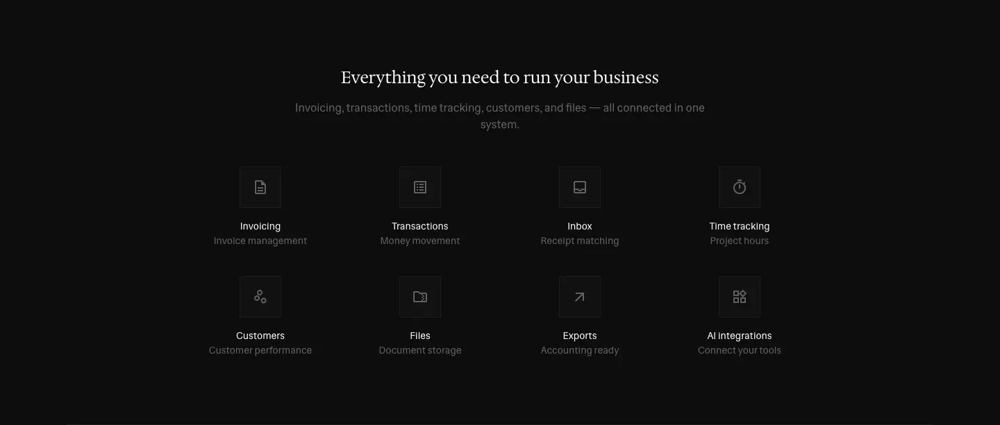
| Feature tiles ("Everything you need") |
4 × 2 |
150 px tiles on a 230 px pitch, centered (x = 300, 530, 760, 990). Icon square 64 px. |
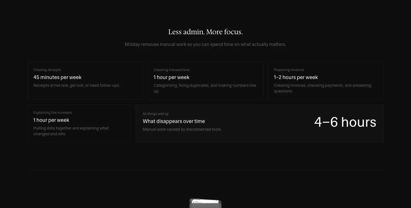
| Less-admin bento |
3 + asymmetric 2 |
Row 1: three 405 px cells, 16 px gaps. Row 2: one 363 px cell plus one 869 px cell (363 + 16 + 869 = 1248). The second row breaks the 3-column grid on purpose, so the "As things add up" summary cell gets the width. |
| How it works |
2 columns |
Text column 448 px from x = 128. Live table 592 px from x = 752. |
| Feature rows |
2 columns, alternating |
Text ≈ 448 px, UI panel ≈ 592 px, sides swap per row |
| Testimonials |
4 visible cards |
≈ 261 × 282 px each, horizontal carousel with arrow button |
| Pricing |
2 cards |
386 × 687 px each, 28 px gap, centered (x = 320 and 734) |
/agents features |
3 columns, ruled |
342 px cells, hairlines between them (a table-like grid, not cards with gaps) |
/computer steps |
4 columns |
257 × 190 px cards |
| Footer |
4 link columns + a right block |
102 px columns at x = 52, 186, 319, 453. Tagline and badges right-aligned. |
Spacing scale actually in use
Tailwind's 4 px scale, with these steps showing up most: 4, 8, 12, 16, 20, 24, 32, 48, 64, 96.
- Card padding: 20 px (bento small), 24 px (bento wide, pricing card sides), 24 × 16 px (pricing card).
- Button: 44 px tall, 24 px side padding.
- Pill: 6 × 14 px padding, 30 px tall. Chip: 6 × 12 px padding, 34 px tall.
- Integration card: 24 px padding, 405 × 267.
Why this layout works
- Hairlines replace containers. A 1 px line at 1.14:1 contrast separates sections without adding visual weight. The page stays one continuous dark sheet, like a printed statement.
- 96 px gutters at 1440 give the product frames room to sit inside the margins. The frames are the only 1248 px-wide objects, so they read as the "page".
- The asymmetric bento row turns a stats grid into a sum: three costs, then a wide "What disappears over time → 4–6 hours". The layout does the arithmetic.
- Footer wider than body (1336 vs 1248). The footer then feels like a separate base plate under the page, and the 508 px wordmark bleeds off both edges.
05 · Hero patterns
Midday uses six hero patterns. Every one opens with the same 36 px announcement bar and the 56 px transparent, blurred nav. Each hero has one filled button: a square, 44 px, foreground-colored "Start your trial", "Get started" or "Start automating". Next to it sits at most one outline or ghost button.
H1 · Home: centered serif promise + product on video
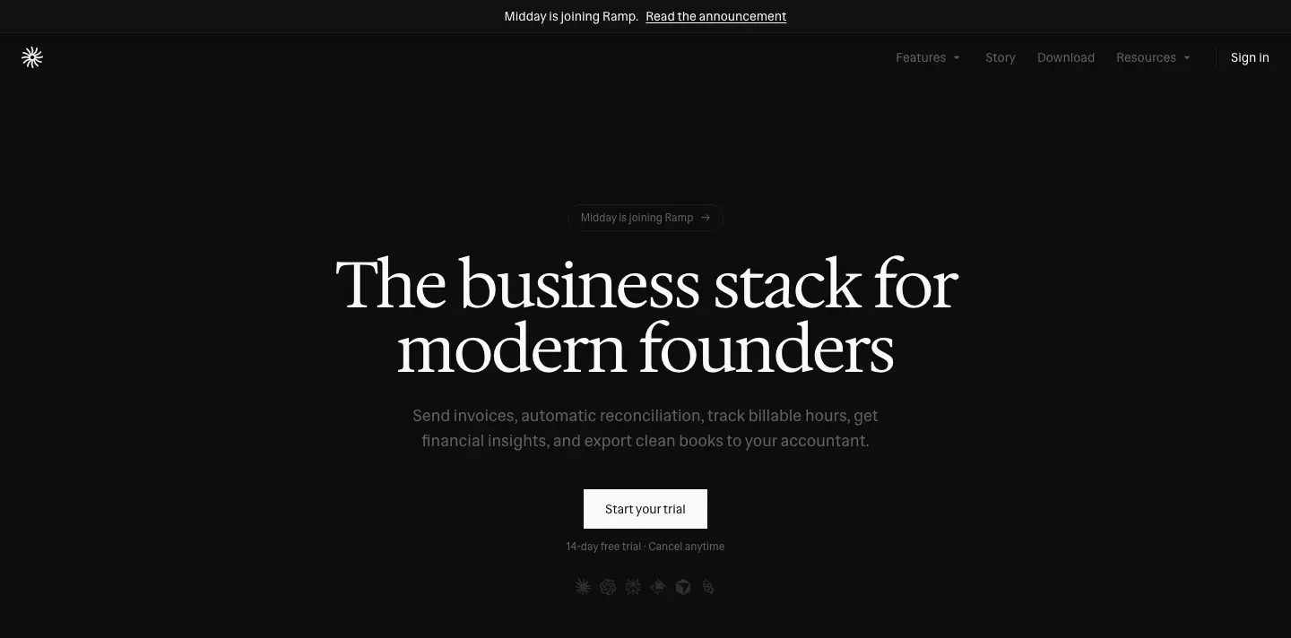
| Part |
Measured |
| Pill |
"Midday is joining Ramp →", 174 × 30 px, rounded-full, 1 px #1c1c1c border, 12 px #616161 text, y = 228 |
| H1 |
Serif 72/72, −1.8 px, 768 px wide (two lines), centered, y = 282. The word "modern" is set in muted gray at 80%. |
| Lead |
Sans 18/28 #616161, 576 px measure, y = 450 |
| CTA |
"Start your trial", 138 × 44, #fafafa fill, #18181b 14 px/500 label, 0 radius, y = 546 |
| Reassurance |
"14-day free trial · Cancel anytime", 12/16 #616161, 44 px under the CTA |
| Logo row |
Six 18 px AI-client logos: Claude, ChatGPT, Perplexity, Raycast, Cursor, Manus. They sit at opacity .4 and link to /mcp/*. On hover: opacity 1 and the brand color (Claude #D97757, Perplexity #20808D, Raycast #FF6363, Manus #34322D). |
| Media |
1248 × 900 frame at y = 712: a looping grayscale login-video.mp4 (poster video-poster-v2.jpg). On top is dashboard-dark.svg (or dashboard-light.svg), 1034 × 672, with drop-shadow(0 30px 60px rgba(0,0,0,.6)). |
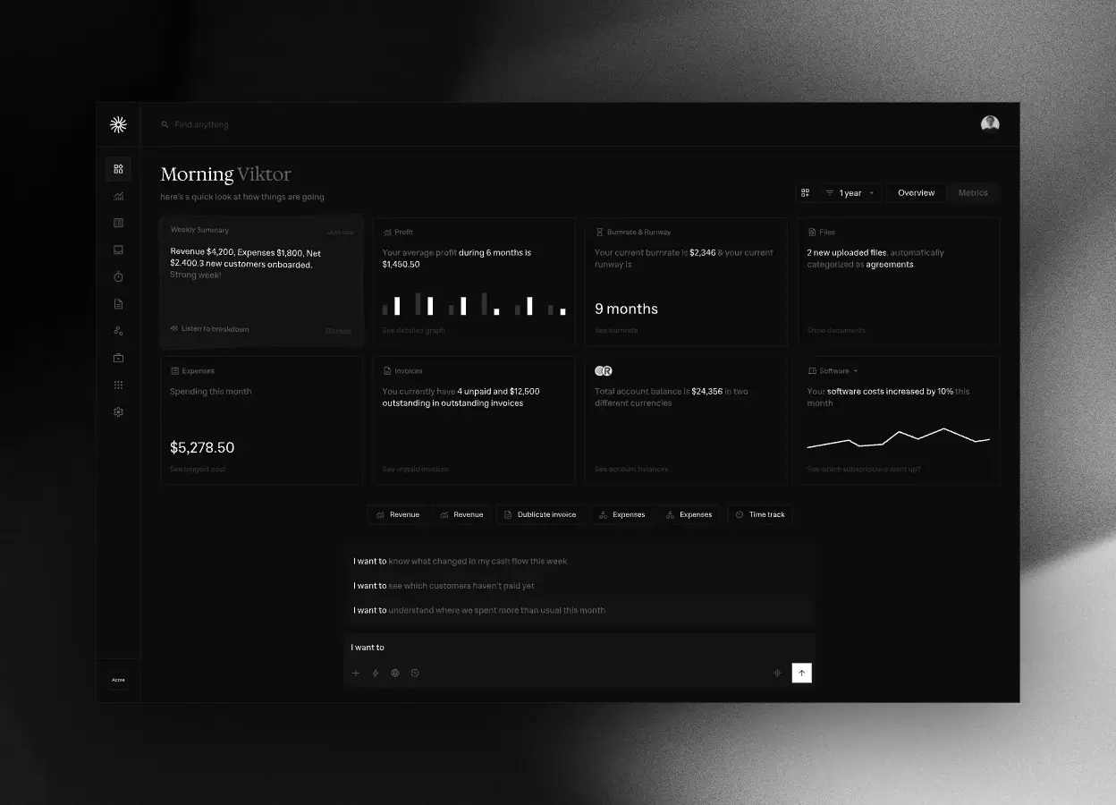
Why. The serif promise and one button sit in the top 600 px, so the decision ("try it") is above the fold on a 900 px screen. The AI-client logos say "works where you already work" without words. The video adds slow light movement behind a still UI. You get the feel of a product "alive in a room", with no fake animation of the UI.
H2 · Feature page: eyebrow + 128 px serif + full product frame
Used by /invoicing, /transactions, /inbox, /time-tracking, /file-storage, /customers and /assistant.
| Part |
Measured |
| Eyebrow |
"INVOICING", 12/16 uppercase, +0.6 px tracking, #616161 |
| H1 |
Serif 128/128, 0 tracking, centered, 3–4 words: "Get paid faster", "Receipts matched", "Know your customers", "See where time goes" |
| Lead |
Sans 16–18 px #616161, two lines |
| Background |
grid-dark.svg: a faint square grid, 1248 × 900, behind the hero |
| Product frame |
1152 × 749 (assistant-dark.svg) or the equivalent screen, centered, 48 px under the lead |
| CTA |
none in the hero. The plan cards at the bottom carry the CTA. |
Why. At 128 px, a three-word headline is a poster. It names the outcome ("Get paid faster"), not the feature ("Invoicing"). The eyebrow carries the feature name for scanning. Putting no button in the hero makes these pages read as explanation, not pitch. The ask comes after the proof.
H3 · Developer split: sans H1 left, terminal right
Used by /agents (navy) and /computer (dark).
| Part |
Measured |
| H1 |
Sans 48/48, −1.2 px, left-aligned: "Let agents run your business." |
| Lead |
14–16 px, #99ace6 on navy |
| Install field |
$ npx @midday-ai/cli@latest in a bordered, square field with a copy icon |
| Buttons |
Primary (white, navy label) "Start automating" + outline "Read documentation" |
| Right column |
A macOS-style terminal window ("midday — zsh"): 3 traffic-light dots, a tab strip (Bill from time · Reconcile · Export · Forecast), a 96 px Geist Pixel "midday" wordmark and a box-drawn invoice table |
Why. A developer audience trusts a copy-pasteable command more than a promise. The terminal is the product demo. Switching the headline to the sans and the page to navy signals a different room in the same house.
H4 · Centered serif with an object above
Used by /sdks (TS / Go / PHP glyph tiles), /download (a tilted dock of app icons), /pre-accounting (a 3D folder) and /mcp (a grid of 15 AI-client tiles below).
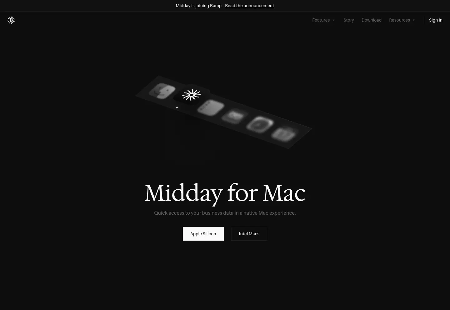
The H1 is 72 px serif, with two buttons below: primary plus ghost ("Apple Silicon" / "Intel Macs", "Get started" / "API documentation"). The object above the H1 is the only 3D or graphic moment on the site. It works like a product photo on a box.
H5 · Index page: small serif + filter
Used by /integrations, /testimonials, /compare, /bank-coverage and /docs.
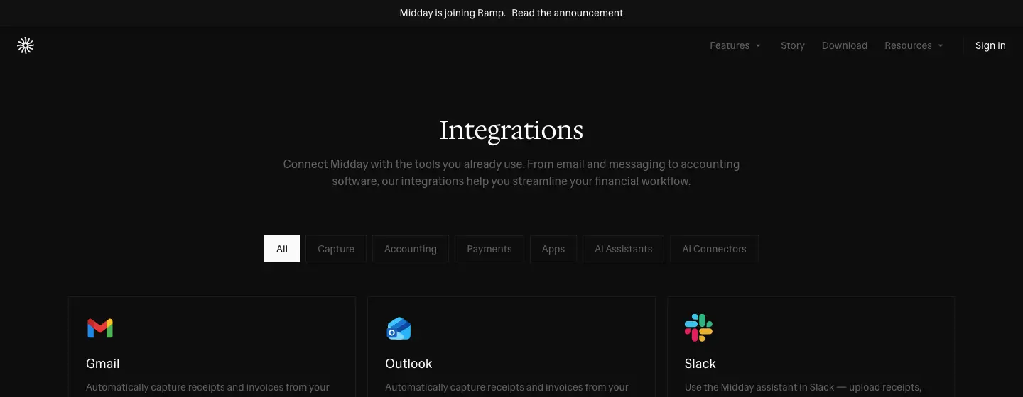
The H1 is serif 30–48 px, centered, with one muted line under it. Then comes the working control: category tabs (All · Capture · Accounting · Payments · Apps · AI Assistants · AI Connectors), a bank search with a country select, or a docs search box. The page starts doing its job within 300 px.
H6 · Article: left column, no hero
Used by /updates/*, /story, /docs/* and /terms.
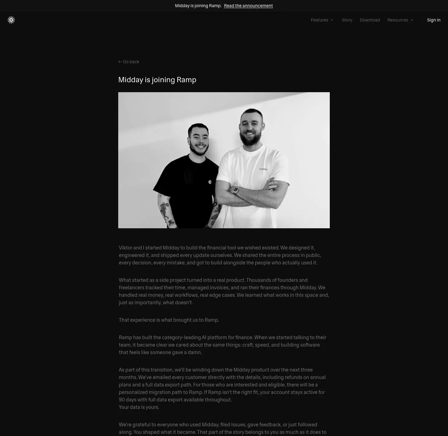
The pattern is a category pill ("Announcement"), a sans H2 at 24 px/500 and a black-and-white photo. Then comes a 600 px column of 16/24 text. Nothing competes with reading.
Summary
| Pattern |
H1 size |
Family |
Align |
Media |
| Home |
72 |
Serif |
center |
video + SVG UI |
| Feature |
128 |
Serif |
center |
SVG UI on grid |
| Developer |
48 |
Sans |
left |
terminal |
| Object |
72 |
Serif |
center |
icon, dock, 3D folder |
| Index |
30–48 |
Serif |
center |
live filter |
| Article |
24–36 |
Sans / Serif |
left |
B&W photo |
06 · Section types
These are all the recurring blocks on midday.ai, with measured values and the reason each one exists. The crops come from the 1440 px dark captures.
1. How-it-works stepper (home, pre-accounting)
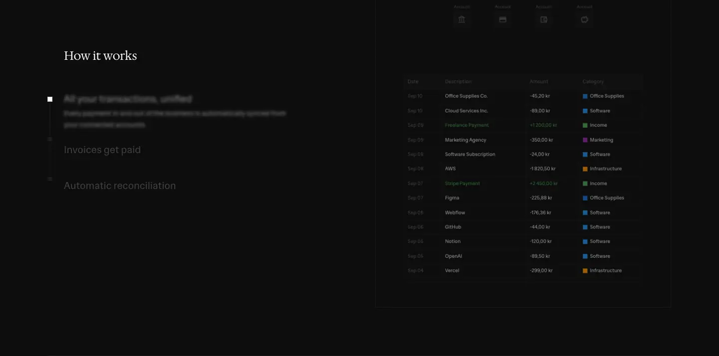
- Left: a serif "How it works" (24/32), then three step titles in sans 20/28. The active step is
#fafafa, the others are #616161, with transition-colors 300ms. The active step shows a 14/22.75 description and a small square bullet.
- Right: a 592 × 740 live HTML "Transactions" panel, made of a real
<table> with 11 px rows 28–32 px tall. Headers are 11 px/500 #616161 (Date, Description, Amount, Category). Income rows are green #4caf50. Category chips are ≈ 8 px color squares. The header has an icon row (bank, card, receipt, refresh) connected by dashed vertical lines down to the table, a small diagram of "sources → ledger".
- Mobile: the stepper unstacks into three separate serif H2 blocks ("All your transactions, unified", "Invoices get paid", "Automatic reconciliation"), each with its own panel.
Why. The UI on the right changes per step, so a visitor understands three features in one viewport, with no scroll and no video.
2. Feature tile grid: "Everything you need to run your business"
- 8 tiles in a 4 × 2 grid, 150 px wide on a 230 px pitch.
- Each tile is a 64 px
--muted square (#1c1c1c) holding a 16 px outline icon, then a 14 px title (#fafafa) and a 14 px subtitle (#616161): "Invoicing / Invoice management", "Inbox / Receipt matching".
- Hover: the square goes
bg-secondary and scale-105 over 200 ms.
- Repeated on every feature page as the site map of the product.
3. Stat bento: "Less admin. More focus."
- Row 1: three bordered cells (1 px
#1c1c1c, 20 px padding, 0 radius). Each has a 12 px label at +0.3 px tracking ("Chasing receipts"), an 18 px sans figure ("45 minutes per week") and a 14 px muted sentence.
- Row 2: one 363 px cell, then one 869 px cell with a
#121212 fill and 24 px padding: "As things add up / What disappears over time / Manual work caused by disconnected tools", with a 48 px "4–6 hours" right-aligned.
- In light mode the wide cell fills
#e6e4e0, a warm stone color.
Why. It is a receipt. Line items, then a total in larger type. The fill change marks the "sum" cell.
4. Accounting-ready checklist
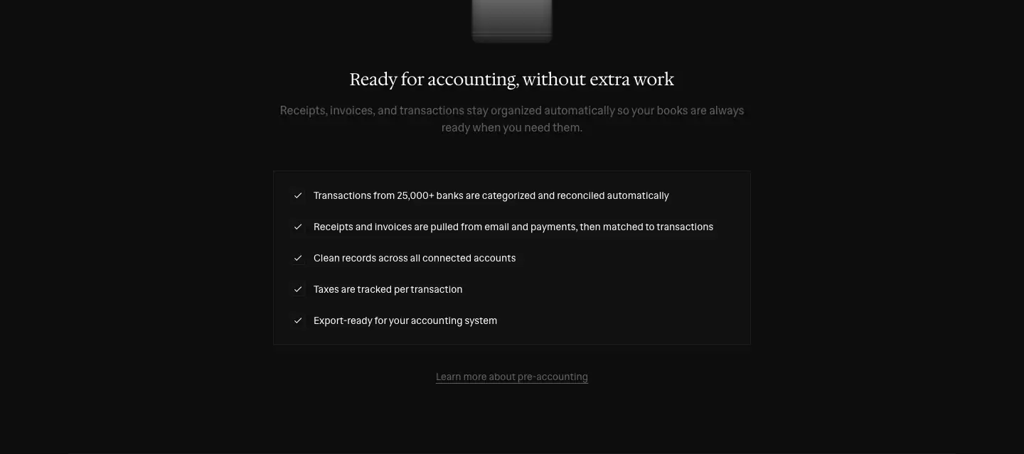
- A 112 × 100 3D folder render (
accounting-dark.png / accounting-light.png) sits centered above a serif H2.
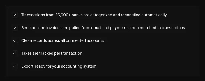
- Below it, a 672 × 246 bordered panel holds five checkmark rows (14/20
#fafafa, 16 px check icons), with 44 px row spacing.
- An underlined text link follows: "Learn more about pre-accounting" (
underline underline-offset-4).
5. Testimonial carousel: "Built alongside our users"
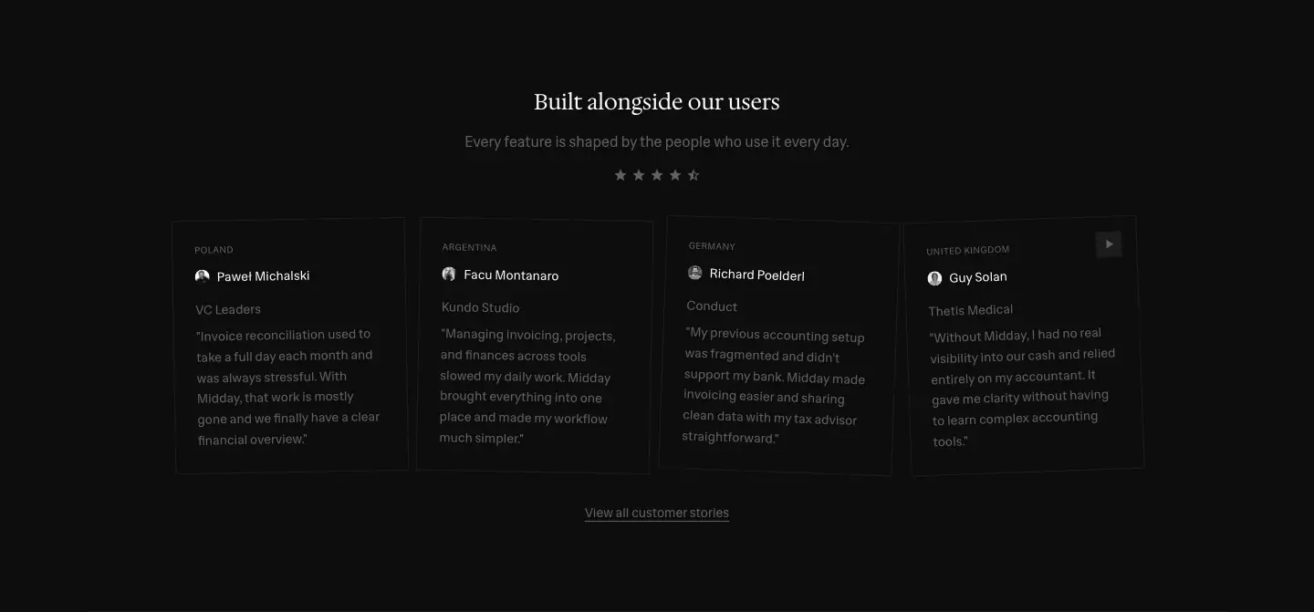
- 4 visible cards, ≈ 261 × 282. Each card has:
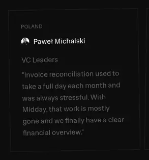
- a country eyebrow (10 px uppercase, +0.5 px: "POLAND", "ARGENTINA", "GERMANY", "UNITED KINGDOM")
- an avatar and a 14 px name
- a muted company name
- a 14/22.75 muted quote in straight quotes
- A square arrow button sits at the top-right of the row. Five dots under the H2 show the pages.
Why. Country labels show it works with your bank, in a product whose main doubt is "does it support my bank?". The cards are small and muted, so the quotes read as notes from peers, not as endorsements.
6. Integration marquee: "Works with the tools you already use"

- Two rows of logo + name chips (14 px), the top row moving left (
marquee-left 30s linear infinite) and the bottom right (marquee-right 28s).
- The two speeds differ by 2 s, so the rows never sync.
- Edges fade through
linear-gradient(to right, #0d0d0d 0%, #0d0d0d 30%, rgba(13,13,13,.8) 50%, rgba(13,13,13,.4) 70%, transparent).
- Ends with "View all integrations".
7. Pricing
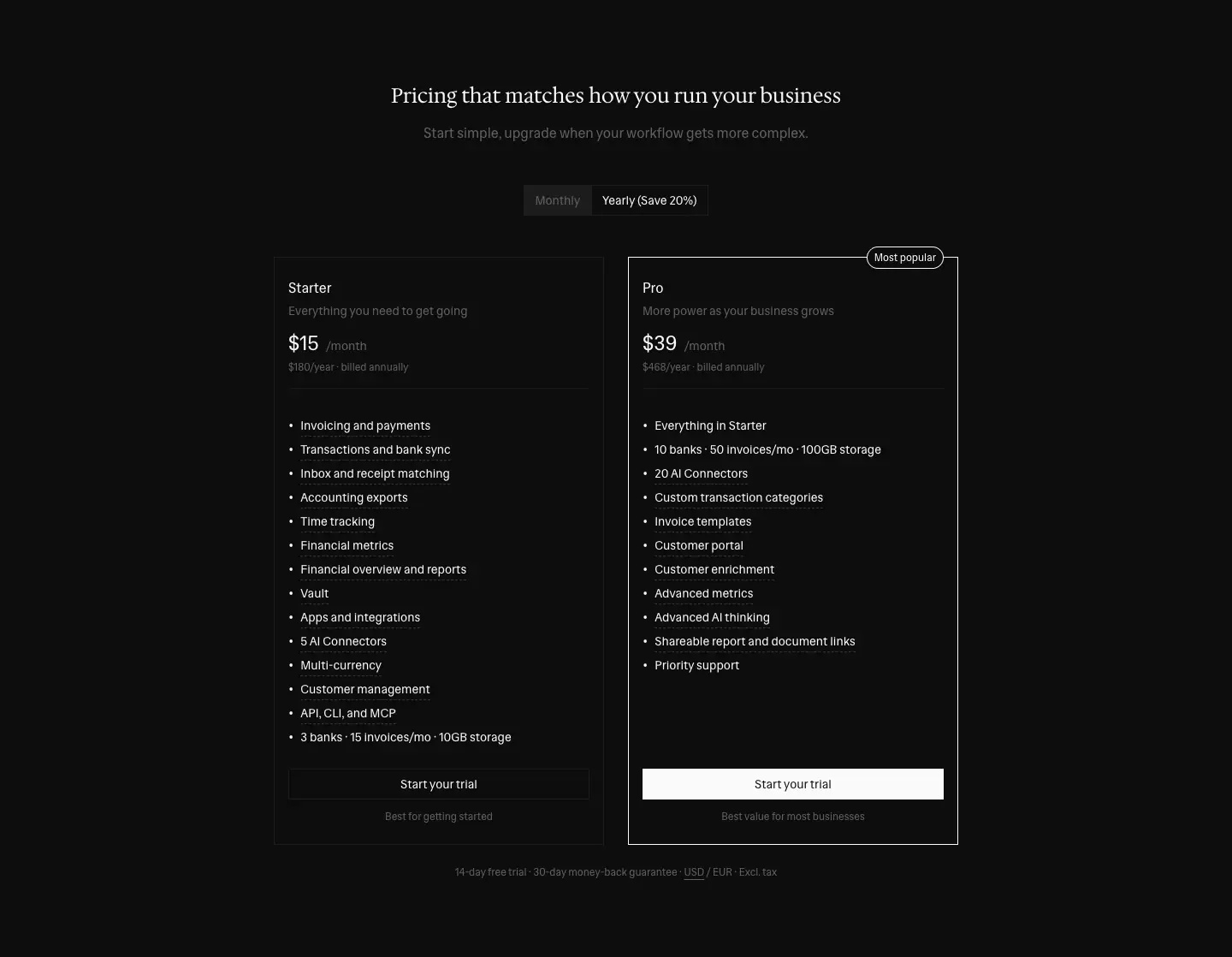
- Serif H2 "Pricing that matches how you run your business".
- Monthly / Yearly (Save 20%) toggle: a bordered, square segmented control, 215 × 36.
- Two 386 × 687 cards, 0 radius:
|
Starter |
Pro |
| Price |
$15/month (24 px), "$180/year · billed annually" |
$39/month, "$468/year · billed annually" |
| Line |
"Everything you need to get going" |
"More power as your business grows" |
| List |
14 items, 28 px rhythm, ending "3 banks · 15 invoices/mo · 10GB storage" |
"Everything in Starter" + 10, starting "10 banks · 50 invoices/mo · 100GB storage" |
| Border |
1 px #1c1c1c |
1 px #fafafa + a "Most popular" pill on the top edge |
| Button |
outline "Start your trial" |
filled "Start your trial" |
| Note |
"Best for getting started" |
"Best value for most businesses" |
- Footnote: "14-day free trial · 30-day money-back guarantee · USD / EUR · Excl. tax". USD and EUR are buttons that switch the currency.
Why. It shows only two plans and the same button label on both. The only difference is the outline vs fill and the border, so the eye lands on Pro without a colored badge.
8. Alternating feature row (feature pages)
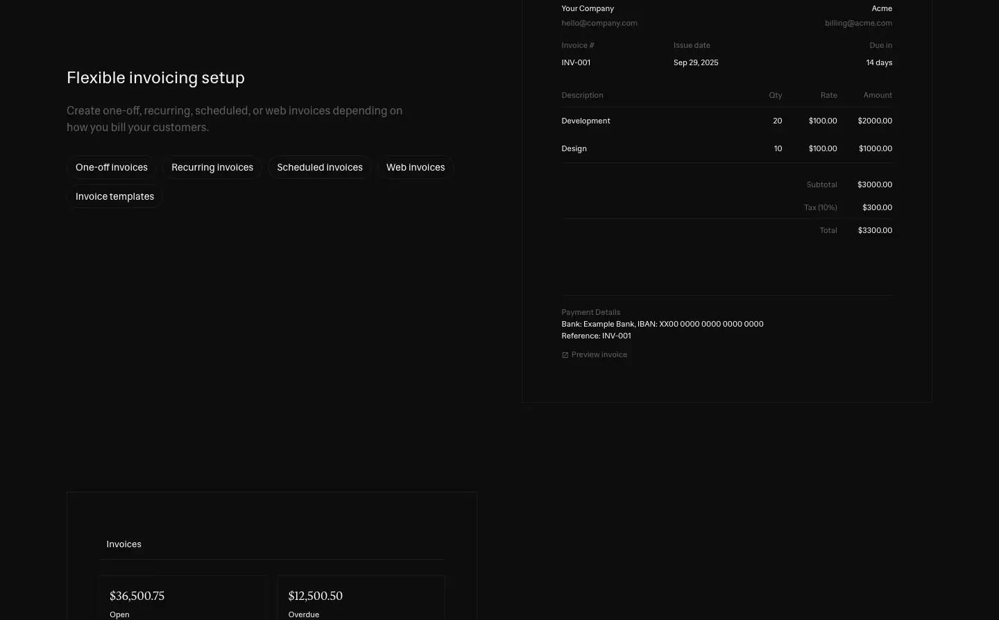
- One half is a sans 24/32 H2 + a 14–16 px muted lead + a wrap of pill chips (
rounded-full, 1 px border, 6px 12px padding, 16 px text, 34 px tall): "One-off invoices", "Recurring invoices", "Scheduled invoices", "Web invoices", "Invoice templates".
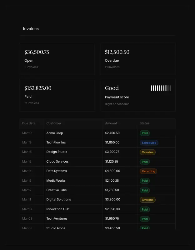
- The other half is a live HTML mock (invoice document, invoice table with colored status chips "Paid / Scheduled / Overdue / Recurring").
- Sides swap on the next row.
- Chips with brand logos ("Stripe") sit in the same wrap.
9. Ruled grid (/agents, /computer)
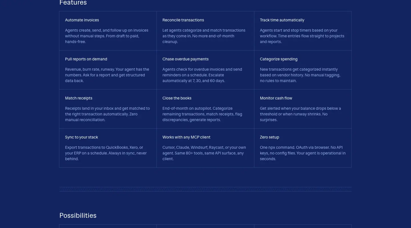
A 3-column grid with no gaps. Hairlines draw the cells (1 px #2d4386 on navy, #1c1c1c on dark). Each cell has a 14 px white title and a 14 px muted body. On /agents "Possibilities", each cell also gets an uppercase blue eyebrow naming the client (CLAUDE, CURSOR, OPENCLAW, ZAPIER, RAYCAST, MANUS). It reads like a spec sheet.
10. ASCII / box-drawing diagram
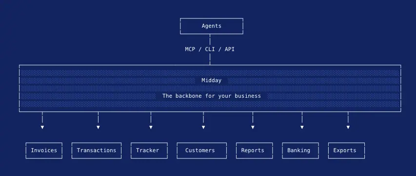
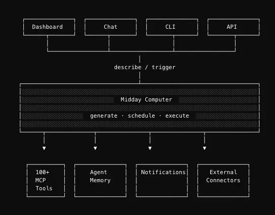
- The diagram is drawn with monospace text in bordered boxes: "Agents → MCP / CLI / API → Midday (The backbone for your business) → Invoices, Transactions, Tracker, Customers, Reports, Banking, Exports".
- The central bar is filled with a diagonal hatch:
repeating-linear-gradient(-60deg, rgba(45,67,134,.4) 0 1px, transparent 1px 6px).
- Arrows are thin lines with small triangle heads.
/computer reuses it: "Dashboard · Chat · CLI · API → describe / trigger → Midday Computer (generate · schedule · execute) → 100+ MCP tools · Agent memory · Notifications · External connectors".
11. Numbered step cards (/computer)
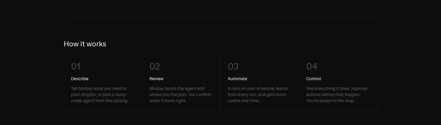
There are four 257 × 190 bordered cards. Each has a 30 px #4d4d4d numeral ("01" … "04"), a 14 px title (Describe, Review, Automate, Control) and a muted body.
12. Agent template cards (/computer)
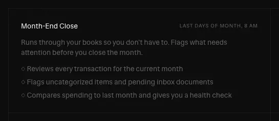
- 513 × 206 bordered cards. Each has a title ("Month-End Close") and a right-aligned schedule tag in 10 px uppercase ("LAST DAYS OF MONTH, 8 AM").
- Then a description and three "○" bullet lines.
13. Prompt typewriter (/computer)
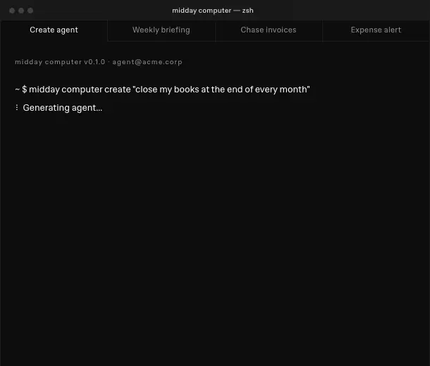
"What would your agent do?" sits above a single bordered field. The field holds $ midday computer create "Alert me when expenses look unusual" and a blinking caret (caret-blink: opacity 1 → 0 at 20–50%, back at 70%). Below it is the line "One sentence. That's all it takes."
14. Bordered CTA panel ("Get started")

A full-width bordered rectangle with a 30 px sans H2, one muted line and two buttons (filled + outline). It closes every developer page.
15. Comparison set (/compare/*)

The page runs in this order:
1. "Key differences at a glance": paired cards, with column heads in 12 px uppercase (MIDDAY 600 vs QUICKBOOKS 500).
2. A feature comparison table with Yes / No / Partial.
3. A pricing comparison with Midday's Pro card highlighted.
4. "Switching from QuickBooks to Midday", as a numbered list.
5. "Where Midday is a better fit".
6. An FAQ accordion.
7. "Ready to make the switch?".
16. Directory grids (integrations, compare index, docs)
- Integrations: 3-column cards, 15 per screen. Each card is a 20 px brand logo + 14 px name + 2-line muted description, plus a small "Beta" tag where relevant. There are 7 filter tabs above. The selected tab is a white-filled square.
- Docs: a "Popular guides" 3 × 2 grid, then "Browse by topic" columns (Getting Started, Banking, Inbox & Vault, Invoicing, Time Tracking, Reports…).
- Bank coverage: a search field and a country select (Sweden by default), then a list: 24 px circle logo, bank name, and right-aligned provider (GoCardless, Teller, Plaid). It answers "is my bank supported?" directly.
17. Long-form testimonials (/testimonials)
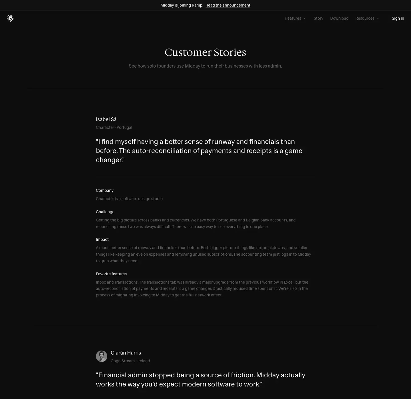
Nine stories. Each has a name (18/28 500), role · country, a pull quote at 18 px #fafafa, then four labelled paragraphs: Company · Challenge · Impact · Favorite features. The last story has an embedded video player.
18. Footer
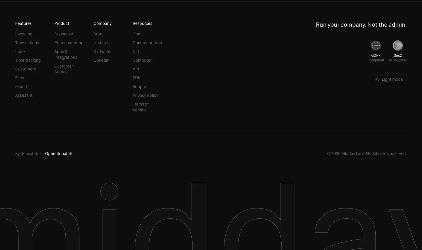
The footer has four parts:
- Link columns: four columns (Features · Product · Company · Resources) with 14 px muted links.
- Right block: the tagline "Run your company. Not the admin." (20/28 px, at x = 1078), two round compliance badges (GDPR Compliant, SOC 2 In progress) and a bordered "Light mode" theme toggle.
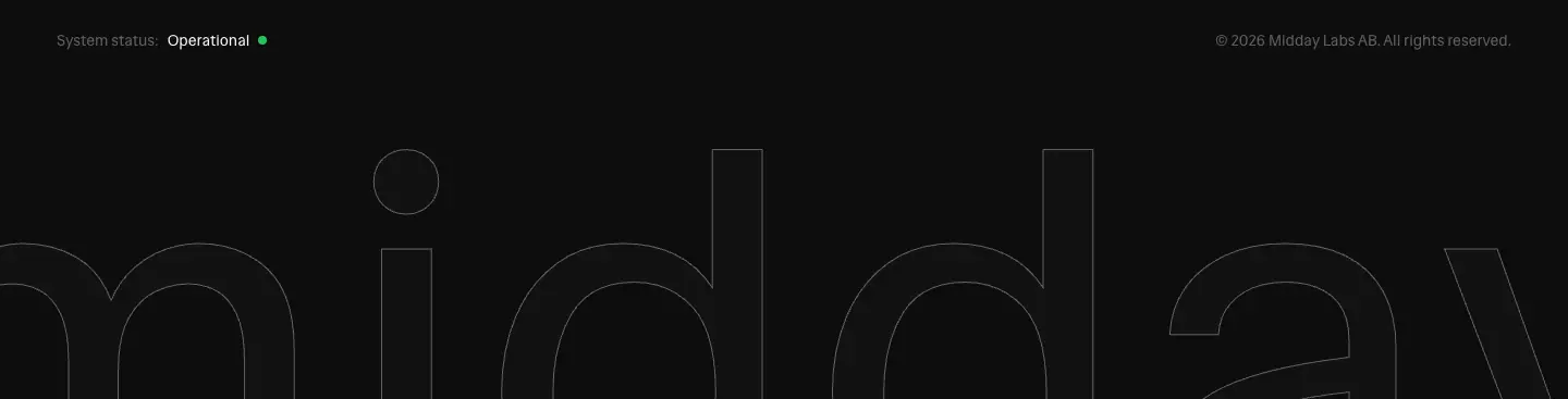
- Status row: a status line (System status: Operational ●, with the green pulse-glow dot) and "© 2026 Midday Labs AB. All rights reserved."
- Wordmark: the 508 px outlined "midday" wordmark, clipped by the bottom edge.
07 · Copywriting and voice
Voice in one line
Plain, short and founder-to-founder. No exclamation marks, no superlatives, no "AI-powered" in headlines. The copy names a chore and says it goes away.
Headline formulas (all measured from the live H1s and H2s)
| Formula |
Examples |
| Outcome in 2–4 words (feature H1s) |
"Get paid faster" · "Receipts matched" · "Know your customers" · "See where time goes" · "Everything in one place" · "All transactions together" · "Get things done" |
| Category claim (home) |
"The business stack for modern founders" |
| Task + done |
"Pre-accounting, handled." · "Midday, everywhere" |
| Imperative for developers |
"Let agents run your business." · "Build with Midday" |
| Metaphor |
"The operating system for your business." (/computer) |
| Two-beat contrast (section H2) |
"Less admin. More focus." · "Less time fixing. Less money wasted." |
| Without + noun |
"Ready for accounting, without extra work" · "Accountant-ready, without the back and forth" |
| Footer tagline |
"Run your company. Not the admin." |
Patterns:
- Sentence case everywhere except the uppercase eyebrows.
- Periods on some H1s. The developer pages end with a period ("Let agents run your business."). The feature pages do not. The period makes developer copy feel like a statement in a README.
- The same section H2 repeats verbatim on every feature page. "Everything you need to run your business", "Built alongside our users", "Works with the tools you already use". This builds recall through repetition.
Leads
The lead is one sentence that lists verbs. Examples:
- "Send invoices, automatic reconciliation, track billable hours, get financial insights, and export clean books to your accountant."
- "Midday removes manual work so you can spend time on what actually matters."
- "Receipts, invoices, and transactions stay organized automatically so your books are always ready when you need them."
The Oxford comma is used consistently.
Quantified pain (bento)
Every cost is a time per week: "45 minutes per week", "1 hour per week", "1–2 hours per week". The sum is "4–6 hours". The numbers are ranges and plausible, never "10×". This matches the ledger tone.
Microcopy
| Place |
Copy |
| Primary CTA |
"Start your trial" (not "Get started free") |
| Under the CTA |
"14-day free trial · Cancel anytime" (middle dot separators) |
| Developer CTA |
"Start automating" · "Read documentation" |
| Pricing footnote |
"14-day free trial · 30-day money-back guarantee · USD / EUR · Excl. tax" |
| Plan notes |
"Best for getting started" · "Best value for most businesses" |
| Text links |
"Learn more about pre-accounting" · "View all customer stories" · "View all integrations" |
| Status |
"System status: Operational" |
| Agent prompt |
$ midday computer create "Alert me when expenses look unusual", then "One sentence. That's all it takes." |
| Announcement |
"Midday is joining Ramp. Read the announcement" |
UI copy inside the mockups
The demo data is realistic and international:
- Swedish kronor formatted "−45,20 kr" and "+1 200,00 kr" (comma decimals, space thousands)
- Vendors such as "Office Supplies Co.", "AWS", "Figma", "Vercel" and "OpenAI"
- The greeting "Morning Viktor"
Realistic data is part of the persuasion. It looks like your month.
SEO layer
<title> tags are keyword-first and differ from the H1:
- /invoicing → "Online Invoicing Software for Small Business | Midday" (H1: "Get paid faster")
- /inbox → "Automatic Receipt Matching & Management | Midday" (H1: "Receipts matched")
- /compare/* → "Best QuickBooks Alternative for Founders (2026) | Midday | Midday". The suffix is duplicated, a template bug on all 17 compare pages.
The poetic H1 serves people. The keyword title serves search. Seventeen /compare/* pages and 69 /integrations/connector-* pages are programmatic SEO pages on one template each.
What the copy avoids
- Feature names in headlines (the eyebrow carries them)
- Exclamation marks (0 found in the captured pages)
- Adjectives such as "powerful", "seamless" or "revolutionary" in H1s and H2s
- Emoji
08 · Components
All values are computed styles from the dark theme at 1440 px. The class strings are copied from the live DOM, so you can see the Tailwind and shadcn/ui source.
Announcement bar + nav

| Part |
Value |
| Bar |
37 px, bg-secondary (#121212 / #e6e4e0), 1 px bottom border, 12–14 px centered text, underlined link "Read the announcement" |
| Nav |
56 px, position: fixed; top: 36px, transparent with backdrop-filter: blur(12px), no border, no shadow, at the top and when scrolled (re-measured at scrollY 1500) |
| Logo |
A 24 px sunburst mark (24 × 24 SVG with thin rays) at the far left. On mobile it is paired with the "midday" word. |
| Links |
Features ▾ · Story · Download · Resources ▾. 14 px #616161, hover #fafafa (transition-colors 150ms). Dropdown triggers have px-3 py-2. |
| Sign in |
14 px text-primary (#fafafa), hover 80% |
| Dropdown |
dropdown-fade / dropdown-slide keyframes (opacity 0→1, translateX(-10px → 0)) |
| Mobile |
44 × 44 hamburger, menu enters with mobile-slide (translateY(-10px) → 0) |

Buttons
| Variant |
Measured |
Classes |
| Primary |
44 px tall, 24 px side padding, #fafafa fill, #18181b 14 px/500 label, radius 0, hover bg-primary/90 |
inline-flex … text-sm font-medium bg-primary text-primary-foreground hover:bg-primary/90 h-11 px-6 transition-colors btn-inverse |
| Outline |
same size, 1 px #1c1c1c (or #fafafa on pricing) border, transparent fill, #fafafa label |
|
| Ghost |
label only, #fafafa → 80% on hover ("Read documentation", "Intel Macs") |
|
| Text link |
14 px #616161, underline underline-offset-4, hover #fafafa |
"View all customer stories" |
| Icon button |
square bordered arrow (testimonial carousel), copy icon in the CLI field |
|
Light mode inverts the primary to a #18181b fill with a #fafafa label.
Pill

The pill and the feature chips are the only rounded controls. It is 174 × 30, rounded-full, with a 1 px --border, px-3.5 py-1.5 and 12 px #616161 text plus a → arrow. On hover the text goes to #fafafa and the border to foreground/30. Smaller pills are used for "Most popular" and the update category ("Announcement").
Chips (feature rows)
The chips are pills: border-radius: 9999px, 1 px #1c1c1c border, 6px 12px padding, 16 px #fafafa text, 34 px tall. Some carry a brand logo (Stripe). Chips and the hero pill are the only round shapes on the site. Anything you can click to learn or that labels is round. Anything that contains is square.
Cards
| Card |
Size |
Border |
Fill |
Pad |
Radius |
| Bento cell |
405 × 134 |
1 px #1c1c1c |
#0d0d0d |
20 px |
0 |
| Bento total |
869 × 134 |
1 px #1c1c1c |
#121212 |
24 px |
0 |
| Testimonial |
261 × 282 |
1 px #1c1c1c |
#0d0d0d |
24 px |
0 |
| Pricing |
386 × 687 |
1 px #1c1c1c / Pro #fafafa |
#0d0d0d |
24 × 16 px |
0 |
| Checklist panel |
672 × 246 |
1 px #1c1c1c |
#121212 |
24 px |
0 |
| Integration card |
405 × 267 |
1 px #1c1c1c |
transparent |
24 px |
0 |
Agent card (/computer) |
513 × 206 |
1 px #1c1c1c |
#0d0d0d |
≈ 24 px |
0 |
Pricing card
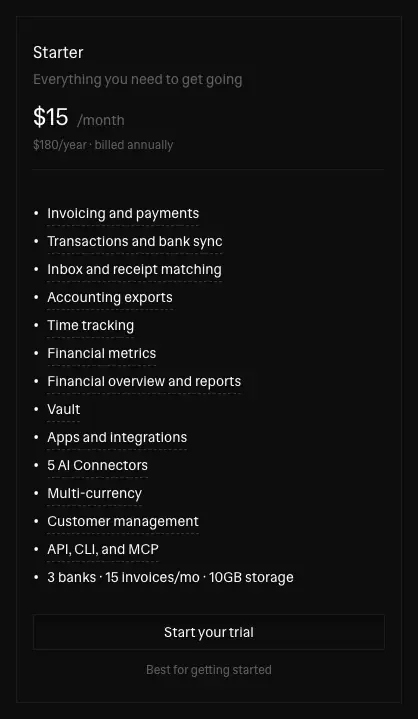
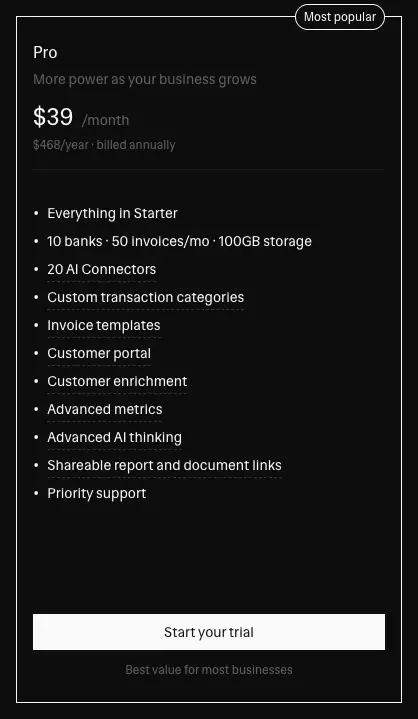
See Section types → Pricing for the full content. The Pro card differs by one property: a #fafafa border instead of #1c1c1c. Its button is filled, and a "Most popular" pill sits on the top border.
Segmented toggle

The toggle is a 215 × 36 bordered strip. The selected segment ("Yearly (Save 20%)") has #fafafa text on a #1c1c1c fill. The unselected segment is #616161 on transparent.
Data table (demo UI)
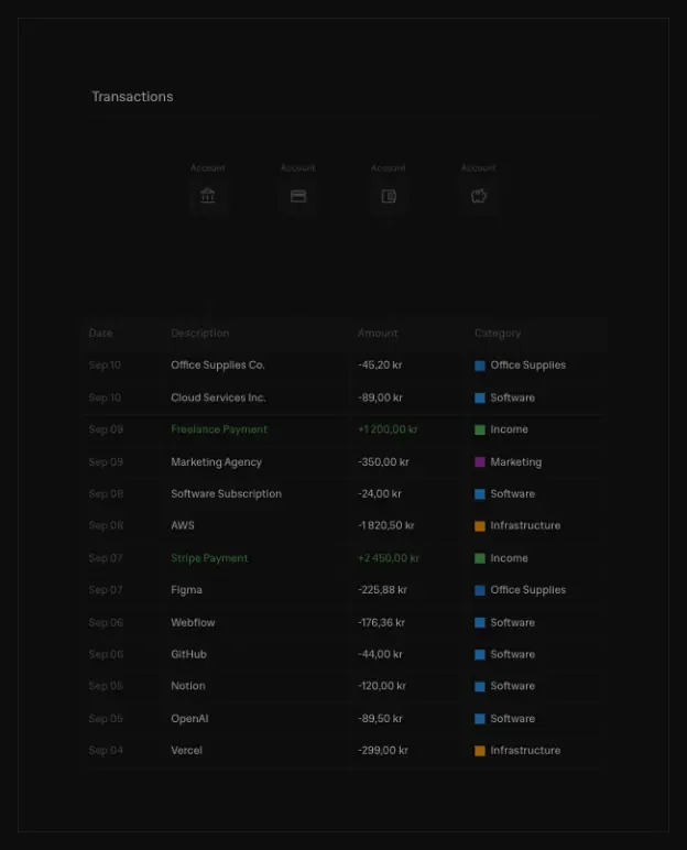
- Rows are 28 px (mobile) or 32 px (desktop) tall, with a
border-b border-border. Rows hover to bg-secondary.
- Text is 11 px. Header cells are 11 px/500
#616161.
- Money is right of the description. Positive amounts are
#4caf50.
- Status chips are 10 px text with a 20%-alpha border: green
rgba(34,197,94,.2), blue rgba(59,130,246,.2), yellow rgba(234,179,8,.2). Labels: Paid, Scheduled, Overdue, Recurring.
Terminal window (/agents, /computer)
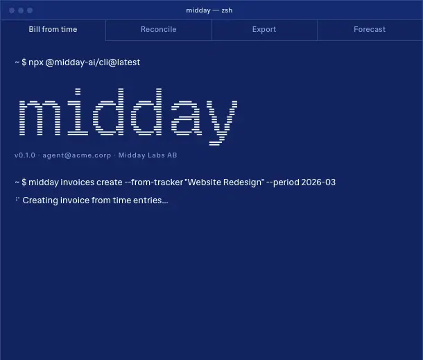
The window is 610 × 519 with a 1 px border:
- Title bar: three 6 px dots and a centered "midday — zsh" in 10 px at +0.25 px tracking.
- Tab strip: 11 px tabs (Bill from time · Reconcile · Export · Forecast). The selected tab has a filled background.
- Body: monospace 14/20 command lines prefixed with › or $. Output blocks use a box-drawn table.
Footer
| Part |
Value |
| Columns |
Features (Invoicing, Transactions, Inbox, Time tracking, Customers, Files, Exports, Assistant), Product (Download, Pre-accounting, Apps & Integrations, Customer Stories), Company (Story, Updates, X / Twitter, LinkedIn), Resources (Chat, Documentation, CLI, Computer, API, SDKs, Support, Privacy Policy, Terms of Service) |
| Column header |
14/20 #fafafa, H3 |
| Links |
14/20 #616161, hover #fafafa |
| Tagline |
"Run your company. Not the admin." |
| Badges |
GDPR "Compliant", SOC 2 "In progress": round grayscale seals with a 12 px caption |
| Theme toggle |
Bordered square button, sun or moon icon + "Light mode" / "Dark mode", hover border foreground/20 |
| Status |
"System status: Operational" + green dot with pulse-glow (2 s, scale 1 → 1.2, ring 0 0 0 4px rgba(34,197,94,.2)) |
| Wordmark |
508 px sans "midday": -webkit-text-stroke: 1px #616161, fill --secondary (#121212 dark / #e6e4e0 light), select-none, cropped by the page bottom |
Icons
| Measured on home |
Count |
16 × 16 outline, stroke #616161 (feature tiles, checks) |
8 + 13 |
| 24 × 24 outline (tile glyphs) |
8 |
18 × 18 filled #616161 (AI client logos at 40% opacity) |
6 |
| 16 × 16 filled brand-color logos (integration marquee: Telegram, WhatsApp, Slack and others) |
≈ 40 |
The UI icons are thin outline glyphs in the muted gray, in the style of Lucide and Radix. Brand logos keep their own colors, and they are the only color on the page apart from the data chips.
09 · Art direction
The direction in one sentence
Monochrome product truth. Every image is either the product UI, a grayscale photo or a monochrome object. Color comes only from the data and from third-party logos.
1. Product UI as illustration (primary)
- Format. Product screens are exported as SVG:
dashboard-dark.svg, dashboard-light.svg, assistant-dark.svg, grid-dark.svg. The site serves them through Cloudflare image resizing (/cdn-cgi/image/width=1200,quality=80/…). There is one file per theme, swapped with dark:hidden / hidden dark:block.
- Treatment.
- The hero UI has
drop-shadow(0 30px 60px rgba(0,0,0,.6)).
- At
lg it carries transform: rotate(-2deg) skewY(1deg) with transition-all duration-700 ease-out. After load it computes to matrix(1,0,0,1,0,0), a flat transform, so the tilt is an entry state that settles to flat.
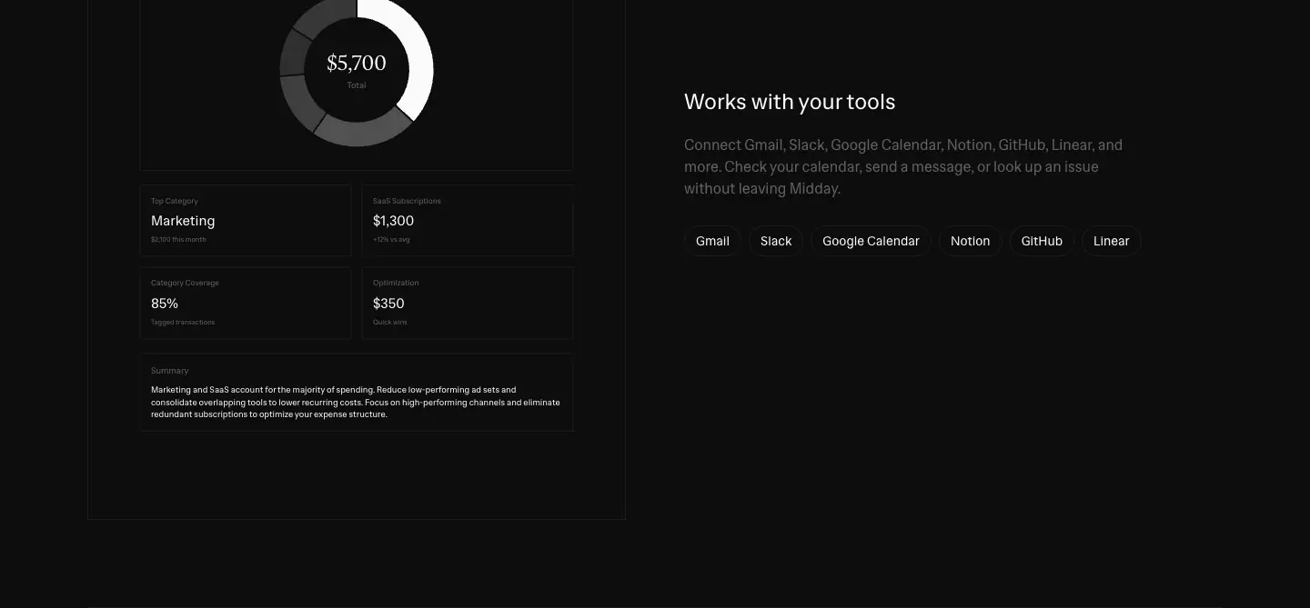
- Live HTML mocks. Feature rows rebuild the UI in real HTML: tables, invoices, KPI tiles, donut charts and an AI chat with "Cash Flow Analysis — October 2025". These have hover states (
hover:bg-secondary on rows) and crisp text at any zoom.
- Data styling.
- Charts are monochrome: white bars,
#6666664d secondary bars, #1d1d1d grid.
- The only saturated colors are the 8 px category swatches (
#2196f3, #9c27b0, #ff9800, #4caf50) and the status chips.
Why. It shows exactly what you get. SVG and HTML stay sharp on retina, theme with the page, and weigh less than screenshots.
2. Ambient video (hero only)
https://cdn.midday.ai/videos/login-video.mp4: autoplay, loop, muted, 1248 × 900, object-cover.
- It is grayscale, soft light moving across a matte surface.
- Its poster is video-poster-v2.jpg (quality=50).
- It fades in with transition-opacity duration-1000 ease-in-out.
- It is the same video the app uses on its login screen.
It sits behind the UI. Its job is atmosphere: a slow, photographic depth behind flat UI, so the hero is not a flat screenshot on black.
In light mode the video stays the same dark grayscale. The light dashboard SVG sits on top. The hero is the one dark object on the white page.
3. Photography

- One photo set: the two founders, black-and-white, standing against a white wall, arms crossed, smiling. It is used on
/story and on the "joining Ramp" update.
- Customer avatars are small circles (≈ 16–20 px) in the testimonial cards.
Why. Black and white keeps the people in the same palette as the UI. Two founders against a plain wall reads as "small team you can email", which is the brand's trust argument.
4. Objects: 3D renders, used once each

| Object |
Where |
Look |
| Folder |
"Ready for accounting", /pre-accounting hero |
Matte gray 3D file folder with a paper sheet peeking out. 112 × 100. Two theme files: accounting-dark.png and accounting-light.png. |
| App dock |
/download hero |
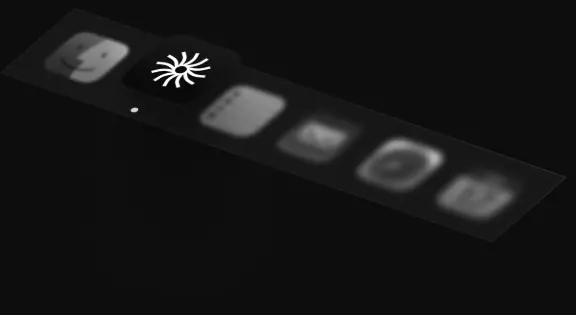
A tilted strip of six rounded app icons in grayscale. The Midday sunburst is the only white icon. |
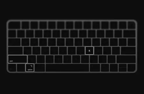
| Keyboard |
/download "Universal search anywhere" |
Line-art Mac keyboard with ⌥ and K keys highlighted, showing the shortcut |
The 3D objects are lit softly from above, with no color and no reflections. They are product photography for objects that do not exist.
5. Terminal and ASCII (developer pages)
- Geist Pixel (96 px) for the "midday" wordmark inside the terminal: a pixel or LCD look.
- Box-drawing tables (
┌ ─ ┐ │) and bordered monospace boxes for architecture diagrams.
- A diagonal hatch fill (
repeating-linear-gradient(-60deg, … 1px, transparent 1px 6px)) marks "the core" in each diagram.
- On
/agents, everything is navy and cornflower (#11245f, #2d4386, #476ad1, #99ace6). It reads like a blueprint.
6. Logos (third-party)
Integration and AI-client logos are shown at full brand color, 16–20 px, in chips and cards. In the hero they sit at 40% opacity and grayscale until hover. That is the site's only "color on hover" moment.
7. What is never used
- Gradients as decoration. The only gradients are the marquee edge fades and the diagram hatch.
- Glow, blur blobs, mesh backgrounds.
- Stock photos, illustrated people, emoji.
- Rounded "app" cards with shadows.
Art direction checklist for this style
- Can the image be the real product? Use it, as SVG or HTML.
- Is it a person? Use black and white on a plain wall.
- Is it a concept (files, accounting)? Use a single matte 3D object in gray.
- Is it for developers? Use a terminal, monospace and a hatch fill.
- Is color appearing? It must be data or a third-party logo.
10 · Brand assets and graphics inventory
This is every distinct graphic type on midday.ai, with a crop, how it is made and how to rebuild something in the same spirit. The crops are PNGs cut from the live page. No logo files were downloaded.
Identity
| Asset |
Crop |
How it is built |
How to rebuild the idea |
| Sunburst mark |
|
24 × 24 inline SVG: a circle of thin rays (the "midday sun"), fill #fafafa, stroke-width 0.25 px. Paired with the lowercase "midday" wordmark on mobile. |
A radial mark from repeated thin strokes. It reads at 16 px and becomes texture at 200 px. |
| Footer wordmark |
|
Text, not an image: "midday" in Hedvig Letters Sans 508 px. -webkit-text-stroke: 1px var(--muted-foreground), fill var(--secondary), select-none, cropped by the page edge. 200 px on mobile. |
Set your wordmark as live text at 30–40% of viewport width, outline-only, low contrast and cropped. It closes the page like a watermark. |
| Pixel wordmark |
|
"midday" in Geist Pixel Line, 96 px, inside the terminal |
The same name in a pixel face, for "machine" contexts |
| Favicon |
— |
/favicon.ico (the sunburst) |
— |
Product graphics
| Asset |
Crop |
Made with |
Notes |
| Hero dashboard |
|
SVG export of the real app, one file per theme |
drop-shadow(0 30px 60px rgba(0,0,0,.6)). Tilt entry rotate(-2deg) skewY(1deg) → flat. |
| Live transactions table |
|
HTML <table>, 11 px |
Real hover rows. Green income. |
| Invoice document |
 |
HTML |
A paper-like invoice: From/To, Invoice #, line items, subtotal, tax, payment details |
| KPI tiles |
(inside the invoice crop) |
HTML, serif 18 px figures |
"$36,500.75 Open", "Good / Payment score" with a bar-code-like meter |
| Donut chart |
 |
SVG/HTML, monochrome segments |
"$5,700" in the serif at the center |
| Status chips |
— |
10 px text, 20%-alpha colored borders |
Paid / Scheduled / Overdue / Recurring |
Diagrams
| Asset |
Crop |
Made with |
| Infrastructure diagram |
|
Bordered divs with monospace labels, connector lines and a repeating-linear-gradient(-60deg) hatch bar |
| Computer diagram |
|
Same system on #0d0d0d with rgba(28,28,28,.4) hatch |
| Source → ledger icons |
(in the how-it-works crop) |
4 outline icons in squares, dashed connector lines |
Objects and photography
| Asset |
Crop |
Made with |
| 3D folder |
|
Rendered PNG, two theme variants (accounting-dark.png, accounting-light.png) |
| App-icon dock |
|
Rendered or composited PNG, tilted perspective |
| Keyboard |
 |
Line-art illustration, 464 × 293 |
| Founders photo |
|
B&W photograph, 832 × 450 |
| Compliance seals |
|
Round grayscale badge images, GDPR and SOC 2 |
UI pieces that act as graphics
| Asset |
Crop |
| Feature tile (64 px icon square) |
|
| Step card with big numeral |
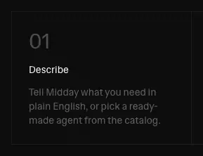 |
| Agent template card |
|
| Ruled grid cell, navy |
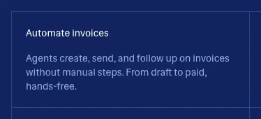 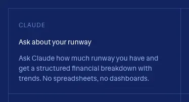 |
| Integration marquee |
|
| Pill |
|
| Primary button |
|
| Segmented toggle |
|
| Terminal (Computer) |
 |
Patterns and textures
| Pattern |
CSS |
| Diagonal hatch (navy) |
repeating-linear-gradient(-60deg, rgba(45,67,134,.4), rgba(45,67,134,.4) 1px, transparent 1px, transparent 6px) |
| Diagonal hatch (dark) |
same with rgba(28,28,28,.4) |
| Hero grid |
grid-dark.svg: a faint square grid behind feature heroes |
| Marquee fade |
linear-gradient(to right, #0d0d0d 0%, #0d0d0d 30%, rgba(13,13,13,.8) 50%, rgba(13,13,13,.4) 70%, transparent 100%) |
| Shimmer text |
--bg: linear-gradient(90deg, #0000 calc(50% - var(--spread)), var(--base-gradient-color), #0000 calc(50% + var(--spread))) with --base-color: #71717a and the shimmer keyframes (background-position 200% → −200%). The variables are declared in the CSS. I did not find which element uses them on the captured pages: no element had a running shimmer animation at capture time. |
Asset production rules (inferred)
- Every raster has a dark and a light file. Example:
accounting-dark.png and accounting-light.png.
- The UI is vector. Screens are SVG or HTML, never PNG screenshots.
- Images go through Cloudflare resizing, with quality 50 for photo or video posters and 80 for UI.
- The wordmark is type, not artwork. It costs zero bytes and themes automatically.
11 · Motion and interaction
The numbers below are summed from getComputedStyle over every element on all 31 captured pages (data/*.probe.json).
Transition budget
| Transition |
Elements (all pages) |
Used for |
color, background-color, border-color, text-decoration-color 150 ms cubic-bezier(.4,0,.2,1) |
3058 |
Every link, nav item, chip, footer link, table row |
all 200 ms cubic-bezier(.4,0,.2,1) |
368 |
Feature tiles (hover:scale-105), cards |
opacity 200 ms / 150 ms |
79 / 72 |
AI-client logos (40% → 100%), logo hover (hover:opacity-80) |
| colors 200 ms |
64 |
|
transform 200 ms |
62 |
Chevrons, arrows |
all 700 ms cubic-bezier(0,0,.2,1) (ease-out) |
34 |
Hero product image settling from tilted (rotate(-2deg) skewY(1deg)) to flat |
opacity 300 ms |
32 |
Fades on secondary content (element-level purpose not traced) |
| colors 300 ms |
7 |
Stepper step titles (transition-colors duration-300) |
all / opacity 1000 ms ease-in-out |
7 |
Hero video fade-in over its poster |
Easing: almost everything uses Tailwind's default cubic-bezier(0.4, 0, 0.2, 1). The only exception is the hero's ease-out entry. No spring curves appear in any computed transition. I did not check for a JavaScript animation library.
Keyframes
| Name |
Definition |
Duration and where |
marquee-left |
translate(0) → translate(-50%) |
30 s linear infinite: integration row 1, every feature page. 35 s on /docs. |
marquee-right |
translate(-50%) → translate(0) |
28 s linear infinite: integration row 2 |
pulse-glow |
opacity .2 → .4, scale(1) → scale(1.2), ring 0 0 0 4px rgba(34,197,94,.2) |
2 s cubic-bezier(.4,0,.6,1) infinite: the footer "Operational" dot, on every page |
fadeInBlur |
opacity 0 → 1, blur(6px) → 0 |
350 ms ease-out on load (home) |
fade-blur-in |
opacity 0 → 1, blur(8px) → 0 |
700 ms ease-out on load (/docs) |
fadeInScale |
opacity 0 → 1, scale(.9) → 1 |
400 ms ease-out on load (home) |
caret-blink |
opacity 1 at 0/70/100%, 0 at 20–50% |
the typing caret in the /computer prompt field |
dropdown-fade / dropdown-slide |
opacity, translateX(-10px) → 0 |
nav menus |
mobile-slide |
opacity, translateY(-10px) → 0 |
mobile menu |
dialog-content-show/hide |
opacity + scale(.97 ↔ 1) centered |
dialogs |
accordion-down/up |
height 0 ↔ --radix-accordion-content-height |
FAQ on compare pages (Radix) |
shimmer |
background-position: 200% → -200% |
loading text (declared) |
ellipsis |
width → 1.25em |
animated "…" (declared) |
spin, pulse, enter, exit |
Tailwind and tailwindcss-animate defaults |
|
Hover rules (from classes)
| Element |
Rest → hover |
| Nav link, footer link, text link |
#616161 → #fafafa |
| Primary button |
fill → 90% (hover:bg-primary/90) |
| Sign in, ghost buttons |
100% → 80% |
| Hero pill |
text #616161 → #fafafa, border → foreground/30 |
| Theme toggle |
border → foreground/20 |
| AI-client logo |
opacity .4 → 1 + brand color (#D97757, #20808D, #FF6363, #34322D) |
| Feature-tile icon square |
bg-muted → bg-secondary, scale(1.05), 200 ms |
| Demo table row |
→ bg-secondary |
| Logo |
→ opacity .8 |
Interactive demos (not video)
- How it works stepper. Clicking a step title, or the auto-advance, switches the right-hand table. Titles fade between
#fafafa and #616161 (300 ms).
- Terminal tabs on
/agents and /computer switch the command shown.
- Pricing toggle switches Monthly and Yearly figures. The USD and EUR buttons switch the currency.
- Testimonial carousel pages with the arrow and the dots.
Reduced motion
The site ships a global rule:
@media (prefers-reduced-motion: reduce) {
  *, ::before, ::after { scroll-behavior: auto; transition-duration: .01ms; animation-duration: .01ms; animation-iteration-count: 1; }
  video { animation: none; }
}
This stops the marquees and the status pulse. The hero video still autoplays, because the rule only removes CSS animation on video.
What cannot be measured here
- Whether the stepper auto-advances, and its interval. No timer is exposed in the CSS. Observing it would need a recording.
- The exact moment the hero image runs its 700 ms tilt-to-flat transition. It was already flat when probed after load.
Why this motion works
Everything users touch reacts in 150 ms with color only, as feedback, never as spectacle. The only continuous motion is the marquee, at a slow 28–30 s per loop, and a status dot. Both say "alive" without asking for attention.
12 · Glossary
These are the terms to use when you brief or build a page in this style. Each term points to where Midday uses it.
| Term |
Meaning |
Midday example |
| Announcement bar |
A thin full-width strip above the nav for one timely message |
"Midday is joining Ramp. Read the announcement" (37 px) |
| Backdrop blur |
backdrop-filter: blur() on a transparent bar, so content blurs under it while scrolling |
Nav: blur(12px), no fill |
| Display serif |
A serif used only at headline sizes |
Hedvig Letters Serif, 24–128 px |
| Superfamily |
Serif and sans drawn together, with shared proportions |
Hedvig Letters Sans + Serif |
| Faux bold |
A bold the browser synthesizes when only a regular font file is loaded |
Every 500/600 label |
| Muted foreground |
The secondary text token |
#616161, both themes |
| Hairline |
A 1 px rule at very low contrast |
#1c1c1c on #0d0d0d (1.14:1) |
| Full-bleed |
An element that runs to the viewport edges |
Footer divider, footer wordmark |
| Gutter |
Space between the content edge and the viewport edge |
96 px at 1440 |
| Measure |
Line length of a text block |
576 px hero lead, 672 px section lead |
| Eyebrow |
A small uppercase label above a headline |
"INVOICING", 12 px, +0.05 em |
| Lead / dek |
The one-sentence paragraph under a headline |
18/28 muted |
| Bento grid |
Cells of different sizes in one grid |
"Less admin. More focus." (3 + 1 + wide) |
| Asymmetric row |
A row that breaks the column grid on purpose |
363 + 869 px row in the bento |
| Stepper / tabbed explainer |
A list of steps that swaps a visual |
"How it works" |
| Live mock |
Product UI rebuilt in HTML rather than shown as an image |
Transactions table, invoice |
| Product SVG |
The UI exported as vector, one file per theme |
dashboard-dark.svg |
| Ambient video |
A muted, looping, low-detail video used for atmosphere |
Grayscale login-video.mp4 behind the hero UI |
| Marquee / logo ticker |
An endlessly scrolling row of logos |
Integrations, 30 s and 28 s rows |
| Edge fade / mask |
A gradient that hides the ends of a ticker |
linear-gradient(to right, bg 0–30%, transparent) |
| Ruled grid |
A grid drawn with lines between cells, no gaps |
/agents features |
| Hatch fill |
Diagonal-line texture |
repeating-linear-gradient(-60deg, … 1px, transparent 1px 6px) |
| Box-drawing diagram |
A diagram drawn in monospace text and borders |
Infrastructure diagram |
| Pixel font |
A typeface built on a pixel grid |
Geist Pixel "midday" |
| Outlined wordmark |
Live text with stroke only, used as a graphic |
508 px footer "midday" |
| Social proof |
Testimonials, logos, counts |
Country-labelled testimonial cards |
| Plan card / "most popular" |
A pricing column, one highlighted |
Pro, white border + pill |
| Segmented control |
A two- or three-way toggle |
Monthly / Yearly |
| Status indicator |
A live system-health dot |
"Operational", pulse-glow |
| Programmatic SEO |
Many pages generated from one template plus data |
17 /compare/*, 69 /integrations/connector-* |
| Theme tokens |
Named CSS variables that switch per theme |
shadcn --background, --muted-foreground |
| Ease-out |
A curve that starts fast and settles |
Hero tilt cubic-bezier(0,0,.2,1) 700 ms |
| Reduced motion |
Honoring the OS setting that turns off animation |
Global prefers-reduced-motion rule |
A brief you could paste
A dark-first marketing page (#0d0d0d) with a warm light theme (#fff, #e6e4e0).
- Type: a text serif for headlines at weight 400 only (72 px H1, 24 px section titles) and a neutral grotesque for everything else at 14/20. Secondary text in one muted gray.
- Shape: no accent color. Square corners everywhere, with pills only for labels and chips. 1 px low-contrast hairlines between sections, 96 px section padding and 96 px gutters.
- Hero: the real product UI as SVG over a slow grayscale ambient video.
- Sections: an outcome-first 3-word headline per feature, a bento that adds up time saved, a two-plan pricing block with a white-bordered "Most popular" card, and a two-row logo marquee.
- Footer: a giant outlined wordmark.
- Motion: 150 ms color-only hovers.
13 · Build recipe
This is a minimal token set and CSS to start a page with the Midday feel. Every value is the measured one from the live site. Pick your own typeface if you want your own voice: the recipe still works.
1. Fonts
<link rel="preconnect" href="https://fonts.googleapis.com">
<link href="https://fonts.googleapis.com/css2?family=Hedvig+Letters+Sans&family=Hedvig+Letters+Serif:opsz@12..24&display=swap" rel="stylesheet">
2. Tokens (both themes)
:root {
  --font-sans: "Hedvig Letters Sans", system-ui, sans-serif;
  --font-serif: "Hedvig Letters Serif", Georgia, serif;

  /* light: warm paper */
  --bg: #ffffff;
  --fg: #121212;
  --muted-fg: #616161;   /* 6.19:1 on white */
  --secondary: #e6e4e0;  /* bar, bento total, wordmark fill */
  --muted: #e6e4e0;
  --card: #f7f6f3;
  --border: #dbdad7;
  --primary: #18181b;
  --primary-fg: #fafafa;
  --positive: #4caf50;
  --ok: #22c55e;

  --gutter: 96px;
  --section-y: 96px;
  --radius: 0;
  --ease: cubic-bezier(.4, 0, .2, 1);
}
.dark {
  --bg: #0d0d0d;
  --fg: #fafafa;
  --muted-fg: #616161;   /* Midday's value: 3.14:1. Use #8a8a8a for AA. */
  --secondary: #121212;
  --muted: #1c1c1c;
  --card: #121212;
  --border: #1c1c1c;
  --primary: #fafafa;
  --primary-fg: #18181b;
}
3. Base and type scale
body { background: var(--bg); color: var(--fg); font: 400 14px/20px var(--font-sans); -webkit-font-smoothing: antialiased; }

.h1-home    { font: 400 72px/72px var(--font-serif); letter-spacing: -0.025em; text-align: center; }
.h1-feature { font: 400 128px/128px var(--font-serif); text-align: center; }
.h2         { font: 400 24px/32px var(--font-serif); text-align: center; }
.lead       { font: 400 18px/28px var(--font-sans); color: var(--muted-fg); max-width: 576px; margin-inline: auto; }
.section-lead { font-size: 16px; line-height: 24px; color: var(--muted-fg); max-width: 672px; margin: 16px auto 0; }
.eyebrow    { font-size: 12px; line-height: 16px; text-transform: uppercase; letter-spacing: .05em; color: var(--muted-fg); }

@media (max-width: 639px) {
  .h1-home { font-size: 30px; line-height: 33px; letter-spacing: -0.025em; }
}
4. Frame
.bar   { position: fixed; inset: 0 0 auto; height: 37px; z-index: 60; background: var(--secondary); border-bottom: 1px solid var(--border); font-size: 12px; display: grid; place-items: center; }
.nav   { position: fixed; top: 36px; inset-inline: 0; height: 56px; z-index: 50; backdrop-filter: blur(12px); display: flex; align-items: center; justify-content: space-between; padding: 0 24px; }
.nav a { color: var(--muted-fg); transition: color 150ms var(--ease); }
.nav a:hover { color: var(--fg); }

.container { max-width: 1248px; margin-inline: auto; padding-inline: 16px; }
.section   { padding-block: var(--section-y); }
.rule      { height: 1px; border-top: 1px solid var(--border); max-width: 1248px; margin-inline: auto; }
@media (max-width: 1023px) { :root { --section-y: 64px; } }
@media (max-width: 639px)  { :root { --section-y: 48px; } }
5. Components
.btn { display: inline-flex; align-items: center; height: 44px; padding: 0 24px; font-size: 14px; font-weight: 500; border-radius: 0; transition: background-color 150ms var(--ease); }
.btn-primary { background: var(--primary); color: var(--primary-fg); }
.btn-primary:hover { background: color-mix(in srgb, var(--primary) 90%, transparent); }
.btn-outline { border: 1px solid var(--border); color: var(--fg); }

.pill { display: inline-flex; gap: 8px; padding: 6px 14px; border: 1px solid var(--border); border-radius: 9999px; font-size: 12px; color: var(--muted-fg); }
.chip { padding: 6px 12px; border: 1px solid var(--border); border-radius: 9999px; font-size: 16px; }

.card  { border: 1px solid var(--border); padding: 20px; }
.card--total { background: var(--secondary); padding: 24px; }

.bento { display: grid; grid-template-columns: repeat(3, 1fr); gap: 16px; }
.bento .wide-row { grid-column: 1 / -1; display: grid; grid-template-columns: 363fr 869fr; gap: 16px; }

.plan { border: 1px solid var(--border); padding: 24px 16px; width: 386px; }
.plan--popular { border-color: var(--fg); position: relative; }
.plan--popular::before { content: "Most popular"; position: absolute; top: -11px; right: 12px; font-size: 12px; padding: 2px 8px; border: 1px solid var(--fg); border-radius: 9999px; background: var(--bg); }

.wordmark { font: 400 clamp(200px, 35vw, 508px)/1 var(--font-sans); color: var(--secondary); -webkit-text-stroke: 1px var(--muted-fg); user-select: none; overflow: hidden; white-space: nowrap; }
6. Motion
.marquee { overflow: hidden; mask-image: linear-gradient(90deg, transparent, #000 30%, #000 70%, transparent); }
.marquee > div { display: flex; width: max-content; animation: marquee-left 30s linear infinite; }
.marquee.reverse > div { animation: marquee-right 28s linear infinite; }
@keyframes marquee-left  { to { transform: translateX(-50%); } }
@keyframes marquee-right { from { transform: translateX(-50%); } to { transform: translateX(0); } }

.status-dot { width: 6px; height: 6px; border-radius: 50%; background: var(--ok); animation: pulse-glow 2s cubic-bezier(.4,0,.6,1) infinite; }
@keyframes pulse-glow {
  0%, 100% { opacity: .2; transform: scale(1); box-shadow: 0 0 0 0 rgba(34,197,94,.4); }
  50% { opacity: .4; transform: scale(1.2); box-shadow: 0 0 0 4px rgba(34,197,94,.2); }
}

.hero-shot { filter: drop-shadow(0 30px 60px rgba(0,0,0,.6)); transform: rotate(-2deg) skewY(1deg); transition: transform 700ms cubic-bezier(0,0,.2,1); }
.hero-shot.is-in { transform: none; }

@media (prefers-reduced-motion: reduce) { *, ::before, ::after { animation-duration: .01ms !important; transition-duration: .01ms !important; animation-iteration-count: 1 !important; } }
(The site uses a solid-color gradient overlay for the marquee edge. mask-image gives the same result on any background.)
7. Page skeleton
- Announcement bar, nav
- Hero: pill → serif H1 → lead → one primary button → reassurance line → client logos at 40% opacity
- Product frame: SVG UI over an ambient video, 1248 × 900
- Rule → How it works (stepper + live table)
- Rule → Feature tile grid (4 × 2)
- Rule → Bento of time saved
- Rule → Checklist with an object render
- Rule → Testimonials (4 cards, country labels)
- Rule → Logo marquee (2 rows)
- Pricing (2 plans)
- Full-bleed rule → Footer (4 columns, tagline, badges, theme toggle, status) → outlined wordmark
8. Checklist before shipping
- [ ] Only one filled button per viewport
- [ ] No radius except pills and chips
- [ ] Headlines at weight 400
- [ ] Secondary text passes 4.5:1 in dark mode (Midday's
#616161 does not)
- [ ] Every image has a light and a dark variant
- [ ] Hover = color change ≤ 200 ms
- [ ]
prefers-reduced-motion stops the marquee
Home · /
Height: 6567 px at 1440 (7411 px at 390). Title: "Midday — The business stack for modern founders". Meta description: "Invoicing, automatic reconciliation, time tracking, documents, and financial exports in one place. The business stack that replaces the tools you've outgrown."
1. Announcement bar + nav (0–92 px)
- Bar. A 37 px bar reads "Midday is joining Ramp." with an underlined "Read the announcement".
- Nav. The 56 px nav is transparent with a 12 px blur. It holds the sunburst mark (left), then Features ▾ · Story · Download · Resources ▾ (14 px
#616161), then Sign in (14 px #fafafa, far right).
- No CTA button in the nav. The only conversion button is in the hero.
Why. No second button competes with the hero CTA. "Sign in" is the only bright nav item because returning users are the majority after the acquisition news.
2. Hero (228–712 px)
| Element |
Value |
| Pill |
"Midday is joining Ramp →" 12 px, rounded-full, 1 px border |
| H1 |
Serif 72/72, −1.8 px: "The business stack for modern founders". "modern" is in muted-foreground/80, not italic. |
| Lead |
18/28 #616161, 576 px: "Send invoices, automatic reconciliation, track billable hours, get financial insights, and export clean books to your accountant." |
| CTA |
"Start your trial", 138 × 44, white, square |
| Note |
"14-day free trial · Cancel anytime" 12 px |
| Client logos |
Claude · ChatGPT · Perplexity · Raycast · Cursor · Manus at 40% opacity, linking to /mcp/* |
Why. The serif H1 at 72 px fills two lines, so the promise fits in one glance. The muted "modern" gives the line a soft emphasis without italics or color. The 12 px reassurance under the button removes the main objection: cost and commitment.
3. Product frame (712–1612 px)
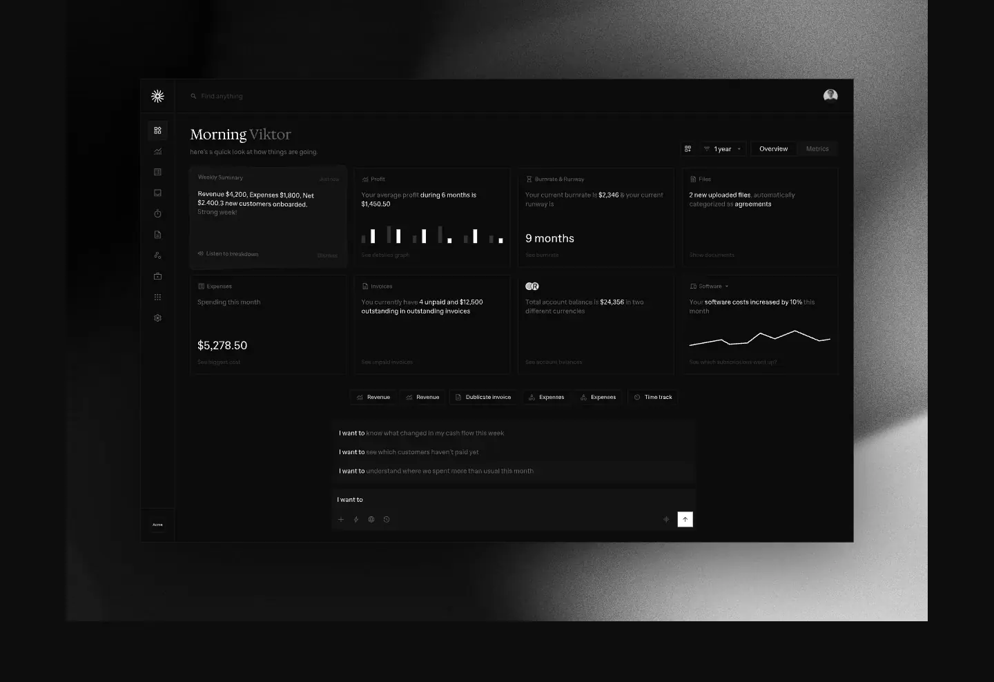
- A 1248 × 900 grayscale looping video, with the 1034 × 672 dashboard SVG on top: "Morning Viktor", KPI cards (revenue, runway "9 months", a sparkline), a transactions summary and an assistant prompt bar.
- The SVG has
drop-shadow(0 30px 60px rgba(0,0,0,.6)). Its entry transform is rotate(-2deg) skewY(1deg) and it settles flat over 700 ms ease-out.
Why. It gives a photographic depth (light moving on a surface) to a UI that is otherwise flat black. The slight tilt-to-flat makes the UI "land" on the page.
4. How it works (1756–2624 px)
- Left: a serif H2 and three steps: "All your transactions, unified" (active,
#fafafa, with a description), "Invoices get paid" and "Automatic reconciliation" (both #616161).
- Right: the live Transactions table (17 rows, SEK amounts, income in green, category swatches). Above it is a 4-icon source strip with dashed connectors.
- Mobile: the steps become three stacked sections with serif H2s.
5. Everything you need to run your business (2625–3237 px)
The serif H2 and a 16 px lead ("Invoicing, transactions, time tracking, customers, and files — all connected in one system.") sit above 8 icon tiles in a 4 × 2 grid. Each tile links to its feature page.
Why. It is a visual sitemap. A visitor sees the whole product in one 600 px band.
6. Less admin. More focus. (3238–3834 px)
There are four time-cost cells: Chasing receipts 45 min/week · Cleaning transactions 1 h · Preparing invoices 1–2 h · Explaining the numbers 1 h. Then a wide #121212 total cell: "What disappears over time … 4–6 hours".
7. Ready for accounting, without extra work (3835–4605 px)
A 3D folder sits above the serif H2 and the lead. Below them, a five-item checklist panel:
1. "Transactions from 25,000+ banks are categorized and reconciled automatically"
2. "Receipts and invoices are pulled from email and payments, then matched to transactions"
3. "Clean records across all connected accounts"
4. "Taxes are tracked per transaction"
5. "Export-ready for your accounting system"
Last comes the underlined link "Learn more about pre-accounting".
8. Built alongside our users (4606–5276 px)
Four testimonial cards labelled by country (Poland, Argentina, Germany, United Kingdom), then an arrow, five pagination dots and "View all customer stories".
Why. "Alongside" frames customers as co-designers, not as reviewers. The country labels answer the bank-support doubt.
9. Works with the tools you already use (5277–5717 px)
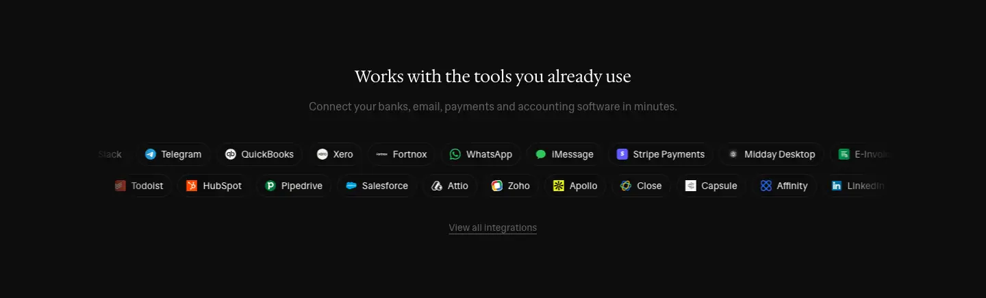
Two counter-scrolling marquees of 16 px brand logos and names, from Gmail and Outlook to Zoho Books and Sage. They loop at 30 s and 28 s, with edge fades. "View all integrations" follows.
10. Footer (5717–6567 px)
See shared header and footer.
Light mode and mobile
- Light mode. It swaps to a
#ffffff page, #121212 text, #dbdad7 hairlines and a #e6e4e0 bento total and wordmark fill. The video stays dark, so the hero becomes a dark "screen" on white paper.
- Mobile (390 px). The H1 is 30/33 and the logo and wordmark sit in the nav. Steps unstack. The wordmark is 200 px. Page height grows to 7411 px.


Feature page template
Pages using it: /invoicing, /transactions, /inbox, /time-tracking, /file-storage, /customers. /assistant uses a variant; see Assistant.
All six pages are 8263–8391 px tall and differ only in the hero and the two feature rows. The worked example is /invoicing.

| Page |
Eyebrow |
H1 (serif 128) |
Feature row 1 |
Feature row 2 |
<title> |
/invoicing |
INVOICING |
Get paid faster |
Flexible invoicing setup |
Connected to your business |
Online Invoicing Software for Small Business |
/transactions |
TRANSACTIONS |
All transactions together |
All business transactions |
Categorized and reconciled at scale |
Business Transaction Tracking & Bank Sync |
/inbox |
INBOX |
Receipts matched |
Receipts and invoices collected |
Matched to transactions |
Automatic Receipt Matching & Management |
/time-tracking |
TIME TRACKING |
See where time goes |
From time to invoices |
Time tracked by project |
Time Tracking for Freelancers & Consultants |
/file-storage |
FILES |
Everything in one place |
Central file storage |
One search across your entire business |
Secure Document Storage for Business |
/customers |
CUSTOMERS |
Know your customers |
Customer revenue and activity |
Customer context, built in |
Customer Management & Revenue Tracking |
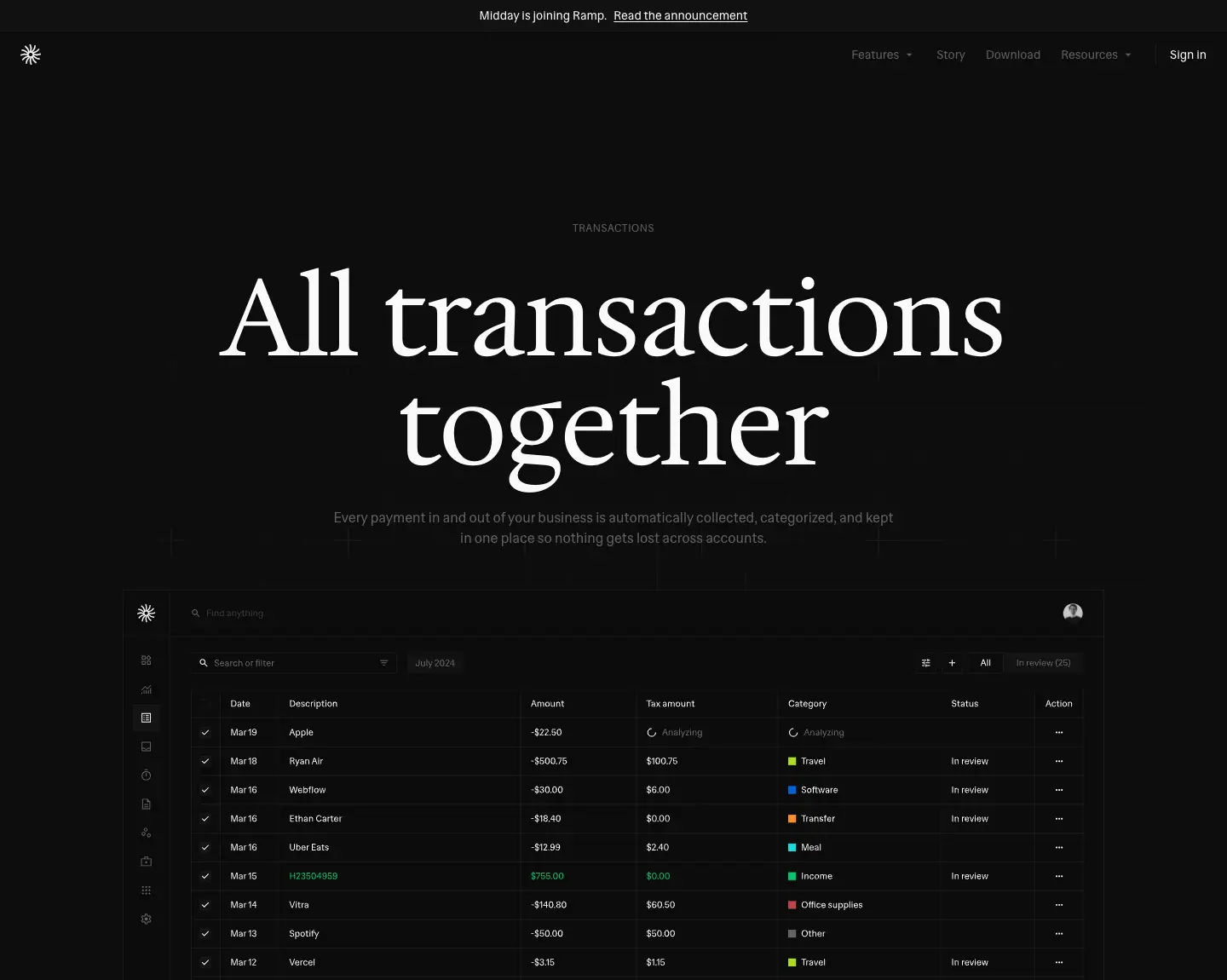
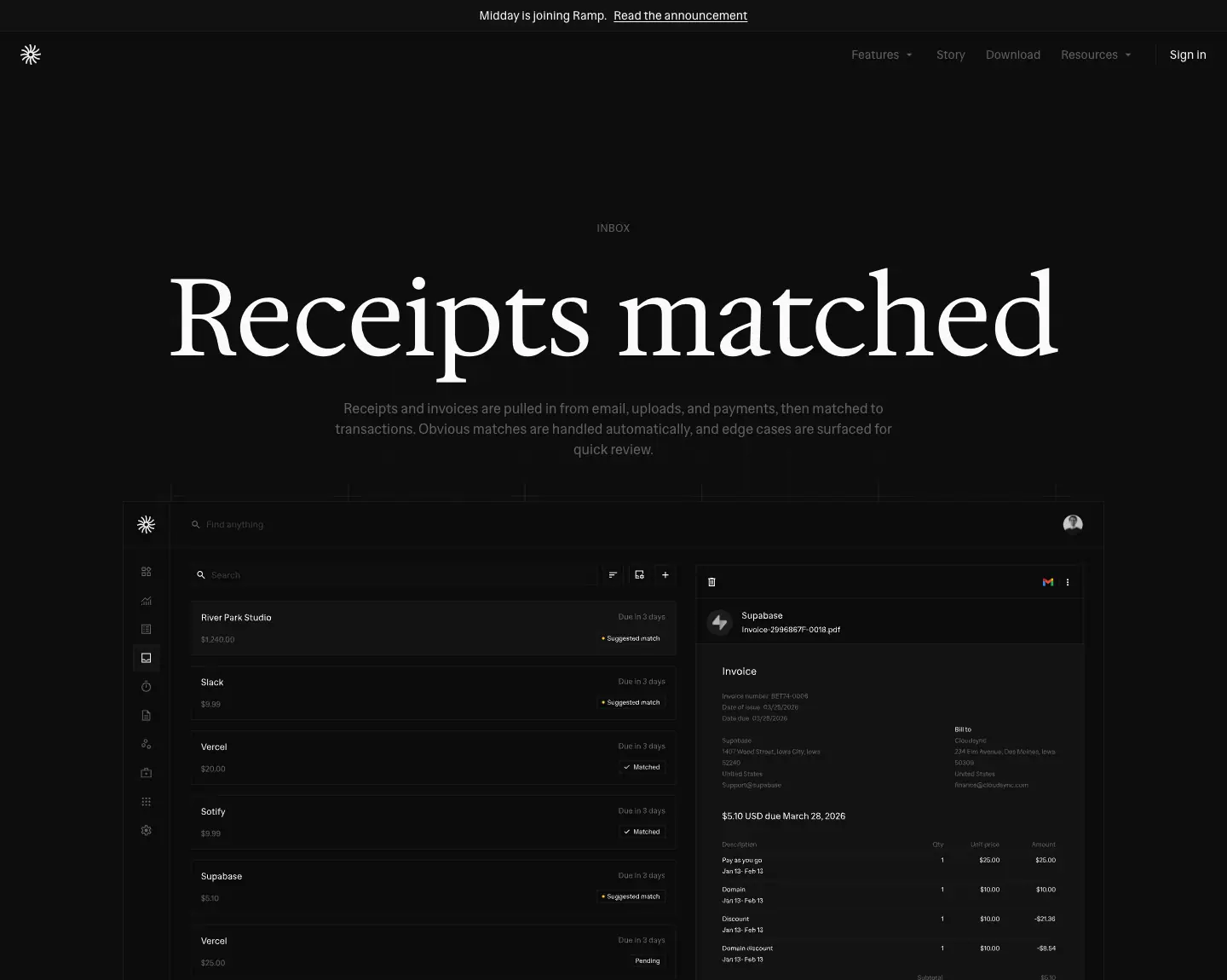
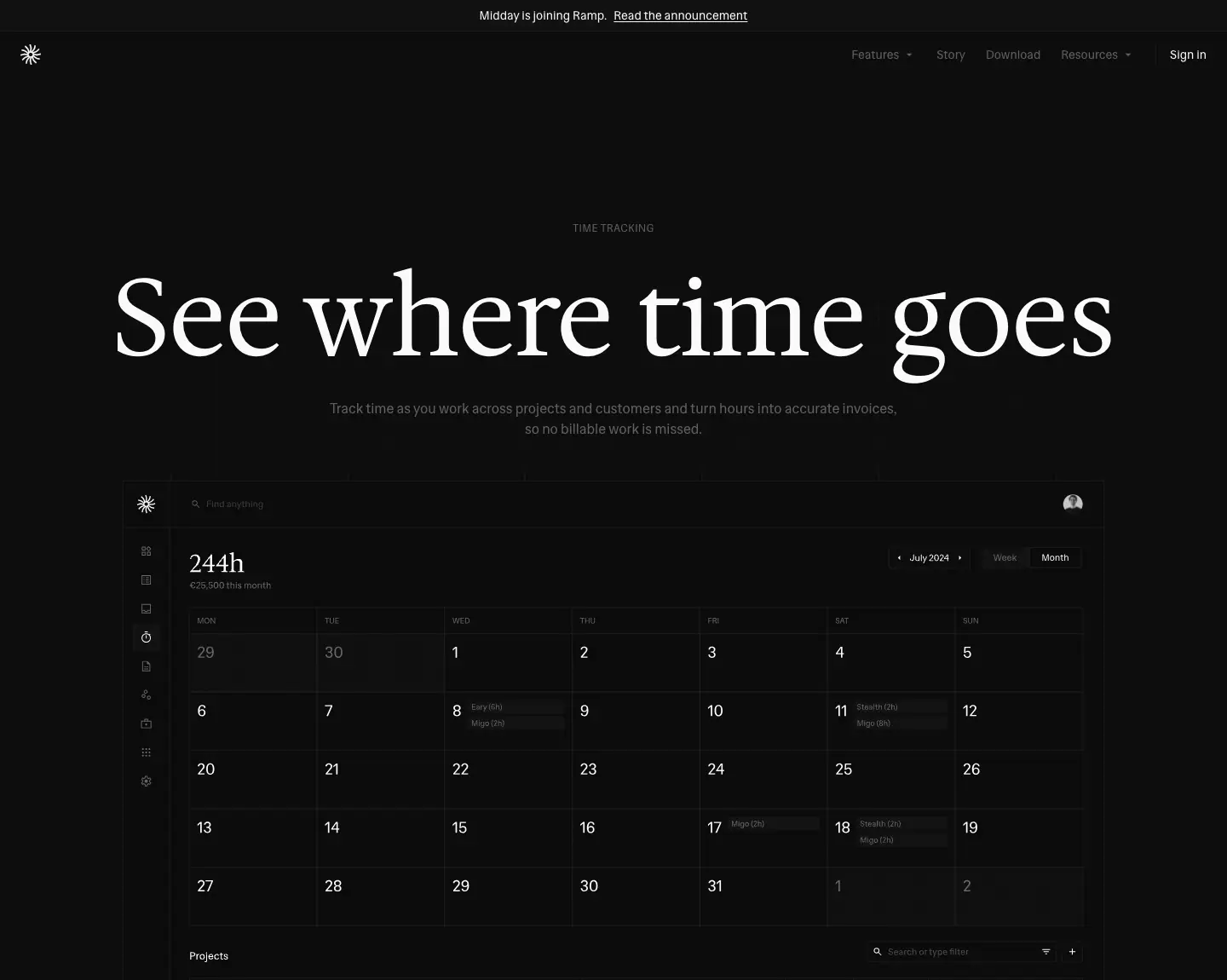
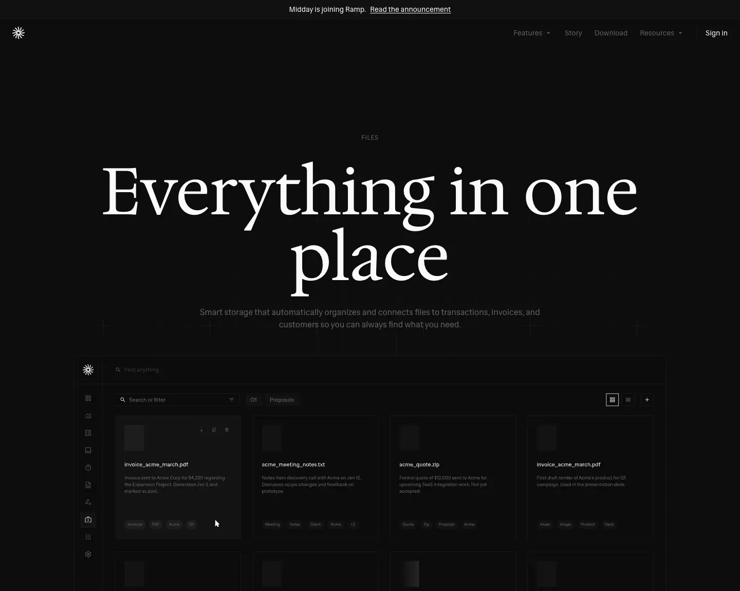
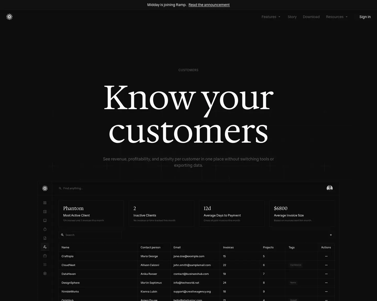
Section order
- Hero. Eyebrow, serif H1 at 128/128, 16 px lead, then a full product frame (≈ 1152 px wide) on a faint grid. No button.
- Feature row A. Text left (sans 24/32 H2, lead, pill chips), live UI right: an invoice document with an "Create an invoice to Acme for 20 development hours and 10 design hours" chat bubble.
- Feature row B. Mirrored: UI left (an invoices table with Open / Overdue / Paid / Payment-score KPI tiles and colored status chips), text right with chips including a Stripe logo chip.
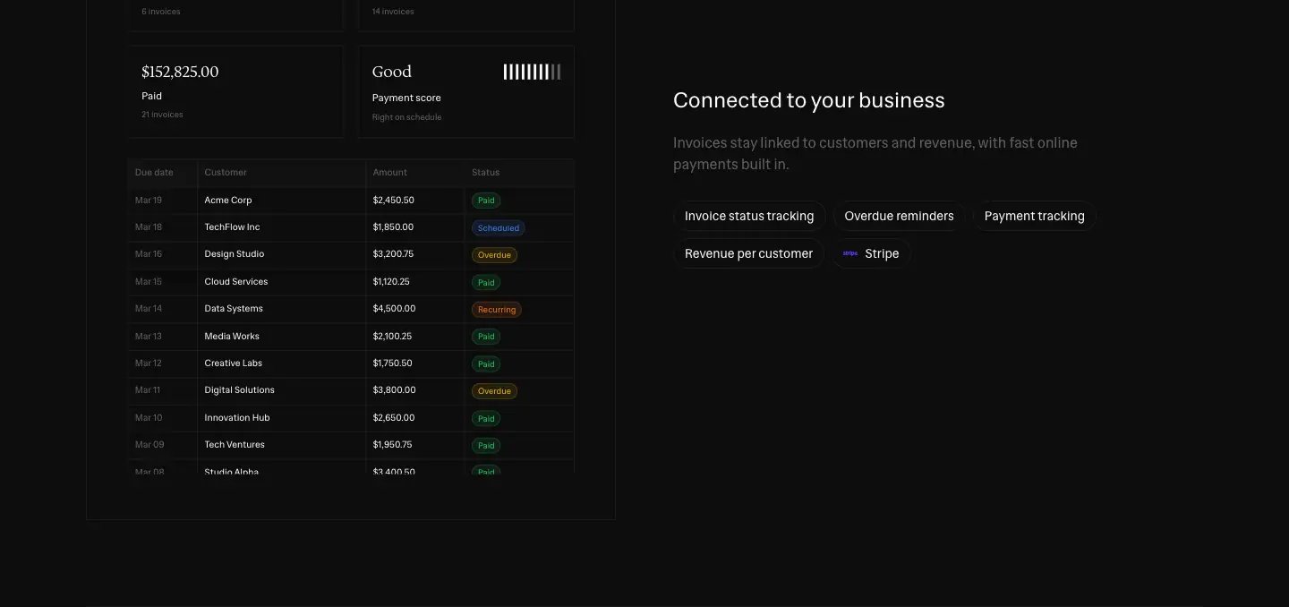
- Shared modules, identical to the home page:
- "Everything you need to run your business" tiles
- "Less admin. More focus." bento
- "Ready for accounting, without extra work" checklist
- "Built alongside our users" testimonials
- "Works with the tools you already use" marquee
- Pricing. "Pricing that matches how you run your business": Starter $15 and Pro $39.
- Footer.
Why this template
- The 128 px headline is the page. Three words at poster size tell the visitor what changes in their life. The eyebrow carries the SEO noun.
- The UI frame carries the rest. The hero shows the actual screen for that feature (the invoice list for invoicing, the inbox for inbox).
- Reuse is the strategy. The shared modules repeat the strongest proof on every page. Anyone who arrives from search gets the full pitch without going to home.
- Pricing at the bottom of every page.
/pricing now redirects. Each feature page closes the sale itself.
Mobile

The H1 drops to the Tailwind text-3xl range. The chips wrap onto 2–3 lines as pills. The UI panels shrink to full width, with tables that keep 28 px rows.
Assistant · /assistant

Height: 8329 px. Title: "AI Assistant for Small Business | Midday". This page is a variant of the feature template with AI-specific rows.
Hero
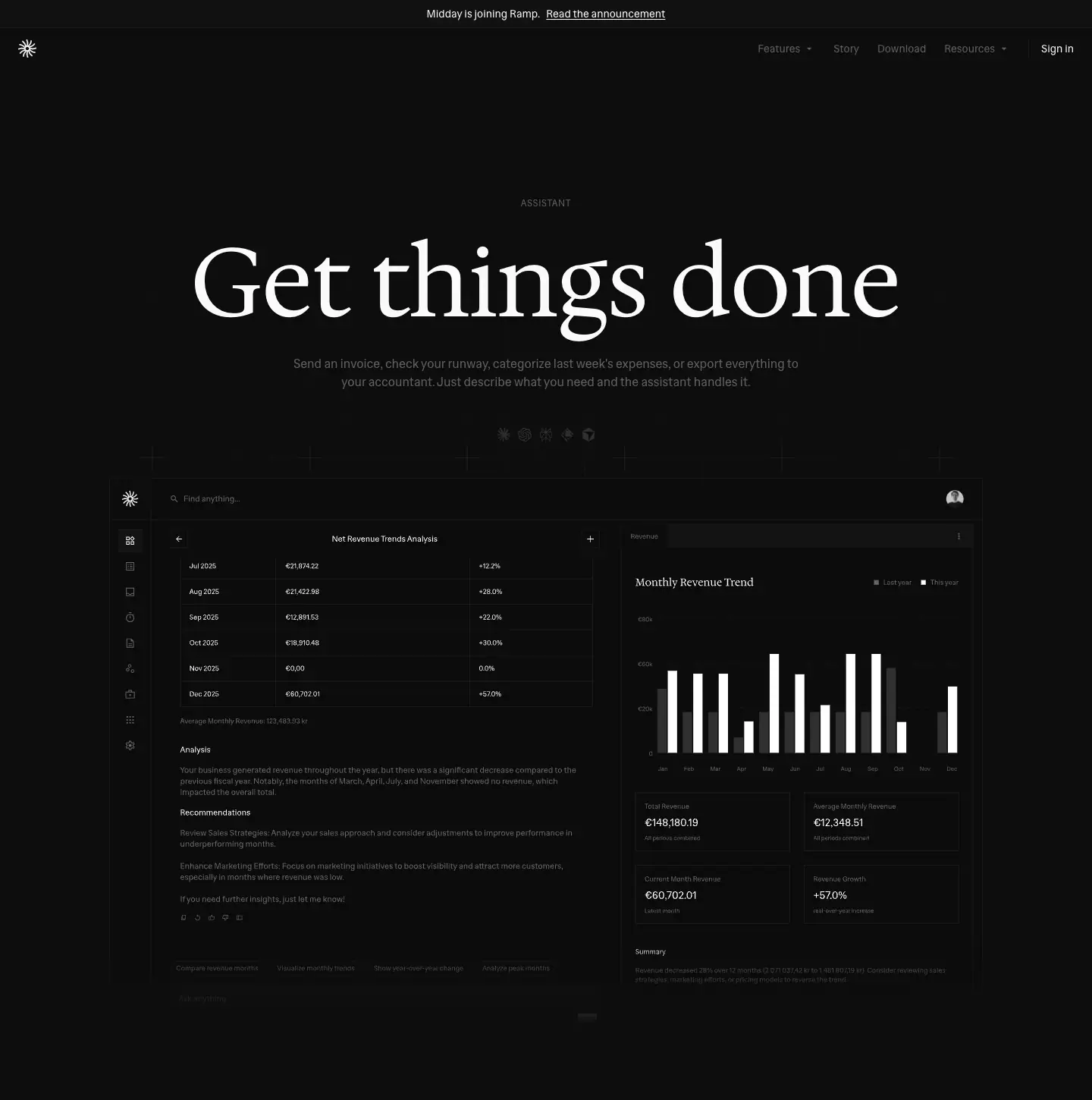
- The eyebrow "ASSISTANT" and the serif 128 px "Get things done".
- Lead: "Send an invoice, check your runway, categorize last week's expenses, or export everything to your accountant. Just describe what you need and the assistant handles it."
- Media:
grid-dark.svg sits behind assistant-dark.svg (1152 × 749): a "Net Revenue Trends Analysis" table and a "Monthly Revenue Trend" bar chart.
Why. The page sells an AI feature without one AI cliché. There is no sparkle icon, no gradient and no "AI-powered". The output, a real report, does the selling.
Row: Ask anything, get things done
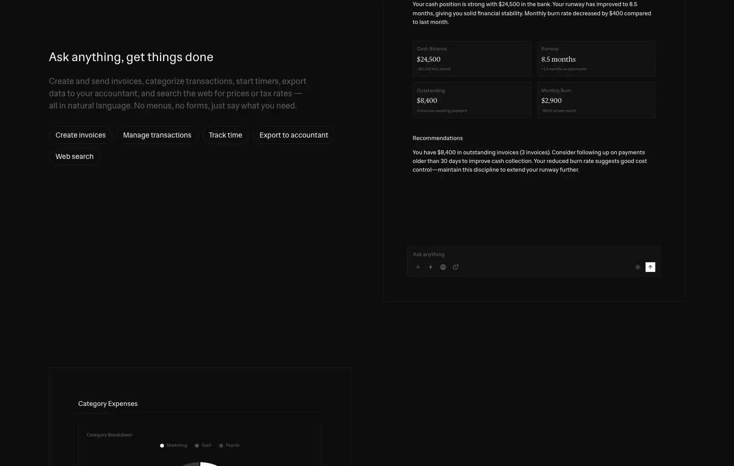
- Text: sans 24 px H2, with chips Create invoices · Manage transactions · Track time · Export to accountant · Web search.
- Right: a chat panel. The user bubble reads "How's my cash flow looking?". The answer is a structured document, "Cash Flow Analysis — October 2025": Current Status ($24,500, runway 8.5 months), four KPI tiles and Recommendations.
- All assistant text is 12/18 px. The document heading is 14/21.
Row: Works with your tools
- Left: a "Category Expenses" donut with "$5,700" in the 24 px serif, and KPI cells (Marketing $1,300, 85%, $350).
- Right: the text, with chips Gmail · Slack · Google Calendar · Notion · GitHub · Linear.
Then
The same shared modules and pricing as the feature template.
Pre-accounting · /pre-accounting
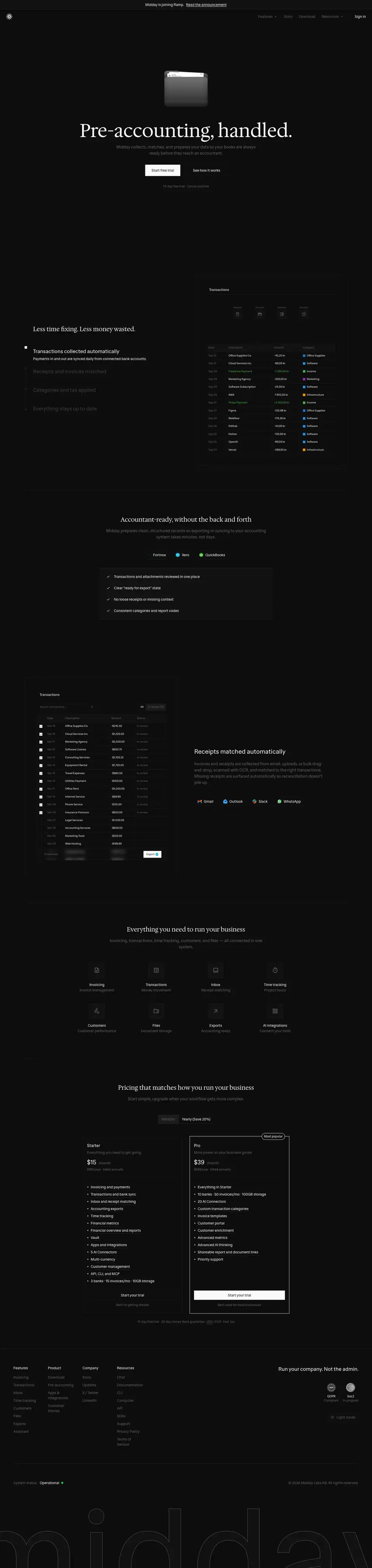
Height: 6075 px. Title: "Automated Pre-Accounting & Bookkeeping | Midday".
Hero: the object pattern
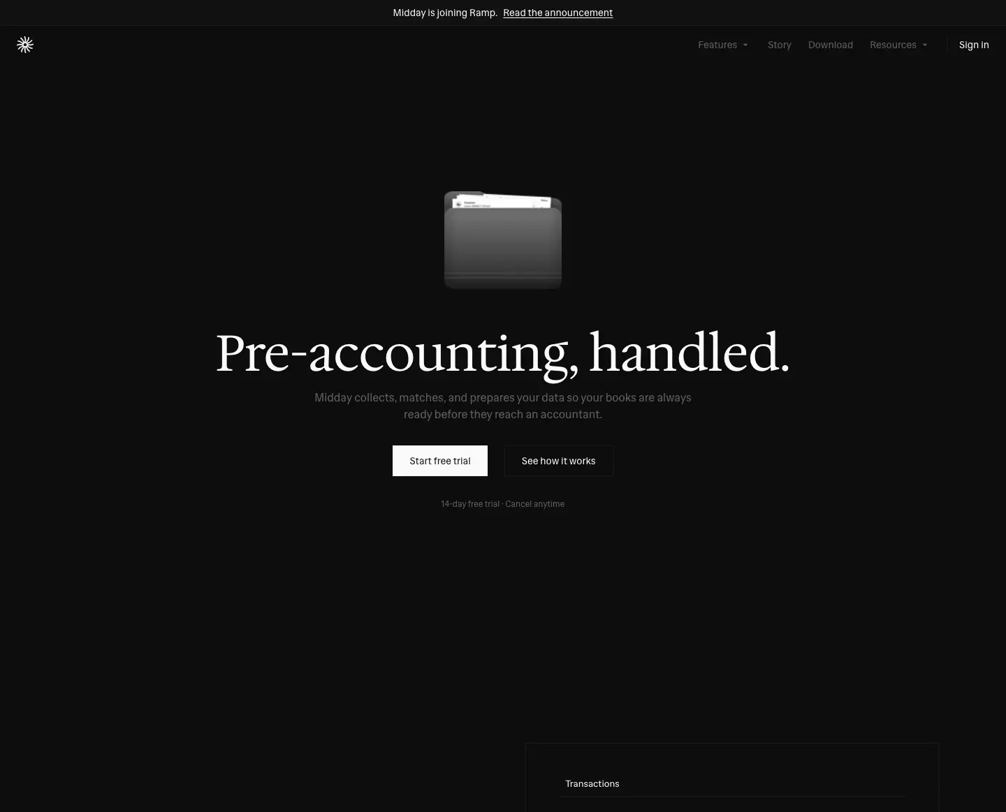
- The 3D folder sits above a serif 72 px H1: "Pre-accounting, handled." (with a period).
- Then the lead, a filled "Start free trial" button, a ghost "See how it works" button and "14-day free trial · Cancel anytime".
Why. The folder is the concept: your papers, collected. It is the one page where an object leads instead of a screen, because pre-accounting is an outcome you never see in the UI.
Less time fixing. Less money wasted.
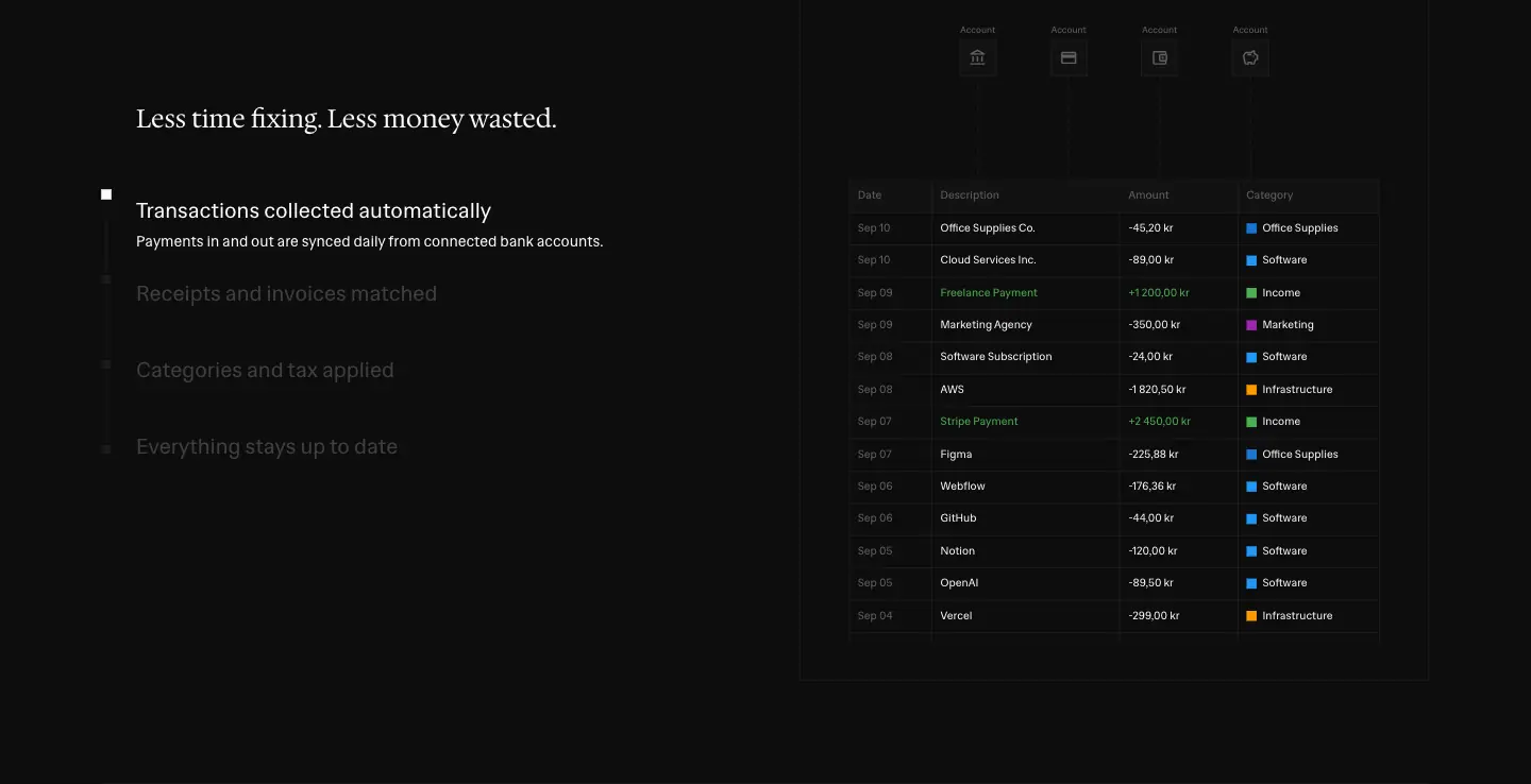
This is the home "How it works" stepper with four steps: Transactions collected automatically · Receipts and invoices matched · Categories and tax applied · Everything stays up to date. The live transactions table sits on the right.
Accountant-ready, without the back and forth
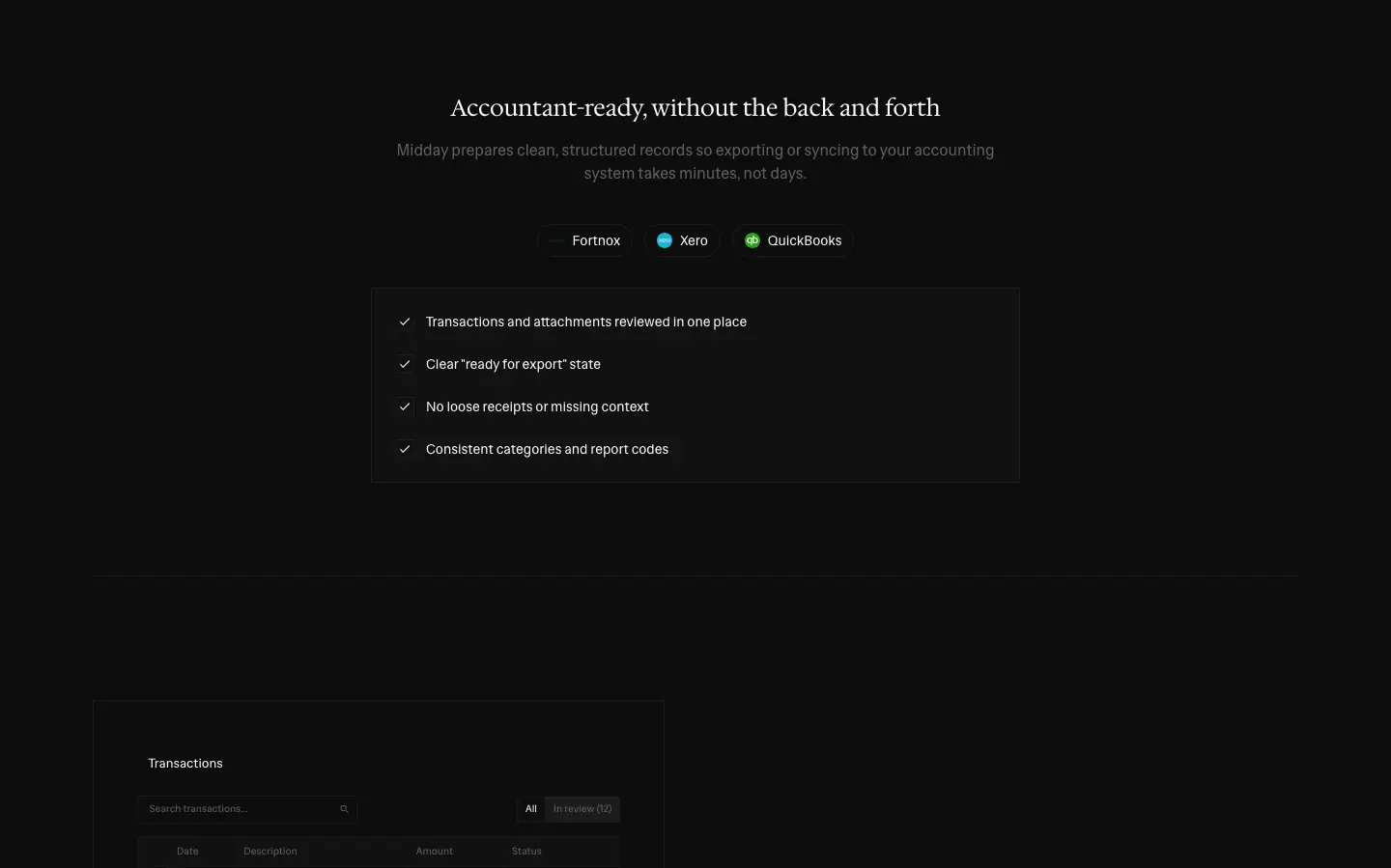
The section opens with the serif H2 and a row of accounting-software logos (Fortnox, Xero, QuickBooks). A checklist panel follows:
1. "Transactions and attachments reviewed in one place"
2. "Clear 'ready for export' state"
3. "No loose receipts or missing context"
4. "Consistent categories and report codes"
Receipts matched automatically
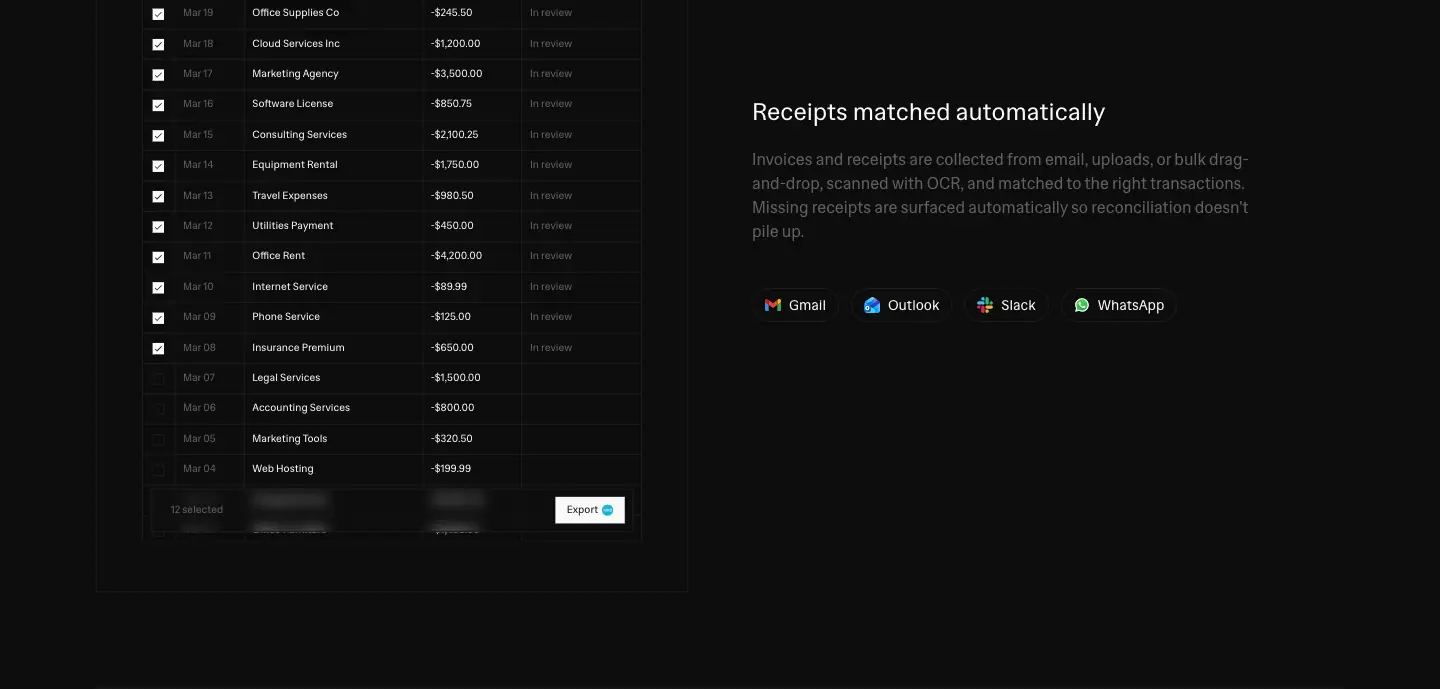
- UI left: a "Transactions · In review (12)" table with checkboxes, 12 selected and a floating action bar.
- Text right: "Invoices and receipts are collected from email, uploads, or bulk drag-and-drop, scanned with OCR…" with source chips (Gmail, Outlook, Slack, WhatsApp).
Then
The "Everything you need" tiles, pricing and the footer. This page skips the bento, the testimonials and the marquee, so it is 2200 px shorter than a feature page.
Agents · /agents
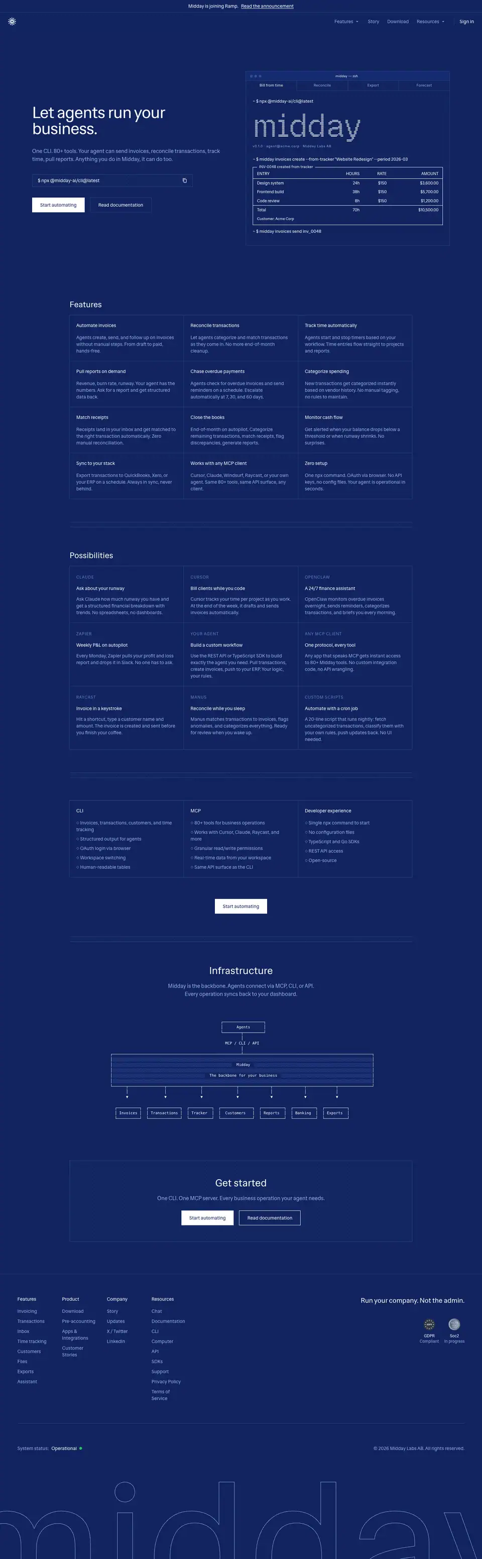
Height: 4648 px. Title: "Agents — Let agents run your business | Midday".
Theme exception: the whole page is navy #11245f in both light and dark mode. The light capture is identical.
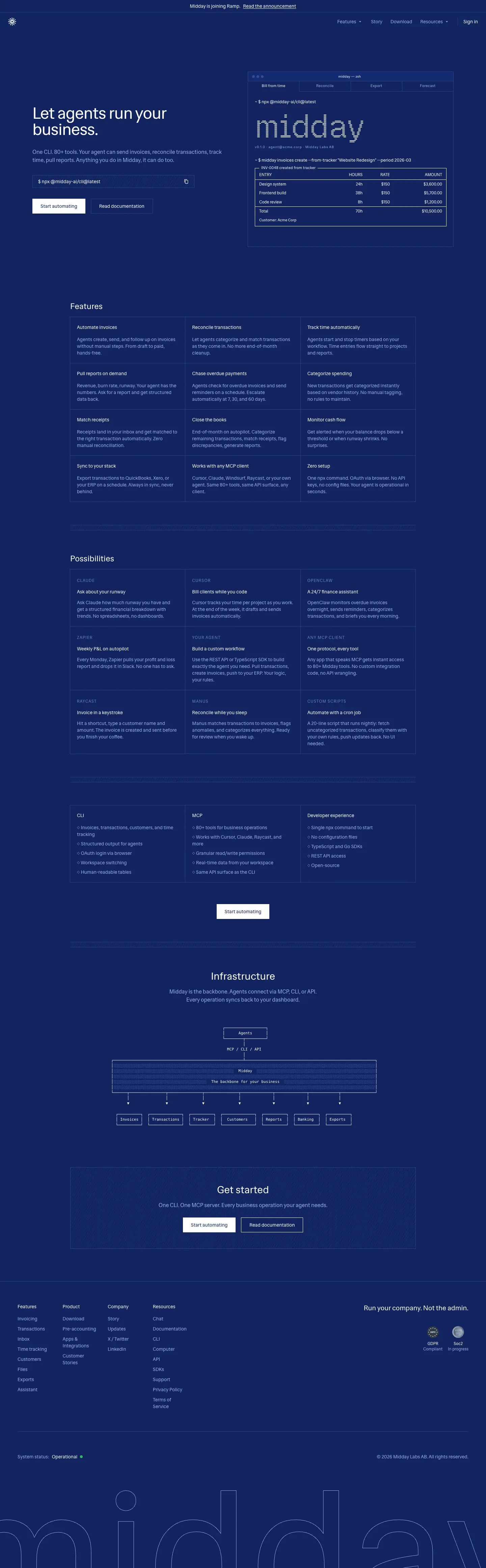
Palette
| Role |
Value |
Contrast on #11245f |
| Background |
#11245f |
— |
| Headline / title |
#ffffff |
14.57 |
| Body |
#99ace6 |
6.52 |
| Eyebrow (12 px, +1.2 px, uppercase) |
#6680cc |
3.83 |
| Mono accent |
#476ad1 |
2.95 |
| Hairline |
#2d4386 |
— |
| Hatch |
rgba(45,67,134,.4) 1 px every 6 px at −60° |
— |
| Primary button |
#ffffff fill, #11245f label |
— |
Hero: developer split
- Left: sans 48/48 −1.2 px "Let agents run your business." Lead: "One CLI. 80+ tools. Your agent can send invoices, reconcile transactions, track time, pull reports. Anything you do in Midday, it can do too." Then the
$ npx @midday-ai/cli@latest field with a copy icon, a filled "Start automating" button and an outline "Read documentation" button.
- Right: a terminal window ("midday — zsh") with tabs Bill from time · Reconcile · Export · Forecast. It holds a 96 px Geist Pixel Line "midday", then "v0.1.0 · agent@acme.corp · Midday Labs AB", then the command
$ midday invoices create --from-tracker "Website Redesign" --period 2026-03 and a box-drawn invoice table (Design system 24h $150 $3,600.00 …, Total 70h $10,500.00).
Why. Developers judge a tool by its CLI output. The pixel wordmark gives the CLI a brand moment, like an ASCII banner in a real tool.
Features: ruled grid
The grid has 12 cells, 3 × 4, separated by hairlines with no gaps. Examples:
- "Automate invoices": "Agents create, send, and follow up on invoices without manual steps. From draft to paid, hands-free."
- Reconcile transactions · Track time automatically · Pull reports on demand · Chase overdue payments · Categorize spending · Match receipts · Close the books · Monitor cash flow · Sync to your stack · Works with any MCP client · Zero setup.
Possibilities
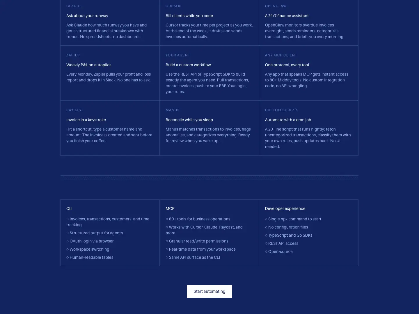
The grid has 9 cells, each with an uppercase client eyebrow:
- CLAUDE "Ask about your runway"
- CURSOR "Bill clients while you code"
- OPENCLAW "A 24/7 finance assistant"
- ZAPIER "Weekly P&L on autopilot"
- YOUR AGENT "Build a custom workflow"
- ANY MCP CLIENT "One protocol, every tool"
- RAYCAST "Invoice in a keystroke"
- MANUS "Reconcile while you sleep"
- CUSTOM SCRIPTS "Automate with a cron job"
Then a 3-column spec list (CLI · MCP · Developer experience) and a "Start automating" button.
Infrastructure
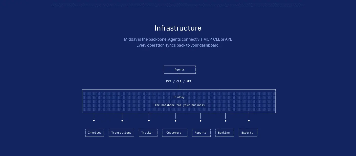
A sans 30 px H2 and "Midday is the backbone. Agents connect via MCP, CLI, or API. Every operation syncs back to your dashboard." Below sits a box diagram with a hatched "Midday — The backbone for your business" bar fanning out to 7 modules.
Get started
A bordered CTA panel: "One CLI. One MCP server. Every business operation your agent needs." with "Start automating" and "Read documentation".
Computer · /computer
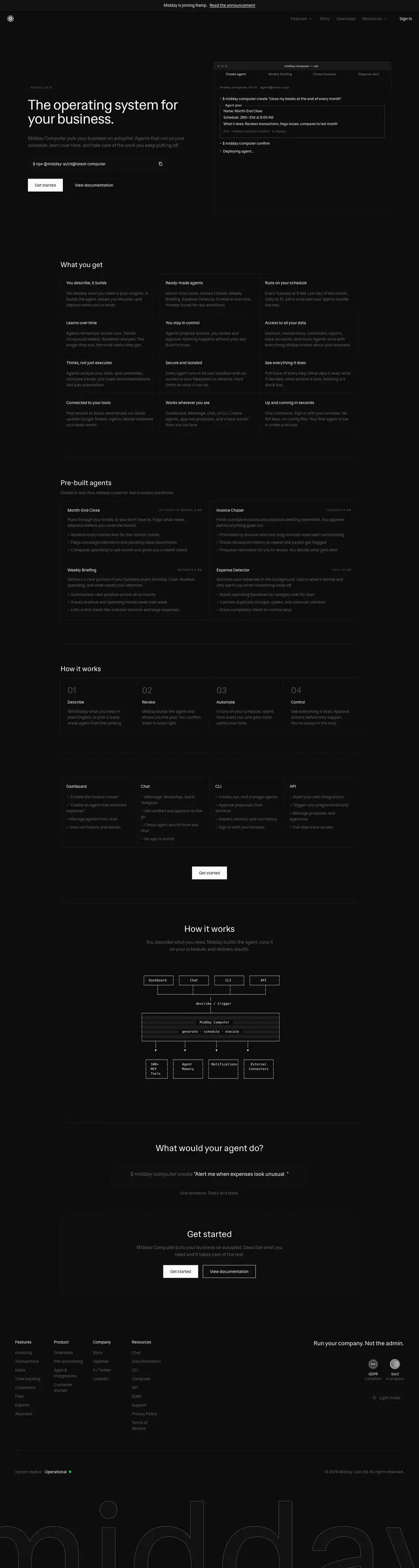
Height: 5378 px. Title: "Computer — Autonomous AI agents for your business | Midday". This page sells scheduled, autonomous agents. It is the dark-theme twin of /agents.
Hero
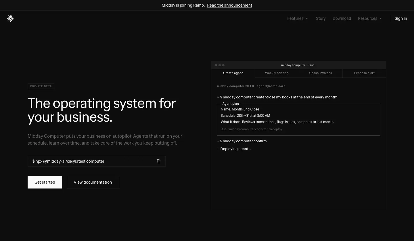
- Left: a 10 px uppercase "PRIVATE BETA" tag (+1 px tracking), then the sans 48 px H1 "The operating system for your business." and the lead "Midday Computer puts your business on autopilot. Agents that run on your schedule, learn over time, and take care of the work you keep putting off."
- Below the lead: the field
$ npx @midday-ai/cli@latest computer, a filled "Get started" button and a ghost "View documentation" button.
- Right: the terminal, with tabs Create agent · Weekly briefing · Chase invoices · Expense alert. Unselected tabs are
#8c8c8c. The terminal shows:
- the command
~ $ midday computer create "close my books at the end of every month"
- an "Agent plan" block: Name: Month-End Close · Schedule: 28th–31st at 8:00 AM · What it does: Reviews transactions, flags issues, compares to last month
- "Run
midday computer confirm to deploy."
What you get
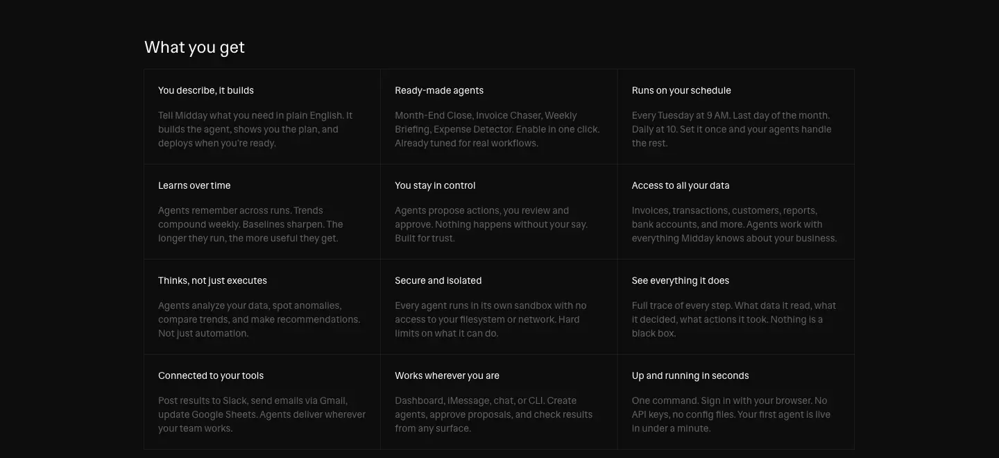
A ruled 3 × 4 grid of 12 benefits, each a 14 px title plus a muted body: You describe, it builds · Ready-made agents · Runs on your schedule · Learns over time · You stay in control · Access to all your data · Thinks, not just executes · Secure and isolated · See everything it does · Connected to your tools · Works wherever you are · Up and running in seconds.
Pre-built agents
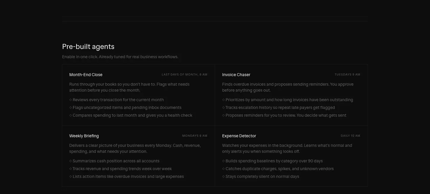
There are four 513 × 206 cards: Month-End Close, Invoice Chaser, Weekly Briefing and Expense Detector. Each has an uppercase schedule tag and three "◇" bullets. Example: "Stays completely silent on normal days".
How it works: steps
Four cards numbered 01–04 in 30 px #4d4d4d (2.3:1, decorative): Describe · Review · Automate · Control.
Surfaces
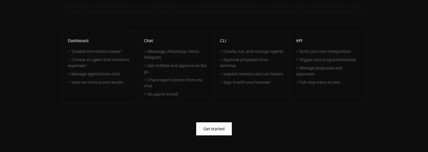
Four columns: Dashboard, Chat ("iMessage, WhatsApp, Slack, Telegram … No app to install"), CLI and API. Each has "◇" bullets. A centered "Get started" follows.
How it works: diagram
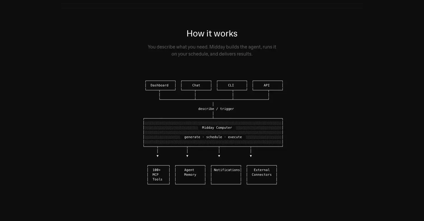
The diagram is a <pre> block of box-drawing characters: ┌──┐ boxes for Dashboard / Chat / CLI / API, then "describe / trigger", a central Midday Computer block filled with ░ shade characters ("generate · schedule · execute"), and arrows down to 100+ MCP tools · Agent memory · Notifications · External connectors.
Why. It shows architecture, the part developers ask about, in the medium developers trust: text.
What would your agent do?

An 18 px prompt field types $ midday computer create "Alert me when expenses look unusual" with a blinking caret. Below it: "One sentence. That's all it takes."
Get started

A bordered CTA panel with "Get started" and "View documentation".
MCP · /mcp and /mcp/<client>
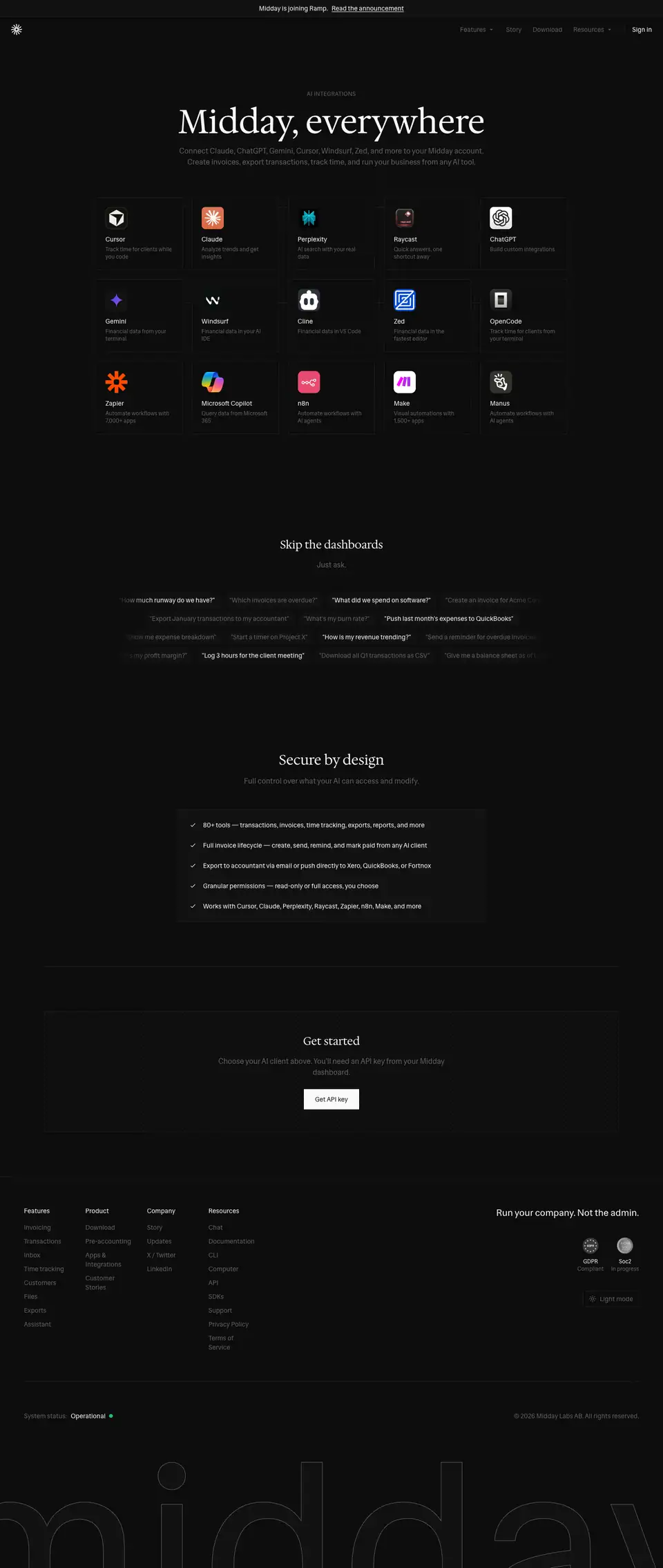
Height: 3402 px. Title: "AI Integrations via MCP — Claude, ChatGPT, Cursor & More | Midday".
Hero + client grid
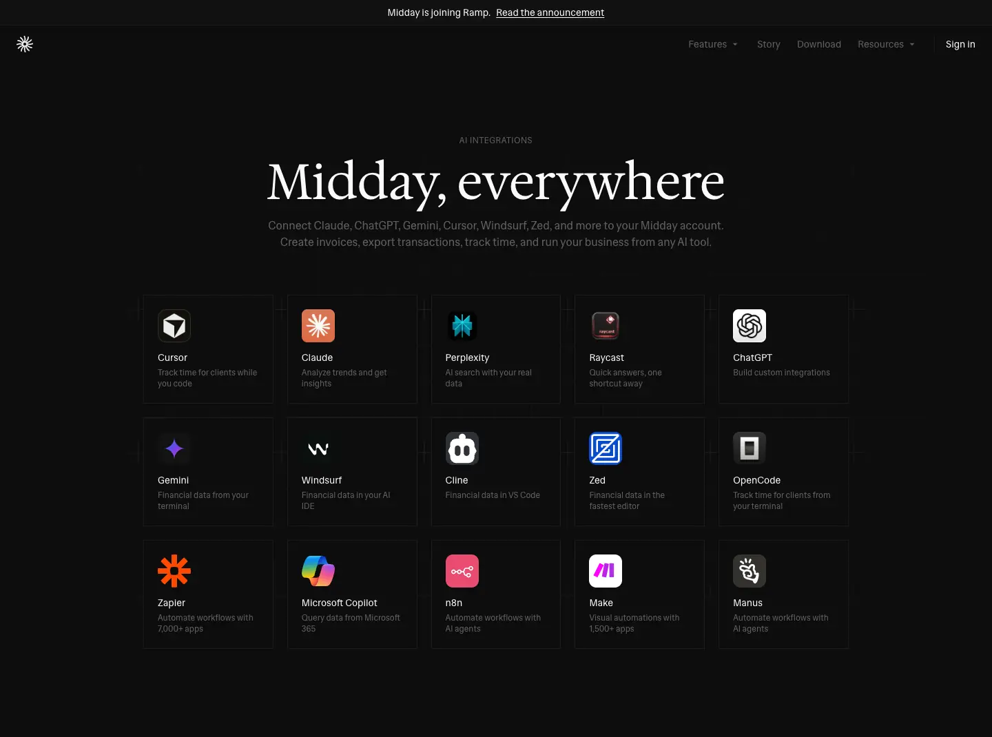
- The eyebrow "AI INTEGRATIONS", the serif 72 px "Midday, everywhere" and the lead "Connect Claude, ChatGPT, Gemini, Cursor, Windsurf, Zed, and more to your Midday account. …"
- A 5 × 3 grid of 15 client tiles. Each tile has a brand-colored app icon, a 14 px/500 name and a 12 px muted one-liner:
- Cursor "Track time for clients while you code"
- Claude "Analyze trends and get insights"
- Perplexity "AI search with your real data"
- Zapier "Automate workflows with 7,000+ apps"
- and 11 more
Why. The grid is a menu. Each tile links to a setup page, so the index page is mostly navigation.
Skip the dashboards
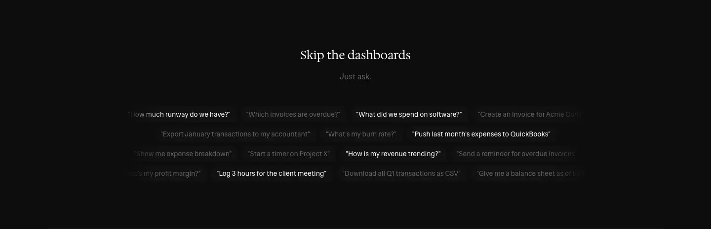
A serif H2 and the one-word lead "Just ask." Below them, 15 example prompts in quotes sit on 4 centered rows (4 · 3 · 4 · 4), with alternating #fafafa and #616161 text: "How much runway do we have?", "Push last month's expenses to QuickBooks"…
Why. The alternating brightness makes a static list feel like a shifting conversation, with no animation.
Secure by design
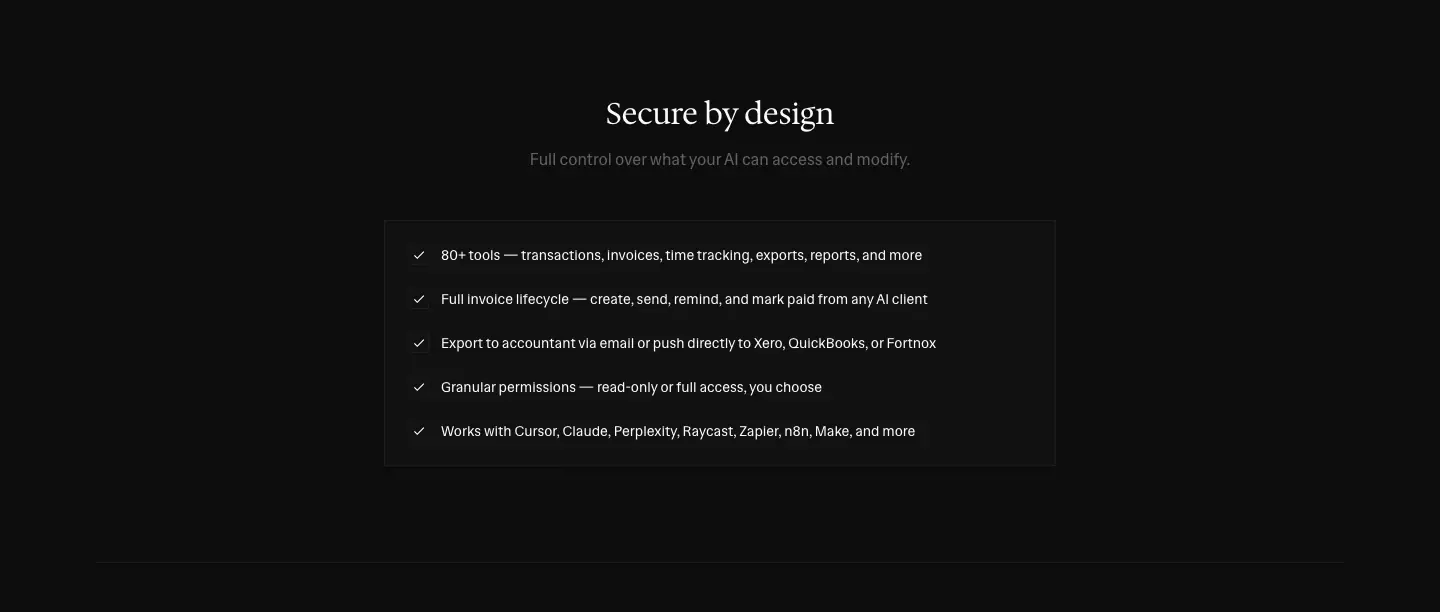
A serif 30 px H2, then a 5-item checklist: "80+ tools …", "Granular permissions — read-only or full access, you choose"…
Get started

"Choose your AI client above. You'll need an API key from your Midday dashboard." Then a filled button, "Get API key".
Client page template · /mcp/claude
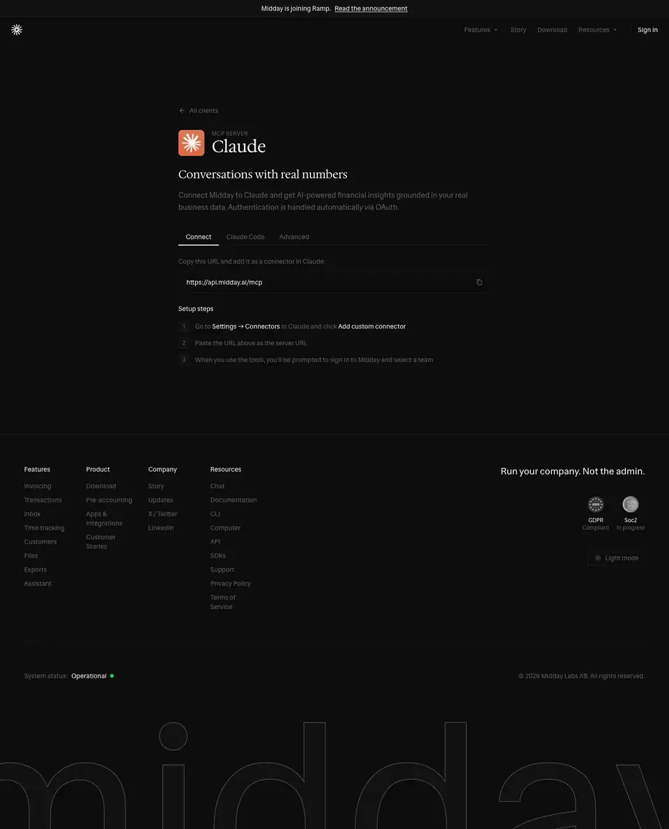
12 pages share this layout: chatgpt, claude, copilot, cursor, make, manus, n8n, opencode, perplexity, raycast, zapier, plus the index.
The page runs top to bottom:
- an "All clients" back link and the client icon
- a 12 px "MCP SERVER" eyebrow and the serif 36/40 client name
- a sans 24 px benefit line ("Conversations with real numbers") and a lead
- a tab strip (Connect · Claude Code · Advanced)
- a copyable URL field (https://api.midday.ai/mcp)
- numbered "Setup steps", with the UI paths in bold white ("Settings → Connectors", "Add custom connector")
Why. A setup page is documentation dressed as marketing. The value line sits above the instructions, so the page persuades and configures at once.
SDKs · /sdks
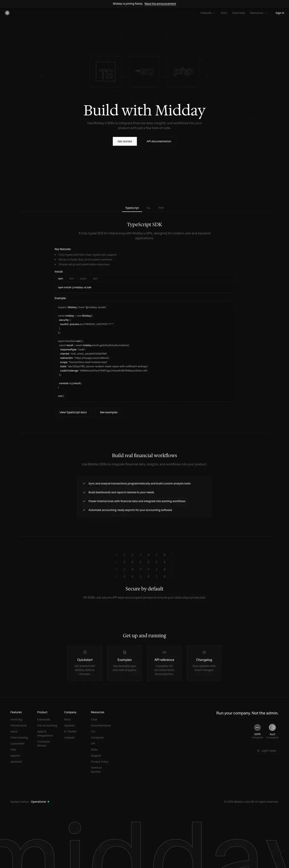
Height: 4318 px. Title: "SDKs | Midday".
Hero
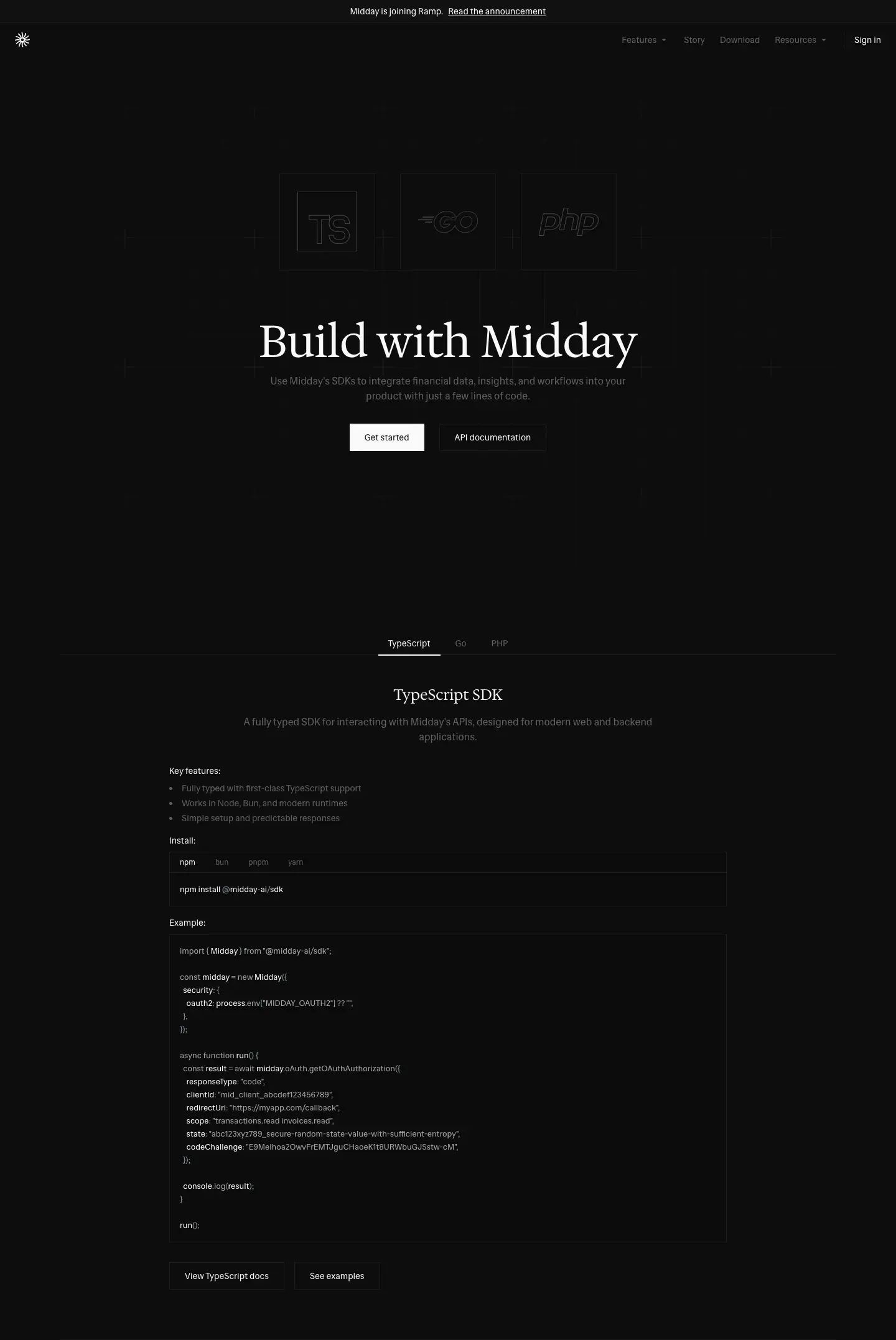
- Above the H1: three outlined language tiles ("TS", "GO", "php") in a faint grid, drawn in a hollow outline style.
- H1: serif 72 px "Build with Midday".
- Lead: "Use Midday's SDKs to integrate financial data, insights, and workflows into your product with just a few lines of code."
- Buttons: a filled "Get started" and a ghost "API documentation".
Language tabs + code
- Tabs: TypeScript · Go · PHP. The active tab is
#fafafa, the others #616161.
- Heading: a serif 24 px "TypeScript SDK", key features as a muted list, and a package-manager tab strip (npm · bun · pnpm · yarn).
- Code block: 13/20 at weight 500, on
#0c0c0c. It uses grayscale syntax highlighting only: identifiers #ffffff, keywords and strings #a7a7a7.
- Example: a real OAuth2 snippet (
midday.oAuth.getOAuthAuthorization({ responseType: "code", clientId: … })).
- Links: "View TypeScript docs" and "See examples".
Why. The syntax colors are grays, so code looks like part of the page rather than an embedded IDE screenshot.
Build real financial workflows
A serif H2 and a four-line checklist panel.
Secure by default

A grid of small outlined square glyphs above the serif H2: "All SDKs use secure API keys and scoped access to ensure your data stays protected."
Get up and running

Four bordered link cards: Quickstart · Examples · API reference · Changelog.
Download · /download
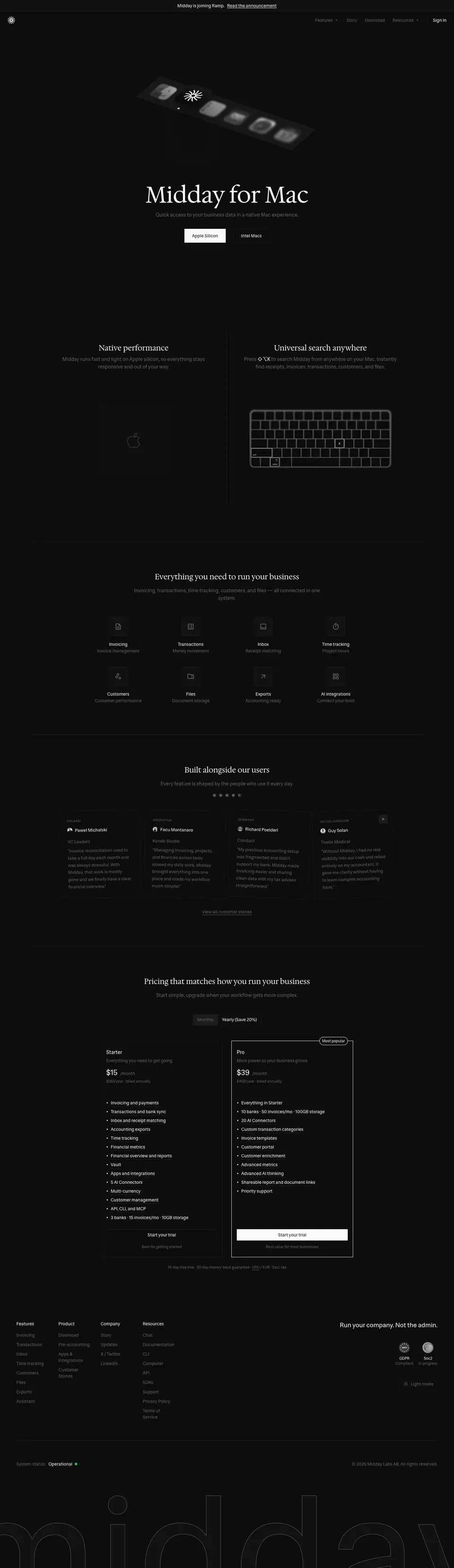
Height: 4975 px. Title: "Download | Midday".
Hero: the object pattern
- Object: a tilted, perspective strip of grayscale app icons (≈ 576 × 315 crop), with the Midday sunburst as the only white icon. The icons sit on a dark surface with soft falloff.
- H1: serif 72 px "Midday for Mac".
- Lead: "Quick access to your business data in a native Mac experience."
- Buttons: a filled "Apple Silicon" and a ghost "Intel Macs".
Why. The dock is a macOS cue that every Mac user reads in a split second. Making every icon gray except Midday's puts the product in the user's dock before they download it.
Native performance / Universal search anywhere
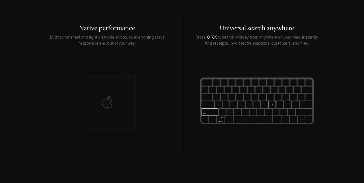
Two columns, each with a serif 24 px H2:
- Native performance: an app-icon glyph in a square.
- Universal search anywhere: a line-art keyboard with ⌥ and K highlighted. The shortcut is shown, not described.
Then
The "Everything you need" tiles, testimonials, pricing and the footer.
Integrations · /integrations and detail pages

Height: 9696 px. Title: "Integrations | Midday". Count: 98 URLs: the index, 6 category pages, 22 native apps and 69 AI connectors. → public pages
Index
- Heading: a serif 36/40 "Integrations" and a 2-line muted lead.
- Category tabs: All · Capture · Accounting · Payments · Apps · AI Assistants · AI Connectors. The selected tab is a white-filled square with a dark label.
- Grid: 3 columns of 405 × 267 bordered cards with 24 px padding. Each card has a 20 px brand logo, a 14 px name, a 2-line muted description and, where relevant, a small bordered "Beta" tag.

The close is "Don't see what you need?" with a "Request an integration" button.

Why. It is a catalog that relies on brand logos for color. The cards are big (267 px tall), so each integration gets room for a sentence, which also serves the SEO pages.
Detail template: native app · /integrations/xero
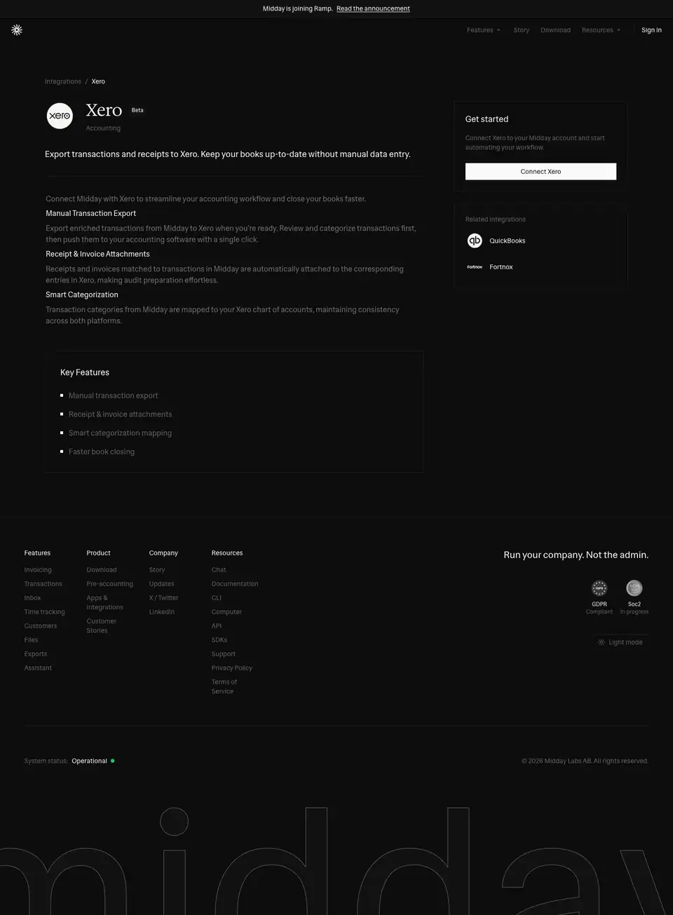
- Left column (811 px):
- a breadcrumb (Integrations / Xero) and the logo with the serif 36 px name
- a category ("Accounting") and an 18/29.25 summary
- 16/24
#707070 body paragraphs, with bold white run-in heads ("Manual Transaction Export", "Receipt & Invoice Attachments", "Smart Categorization")
- a "Key Features" list
- Right sidebar (323 px): "Get started", one sentence, a filled "Connect Xero" button and "Related integrations".
Detail template: AI connector · /integrations/connector-notion
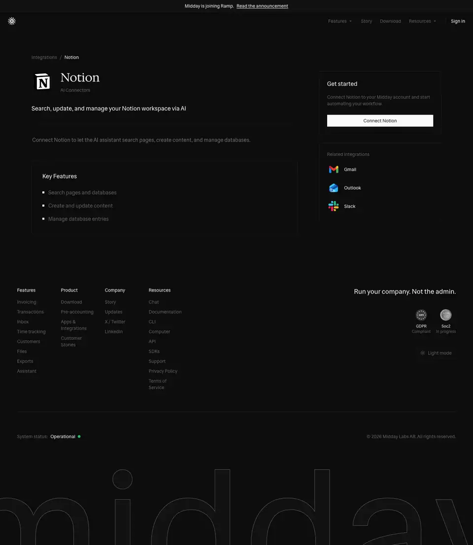
The same template with less content: a one-line summary and three key features. All 69 connector pages are generated from one data source, which makes them programmatic SEO.
Compare · /compare and /compare/<tool>-alternative
Index
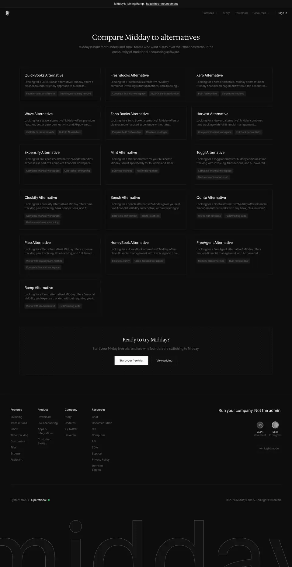
Title: "Compare Midday to QuickBooks, Xero, FreshBooks & More (2026) | Midday".
- Heading: a serif 36 px "Compare Midday to alternatives", then "Midday is built for founders and small teams who want clarity over their finances without the complexity of traditional accounting software."
- Grid: 16 cards in 3 columns. Each card has an 18/28 title ("QuickBooks Alternative"), a 2-line muted pitch starting "Looking for a … alternative?" and two 12 px bordered tags ("Founders and small teams", "25,000+ banks worldwide").
- Close: a bordered panel, "Ready to try Midday?", with two buttons.
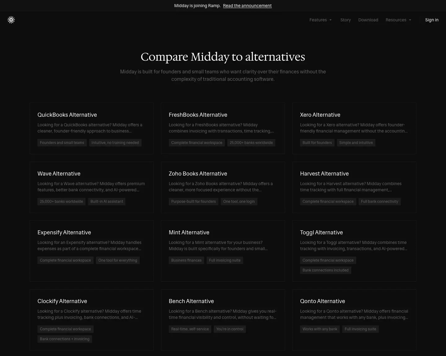
Detail · /compare/quickbooks-alternative
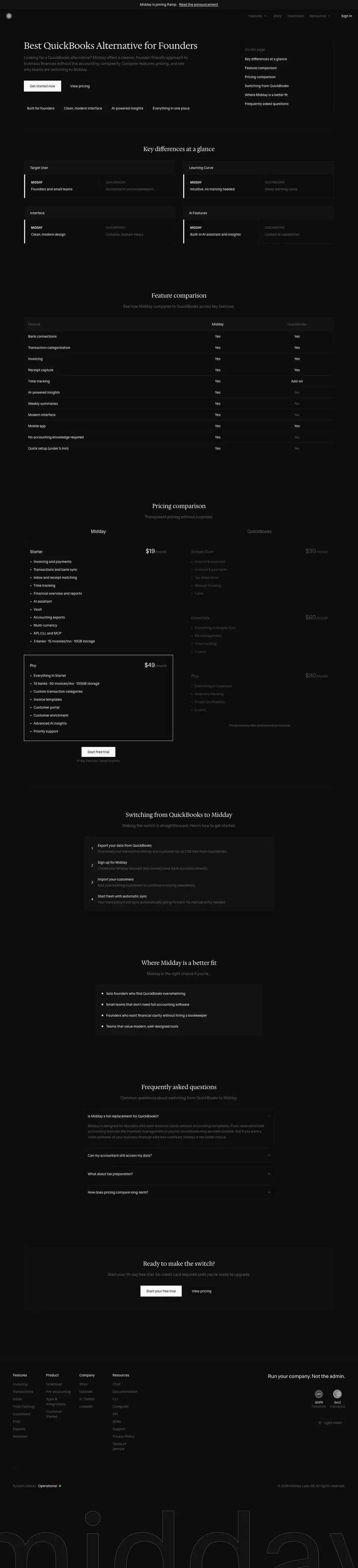
Height: 6302 px. Title: "Best QuickBooks Alternative for Founders (2026) | Midday | Midday". The title duplicates "| Midday" on all 17 compare pages.
| Section |
What it is |
| Hero |
A left-aligned serif H1 ("Best QuickBooks Alternative for Founders"), a lead, two buttons and four inline benefits. A sticky right-hand table of contents (Key differences, Feature comparison, Pricing, Switching, Where Midday is a better fit, FAQ). |
| Key differences at a glance |
Paired cards: MIDDAY (12 px/600 uppercase) vs QUICKBOOKS (12 px/500), with "Target user", "Interface"… |
| Feature comparison |
A table of Midday vs QuickBooks with Yes / No / Partial |
| Pricing comparison |
Midday Starter/Pro cards (Pro with a white border) vs QuickBooks tiers in muted text |
| Switching from QuickBooks to Midday |
4 numbered steps in a bordered panel |
| Where Midday is a better fit |
A checklist |
| FAQ |
A Radix accordion (accordion-down/up keyframes) |
| Ready to make the switch? |
A CTA panel |
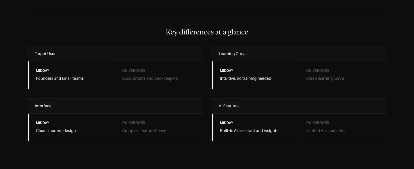
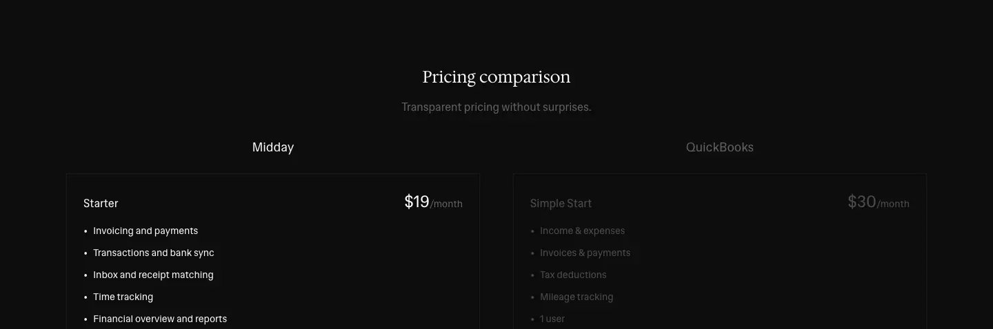
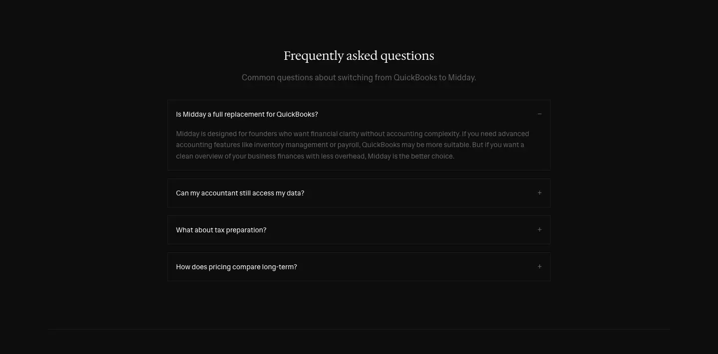
Why. It is the standard competitor page, kept in the house style. Even the competitor gets the same muted, square treatment. The page does not attack the competitor. It lays out a ledger of differences and lets the reader decide.
Updates · /updates and posts (blog + changelog)
Midday has no /blog and no /changelog. Both return 404. One stream, /updates, carries both:
- Company news: "Midday is joining Ramp", "Announcing Public Beta"
- Product releases: "Midday v2", "Introducing Apps", "Introducing Weekly Insights"
- Monthly changelogs: "January Product Update", "July Product Updates", "October Product Updates"
- Engineering posts: "Building an Automatic Reconciliation Engine", "How we are using Trigger.dev for our background jobs", "Generating PDF Invoices: Our Approach"
- An incident report: "Incident report for June 22"
The stream has 29 posts. → public pages
Index · /updates

Height: 7467 px. The index is not a card grid. It renders the latest posts in full, one after another, in a 680 px column starting at x = 380. Pagination dots sit at the bottom.
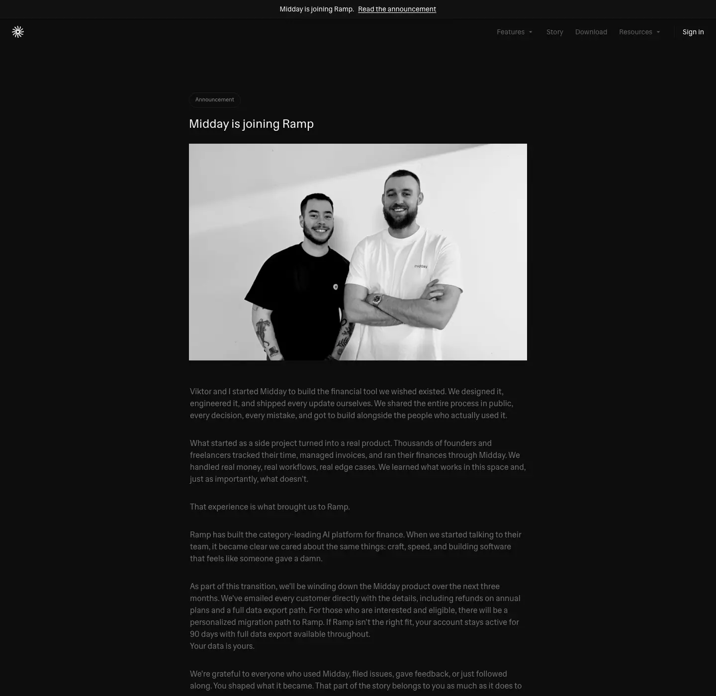
| Element |
Value |
| Category tag |
"Announcement", 11 px #878787 in a small bordered box |
| Post title |
Sans 24/32, weight 500 (faux bold), #fafafa |
| Body |
Sans 16/24 #707070 (3.92:1 on #0d0d0d) |
| Section heads in post |
Sans 26/39, weight 500 |
| Sub-heads |
Sans 16/24, weight 600, #fafafa |
| Run-in bold |
STRONG 16/24, weight 500 |
| Images |
B&W founder photo, full column width |
Why. A small team ships often. Rendering full posts on the index makes the page read as a changelog you can scroll, like a release-notes file, with no click needed to see what changed.
Post template · /updates/joining-ramp
The post has a category tag, a title, a full-width B&W photo of the founders and a first-person letter ("Viktor and I started Midday to build the financial tool we wished existed…"). The /pricing redirect points here.
Post template · /updates/midday-v2
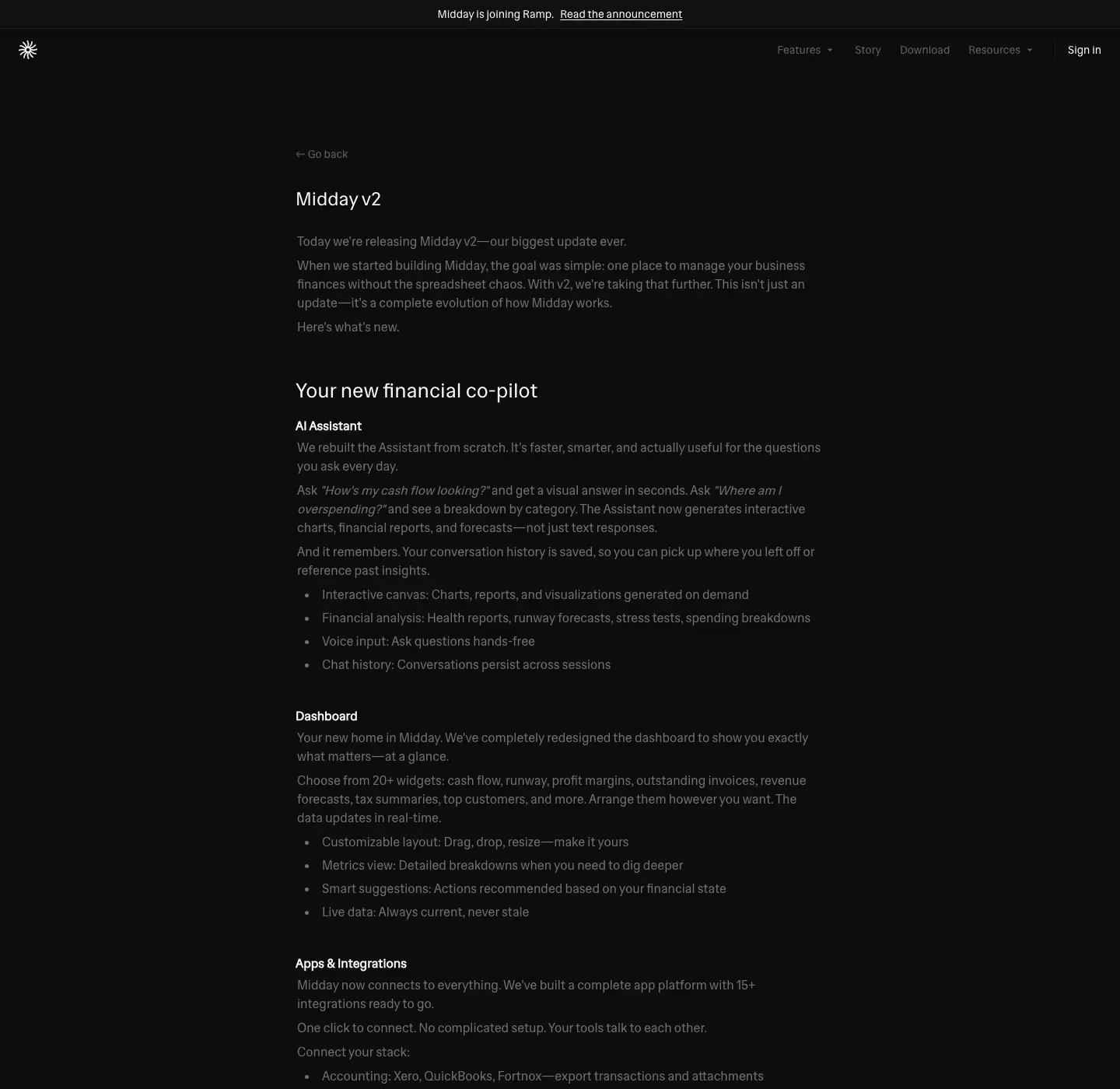
The post has a "← Go back" link, the title "Midday v2" and the opener "Today we're releasing Midday v2—our biggest update ever." Feature sections follow ("Your new financial co-pilot" → "AI Assistant", "Dashboard", "Apps & Integrations", "Recurring Invoices"…). Each section is a bullet list with a bold run-in label ("Interactive canvas:", "Voice input:"). The post ends with an author byline.
Readability note. The article body is #707070, lighter than the site's #616161 but still below 4.5:1 on near-black. Long posts in dark mode are the weakest reading experience on the site.
Docs · /docs and articles
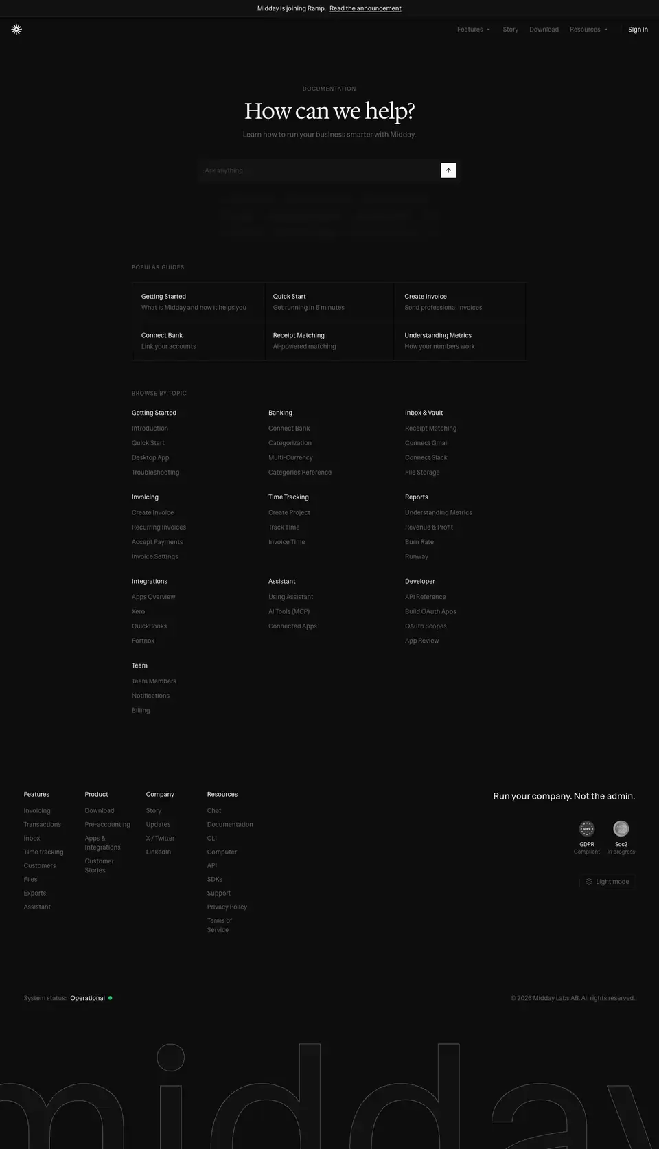
Count: 53 URLs: the index plus 52 articles. → public pages
Index · /docs
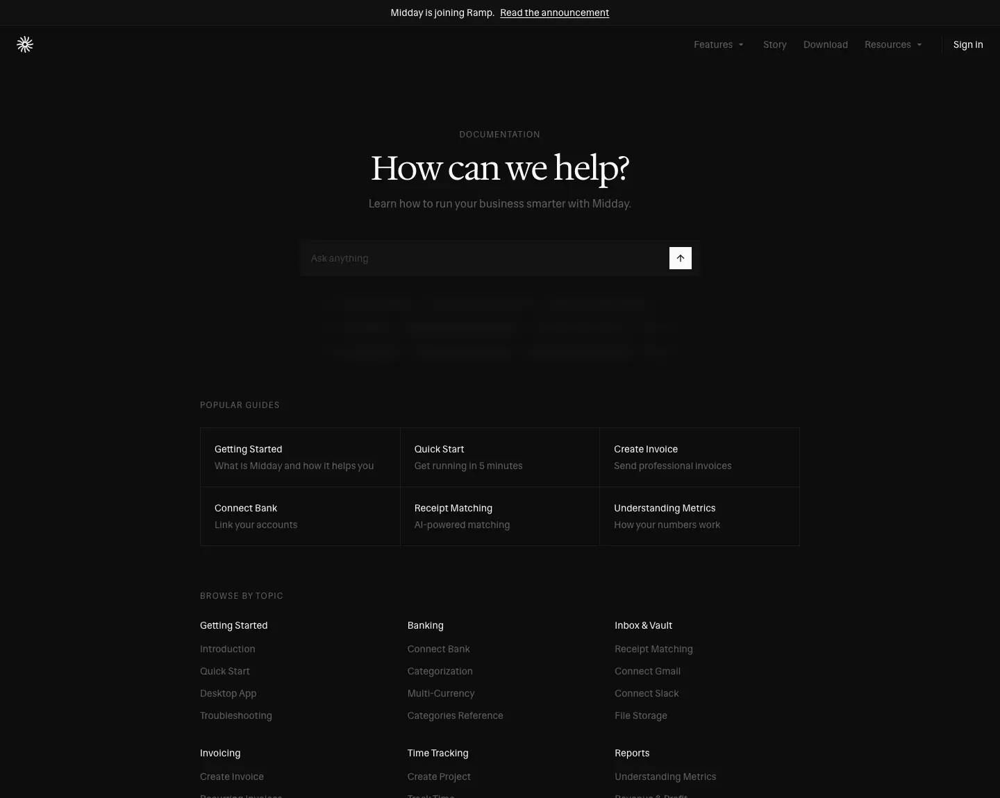
- Heading: the eyebrow "DOCUMENTATION", a serif 48/48 −1.2 px "How can we help?" and the line "Learn how to run your business smarter with Midday."
- Search: a search field labelled "Ask anything" with a submit button.
- Question marquee: three rows of question chips scroll under the search ("How do I create an invoice?", "What's my runway?", "Revenue vs last quarter"…). These are 12 px muted bordered pills. The rows use
marquee-left at 30 s and 35 s and marquee-right at 28 s, and the docs page enters with fade-blur-in (700 ms).
- POPULAR GUIDES: a 3 × 2 bordered grid, each item a 14 px/500 title plus a muted description. Examples: "Quick Start — Get running in 5 minutes", "Receipt Matching — AI-powered matching".
- BROWSE BY TOPIC: 3-column link lists under 14 px/500 heads: Getting Started, Banking, Inbox & Vault, Invoicing, Time Tracking, Reports, Integrations, Assistant, Developer, Team.
Why. The search plus moving example questions teaches what to type. Docs are framed as "ask the assistant", which matches the product.
Article · /docs/create-invoice
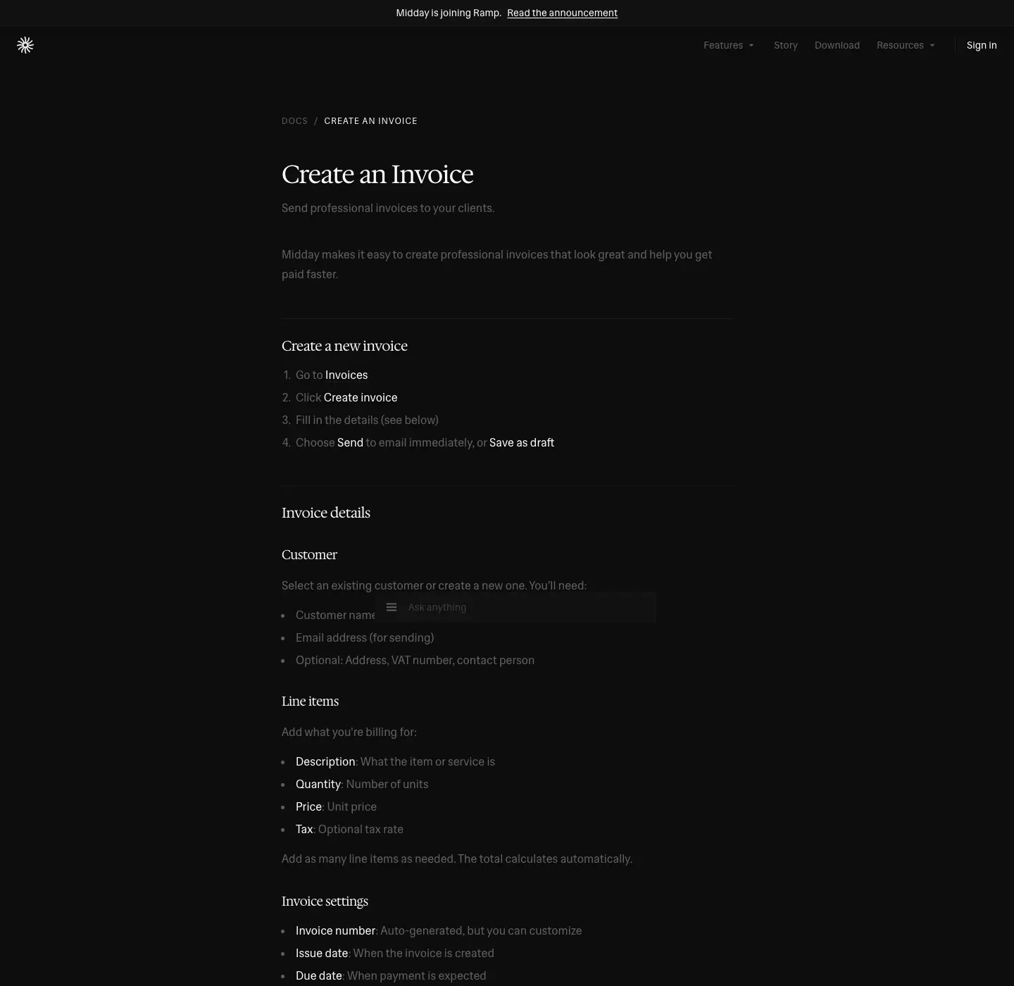
- Top: a breadcrumb, then a serif 36/40 −0.9 px H1 "Create an Invoice".
- Body: serif 20/28 −0.5 px H2s, each prefixed with a muted "#" anchor ("# Create a new invoice", "# Invoice details", "# Sending options", "# After sending", "# Tips"). Body text is 16/24 and 16/28
#616161, with bold white run-ins for UI labels.
- End: previous and next links, and a dot pager.
- Assistant panel: a floating "Assistant" panel (serif 18 px title) on a
rgba(19,19,19,.7) fill.
Customer stories · /testimonials

Height: 8334 px. Title: "Customer Stories | Midday".
- Heading: a serif 36/40 "Customer Stories" and "See how solo founders use Midday to run their businesses with less admin."
- Stories: nine long-form stories in one 768 px column, separated by hairlines. Each story has:
- an avatar, a name (sans 18/28, weight 500) and "Company · Country"
- a pull quote as a
<blockquote> in sans 24/32 #fafafa, in straight quotes
- four labelled blocks: Company, Challenge, Impact, Favorite features. Each label is 14 px/500 white and each body is 14/22.75 muted.
- The last story ends with an embedded video player.
Why. It is a case study without the case-study chrome: no logos wall, no metrics tiles. The four fixed labels let a reader compare stories, like rows in a table.
Company pages · /story, /about, /support, /bank-coverage
Story · /story
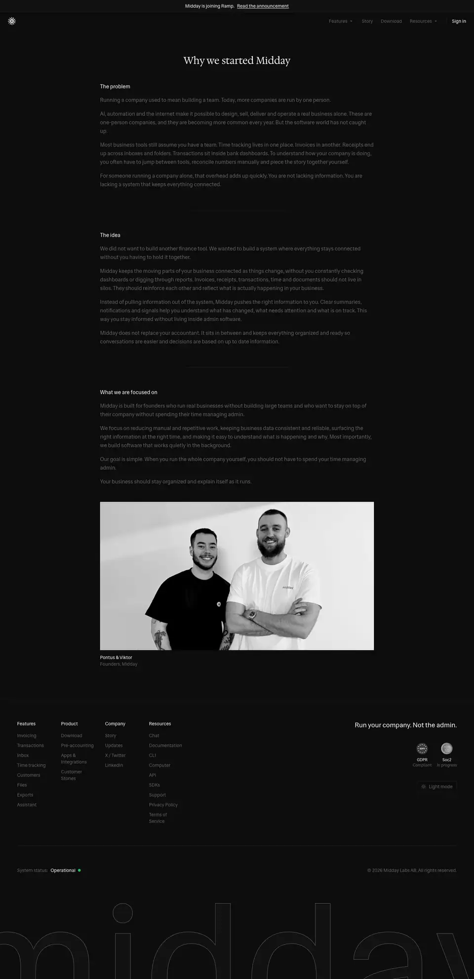
- Heading: a serif 30/39 H1 "Why we started Midday" in an 832 px column.
- Body: three sans 16 px white H2s (The problem · The idea · What we are focused on). The paragraphs are 16/26
#616161.
- Close: a muted 500-weight closing line, "Your business should stay organized and explain itself as it runs.", then the B&W founders photo with the caption "Pontus & Viktor · Founders, Midday".
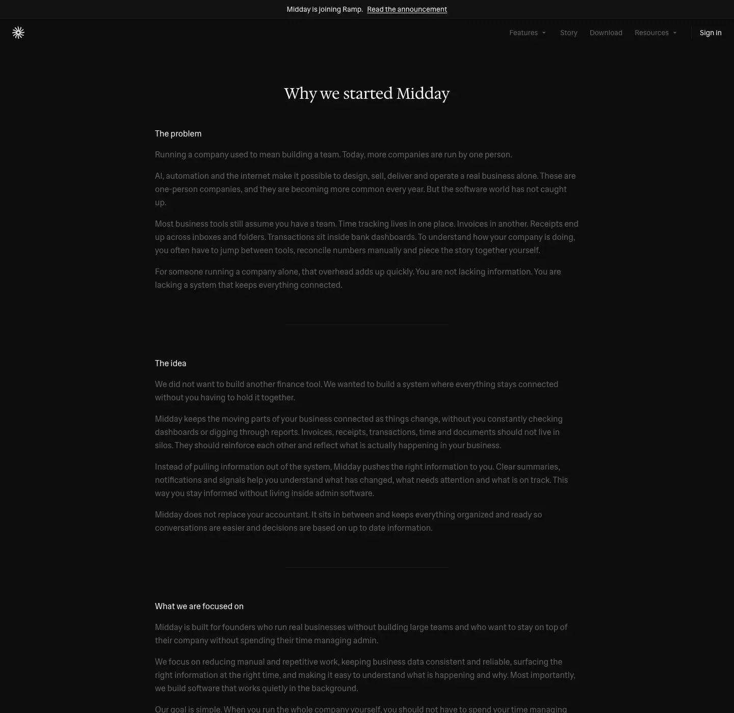
Why. It is a letter, not a page. It has no buttons. The photo at the end puts faces on the "small team" promise.
About · /about
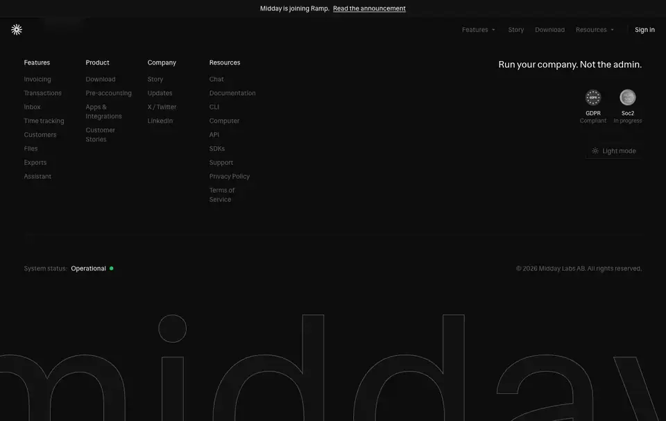
The page is 910 px tall and renders only the footer: the link columns, tagline, badges, status and wordmark. It has no content block, even though its meta description is "About Midday. Learn more about the team and company behind your AI-powered business assistant." The live page has this gap, and it is documented here as found. The real "about" content is on /story.
Support · /support
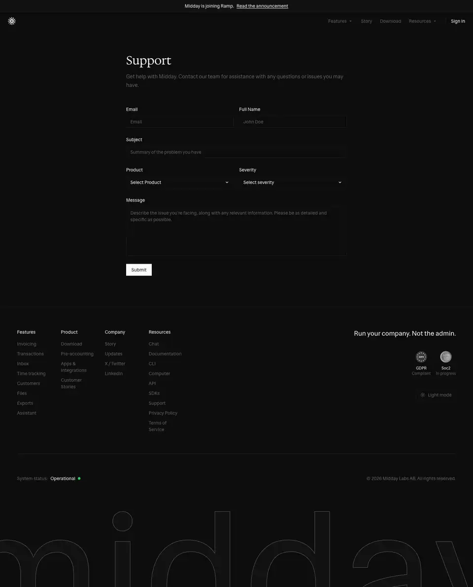
- Heading: a serif 36 px "Support" and a lead.
- Form: a two-column form with Email · Full Name / Subject / Product (select) · Severity (select) / Message. Labels are 14 px/500. Inputs are square and bordered.
- Button: a filled "Submit".
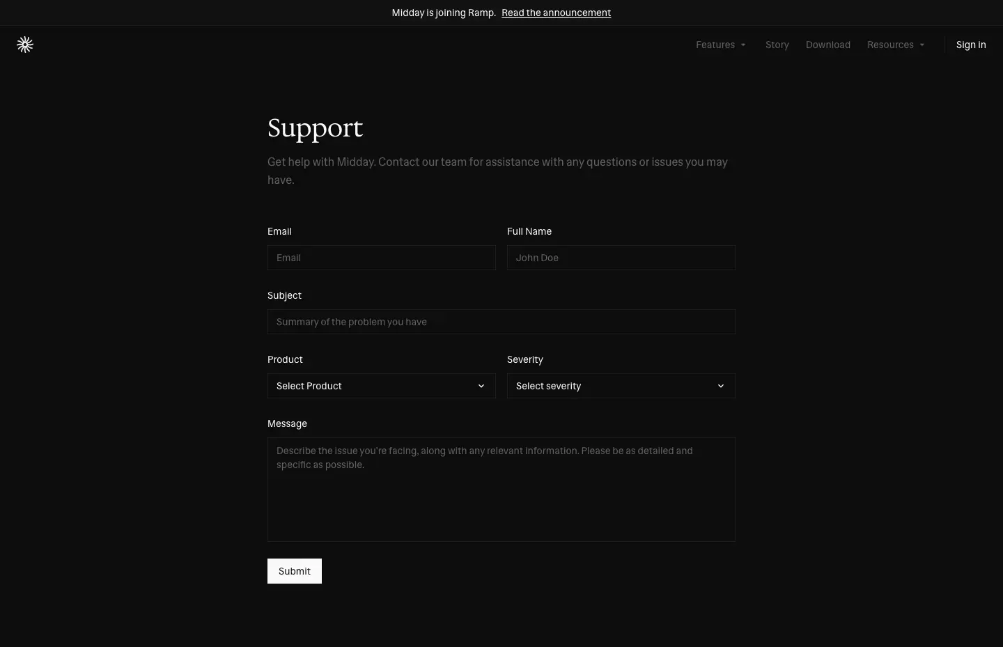
Bank coverage · /bank-coverage
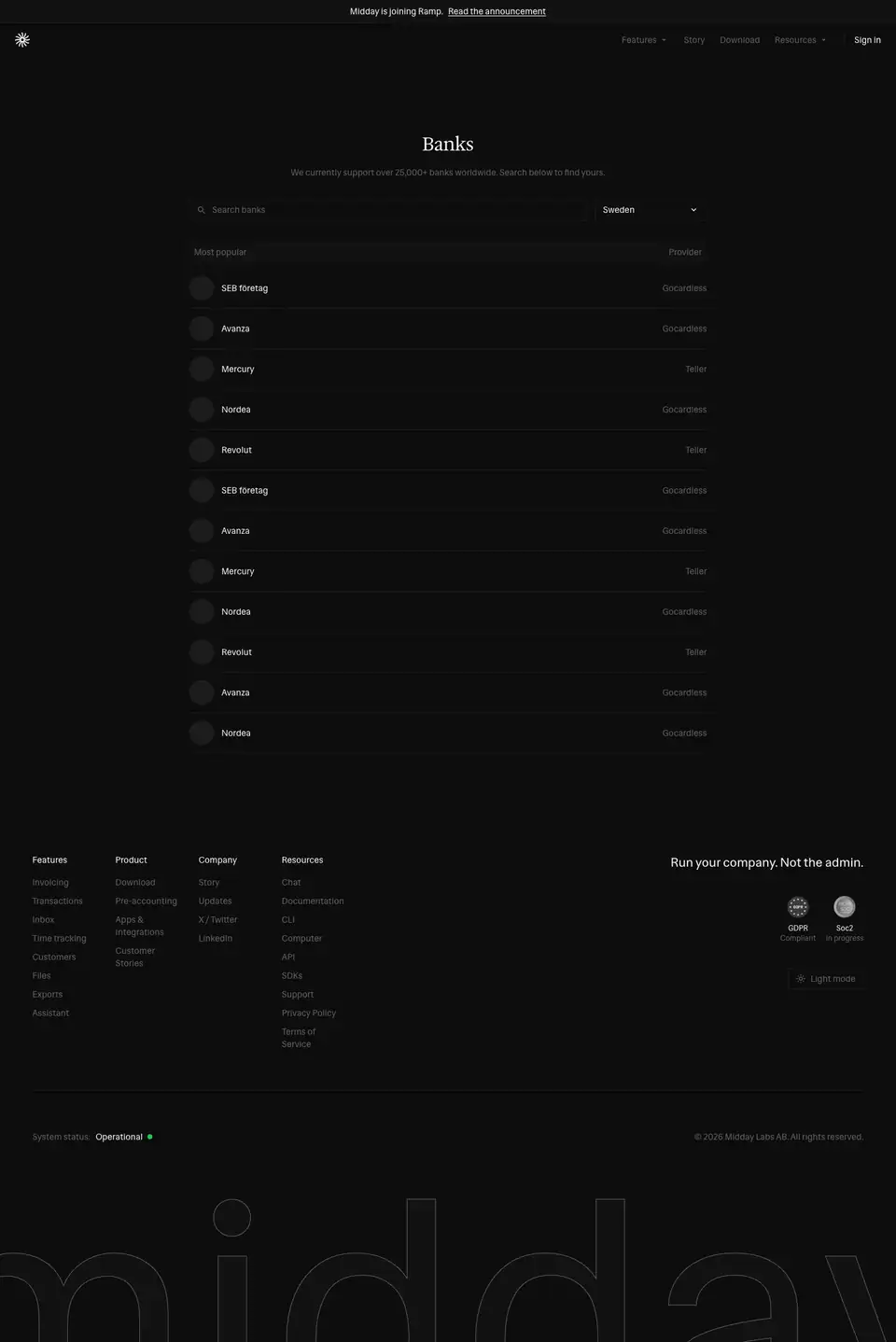
- Heading: a serif 30/39 "Banks" and "We currently support over 25,000+ banks worldwide. Search below to find yours."
- Controls: a search field with a country select, defaulting to Sweden.
- List: a "Most popular" list, with a round logo, the bank name (SEB företag, Avanza, Mercury, Nordea, Revolut…) and a right-aligned provider (GoCardless, Teller).
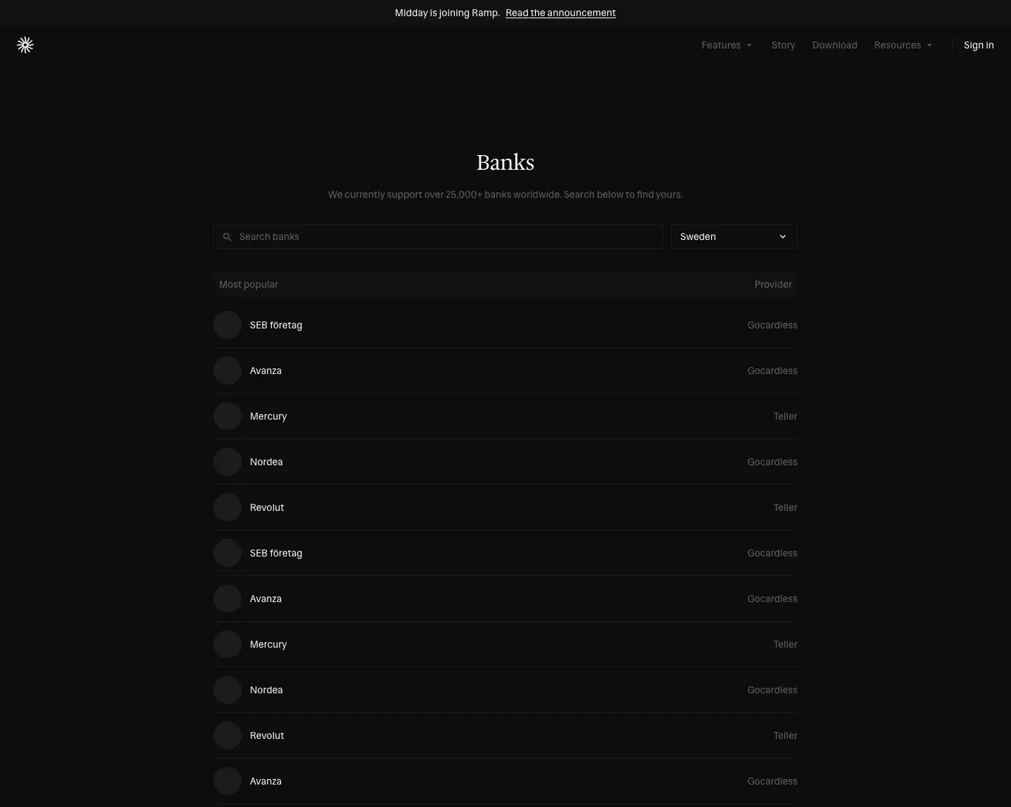
Why. "Does it support my bank?" is the first question for a finance tool. The page answers it with a live tool, not a claim.
Legal · /terms, /policy
Height: 6311 px.
- Heading: a serif 30/39 "Terms and Conditions" and "Last updated: October 26, 2023" (14 px muted).
- Sections: 16 numbered sections with sans 16 px white H2s ("1. Subscriptions" … "16. Contact Us"). Body text is 14–16 px
#616161 in an 832 px column.
- The page has no table of contents and no sidebar.
/policy (Privacy Policy) uses the same template. It is listed in public pages and was not captured separately.
Why. Legal pages keep the site's type and column, so even the fine print looks like part of the product.